We've been reviewing customer dashboards lately, and there's a pattern we keep seeing: companies choosing colors because they "look nice" rather than because they communicate clearly.
Consider a dashboard that uses bright purple for revenue growth and lime green for churn. Without labels or a defined semantic contract, neither hue tells the reader whether the state is desirable, comparable, selected, or merely branded.
Color in customer-facing analytics should have an explicit job: group, order, diverge around a reference, show state, or direct attention. Labels and structure still carry the meaning.
Your Dashboard Speaks Before Anyone Reads It
Color can direct attention quickly, but its meaning depends on context, convention, culture, theme, and the cues placed beside it.
Do not assign product semantics from generic color psychology. Define the intended role, label it visibly, and test comprehension with the target audience.
This matters more in customer-facing analytics than internal tools. Your own team learns your color system over time. They'll adapt to purple meaning good and yellow meaning critical.
But your customers? They're seeing your dashboards sporadically, maybe weekly or monthly. They don't have time to learn a custom color language.
Familiar status palettes may reduce learning for some audiences, but they are not universal and cannot carry meaning alone. A visible label or icon must still identify the state.
The Same Color Means Different Things in Different Contexts
Here's where it gets tricky: the same color can mean completely different things depending on context.
Red means "stop" on a status indicator. But red means "increase" on a trend line.
Red revenue growth? That's good. Red customer churn? That's bad. Same color, opposite meanings.
Use color + context:
- Status badges pair the chosen status color with explicit text and an icon
- Trend indicators pair direction with a target line and a toward/away label
- Comparison charts use neutral colors unless showing performance against target
Ask representative users to identify the highlighted series, interpret status, and complete the target decision. Measure errors, completion time, and confidence; there is no universal three-second color rule.
When Brand Colors Fight Your Data Story
Every SaaS company wants their embedded analytics to match their brand. Makes sense, you've invested in brand recognition, why not extend it to your dashboard?
But brand colors weren't designed for data visualization. Your brand blue might be perfect for buttons and headers. It might be terrible for showing negative trends.
We've seen this tension play out repeatedly. A company with an orange brand palette trying to show KPI statuses. Orange means "warning" to most users. But it's their primary brand color.
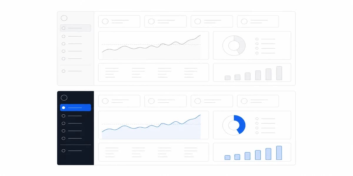
The solution? Use brand colors for chrome (headers, navigation, containers) and data-appropriate colors for actual metrics.
A practical separation is to use brand tokens for product chrome while assigning explicit, tested roles to data and status colors. The two systems may share colors, but they should not share ambiguous meanings.
Embedded White-Label Analytics Means Managing Two Brand Identities at Once
When you're embedding analytics that customers present to their customers, you're managing two brand identities: yours and theirs.
One review structure is:
- Chrome layer: Customer's brand colors (headers, buttons, containers)
- Data layer: Task-specific sequential, diverging, categorical, or status roles
- Accent layer: Customer's brand for highlights and emphasis
This separates identity from encoding, but it still requires testing across states, themes, charts, exports, and customer-configured palettes.
Accessibility Isn't Optional, It's Expected
Color perception varies, and some users cannot distinguish hues that a designer sees as clearly different. Accessibility therefore cannot depend on a prevalence estimate or one red-green simulation.
WCAG 2.2 Use of Color requires information conveyed by hue to remain available through another visible means. Use cues such as:
- Icons alongside colors (✓ checkmark with green, ✗ with red)
- Patterns or textures in charts
- Text labels that explicitly state status
- Sufficient contrast between elements
The contrast requirements: WCAG 2.2 level AA contrast criteria require 4.5:1 for normal text and 3:1 for large text. Non-text contrast generally requires visual information needed to identify UI components and states or understand graphical objects to reach 3:1 against adjacent colors. Test the exact foreground, background, size, weight, state, and least-contrasting part of a required graphic.
Tools we've found helpful:
- Chrome DevTools built-in color blindness simulator
- WebAIM contrast checker
- Figma's accessibility plugins
Grayscale and color-vision simulation can expose color-only distinctions, but they do not replace contrast measurement, visible alternative cues, keyboard and focus-state checks, or assistive-technology testing.
A mathematical comparison of relative luminance between two colors. The required ratio depends on the content and conformance target: WCAG 2.2 level AA uses 4.5:1 for normal text, 3:1 for large text, and 3:1 for required UI-component and graphical information against adjacent colors.
Falling Costs Are Good News, Which Breaks Green-Up and Red-Down
Financial dashboards have unique color psychology challenges. Traditional rules suggest green equals positive growth and red equals negative danger.
But what about debt reduction? That's costs going down (good outcome) shown as red trend going down. Is that red-negative or red-positive?
Encode the relationship to the target explicitly:
- ↑ or ↓ plus “toward target” when movement is desirable
- ↑ or ↓ plus “away from target” when movement is undesirable
- → plus “within range” or “stable” when that is the defined state
Color can reinforce these states, but the arrow, target, and text must preserve the interpretation without hue.
The Color Wheel Is a Practical Tool, Not Just Design Theory
The color wheel isn't just design theory. It's a practical tool for creating harmonious, readable dashboards.
Each scheme has a cost the swatches do not show. Monochromatic scales can encode ordered intensity when their lightness steps remain distinguishable, but they are a weak default for unrelated categories. Analogous and complementary palettes can separate groups only when the selected colors remain distinguishable in the actual chart, theme, display, and non-color fallback. The wheel relationship alone does not prove readability.
There is no universal five-colour limit. The practical question is how many distinctions the task requires at once, whether readers can identify them without repeated legend lookup, and whether direct labels, markers, or line styles reduce dependence on hue.
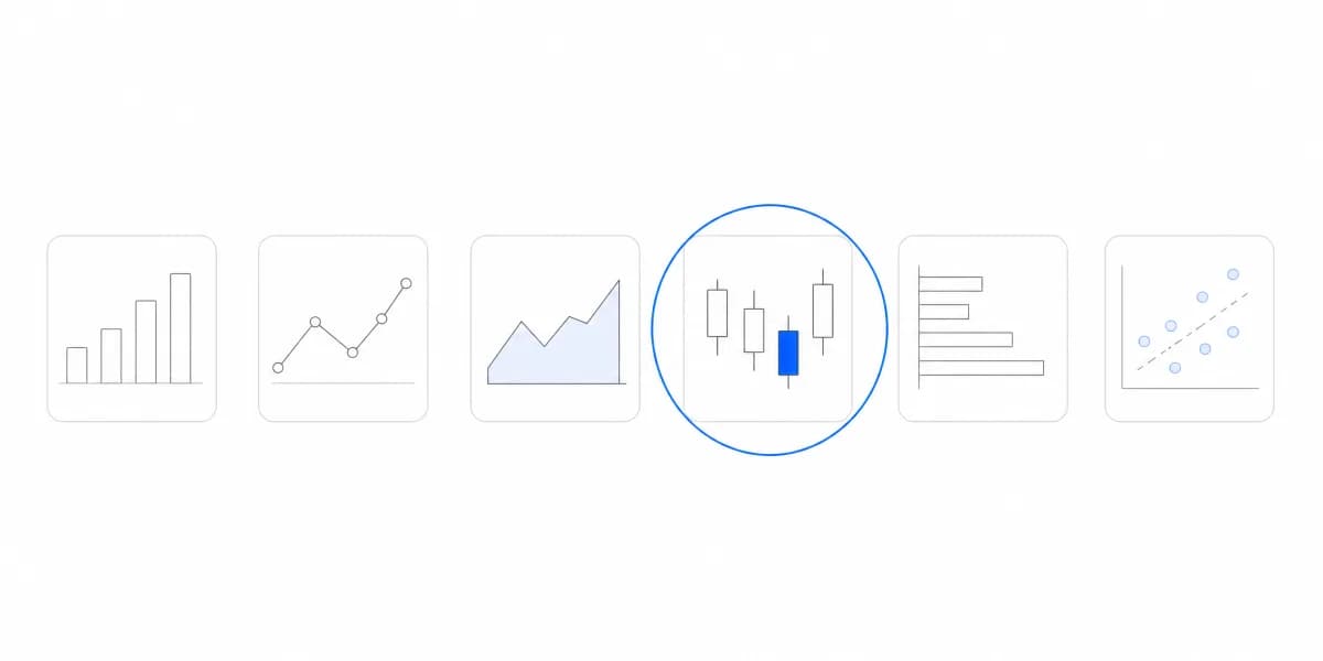
Understanding different chart types and when to use them is essential for pairing effective visualizations with the right color choices, our complete guide shows how form and color work together.
Build Color Roles From the Task, Then Test Them in the Product
Build roles from the task, then validate them in the product:
Layer 1: Foundation (Neutrals) Use neutral tokens for backgrounds, borders, and non-data text where they meet the required contrast. There is no universal percentage of neutral surface.
Layer 2: Data Categories Choose a palette designed for the data relationship: sequential for ordered magnitude, diverging around a meaningful reference, or categorical for groups without order.
Avoid reusing the same hue for unrelated categorical and status meanings within one product. The reserved hues depend on the status contract you define.
Layer 3: Status & Alerts Define the states first, then assign tested tokens and redundant cues:
- ✓ On target: explicit label plus a success icon and color token
- ! Attention: explicit label plus a warning icon and color token
- × Action required: explicit label plus an error icon and color token
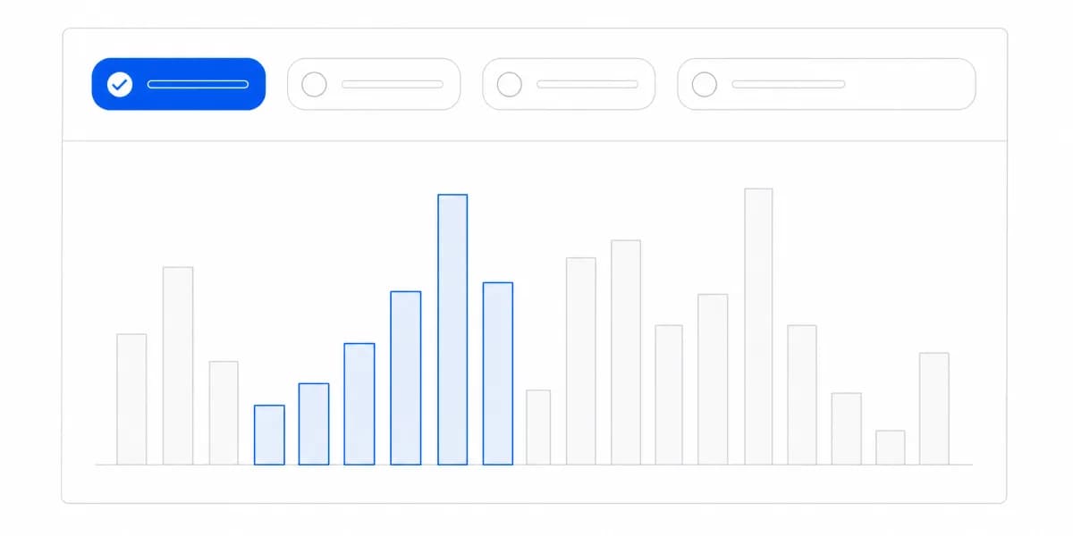
Layer 4: Emphasis Reserve an emphasis role for the item that should be inspected first. Its contrast, focus behavior, and meaning must remain clear in every theme.
Colors look different on light vs dark backgrounds, at different sizes, and when adjacent to other colors. Always test your color system in actual dashboard layouts, not just in design files.
Validate the Palette in Its Domain
Industry labels do not determine a palette. The workflow, audience, display conditions, conventions, risk, and data relationship do.
Financial services: Test target-relative movement, loss/gain conventions, print and export output, and whether arrows and labels preserve meaning without red or green.
SaaS analytics: Separate brand, category, status, selection, and focus roles, then test customer-configured themes and embedded states.
Healthcare dashboards: Follow the product's clinical safety, terminology, alert-priority, display, and accessibility requirements; do not infer a safe palette from “calming” color psychology.
Marketing dashboards: Use only the simultaneous category distinctions the comparison requires, with direct labels and a fallback for dense channel sets.
The common thread is explicit roles and evidence: every color has one job, every meaning has another visible cue, and every required state is tested.
For complete guidance on creating dashboards that communicate clearly, explore our complete guide to dashboard types to understand how different dashboard purposes require different color strategies.
Comprehension and Error Rate Are Better Evidence Than Aesthetic Preference
Here's what actually improves comprehension:
Consistency across views: If a token means “on target” on the main dashboard, preserve that meaning across views, exports, and themes.
Progressive disclosure: Start with the decision-level status and expose the supporting series on demand, without making color the only link between summary and detail.
Configurable themes with constraints: Allow brand variation within tested token roles and reject combinations that fail contrast, state, or distinguishability requirements.
Visible labels and documentation: The interface should not require memorizing an unexplained legend. Direct labels handle the immediate task; concise documentation can still define domain terms and palette roles.
Validate color through representative decisions: comprehension, error rate, completion time, confidence, and accessibility findings provide stronger evidence than aesthetic preference.
Want to see how professional data visualization principles extend beyond just color? Our glossary covers the foundational concepts that make dashboards truly effective, including the science behind why certain visual choices work better than others.
Where to go next
- Chart types guide: more than forty charts grouped by the question each one answers.
- Bad Data Visualization: seven charts that lost their readers, each with the defect named.
- Data Visualization articles: every article in this cluster.
Ready to launch customer-facing analytics?
Stop losing customers to competitors with better analytics. Sumboard's customer-facing analytics platform lets you launch self-service dashboards in days, not months.