Choosing the right chart can make insights instantly clear. The wrong choice confuses audiences and leads to poor decisions. This complete guide covers 40+ chart types organized by purpose, with specific focus on embedded analytics and customer-facing dashboards. Unlike traditional guides focused on internal BI, this resource addresses both classic chart selection and modern requirements for interactive, mobile-responsive, white-labeled analytics.
Charts Are Categorised by the Analytical Purpose They Serve, Not by How They Look
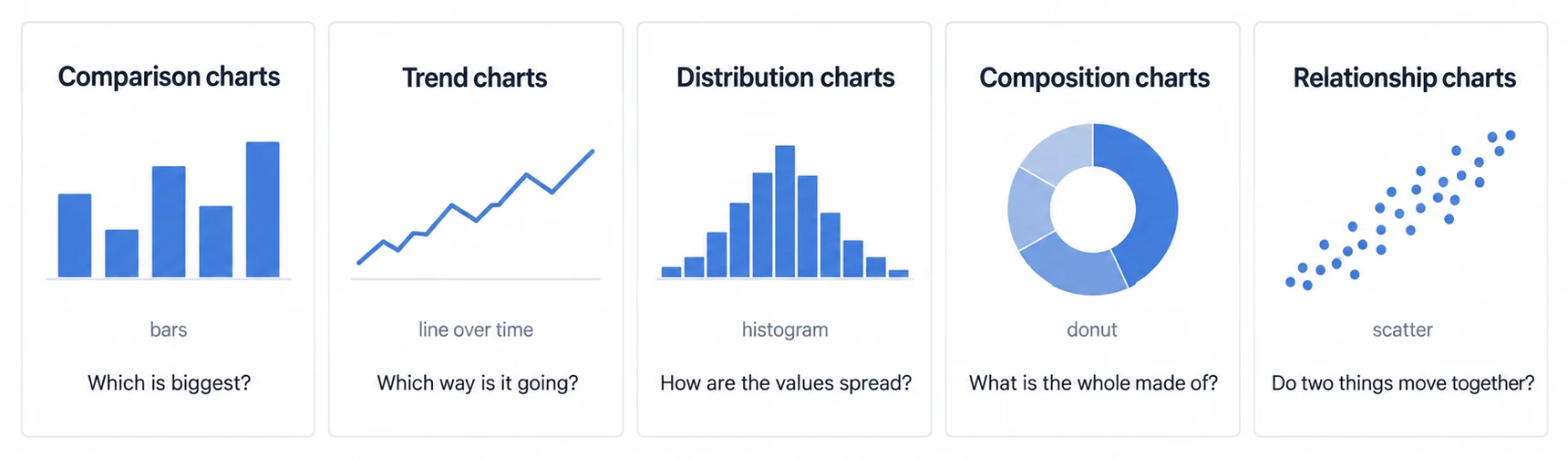
Charts are categorized by the analytical purpose they serve: comparison, trend analysis, distribution, composition, and relationship exploration. Most charts encode data in one of a few ways, as bars, lines, points or boxes, which is why so many of the forty below are variations rather than separate inventions. That framing runs through the standard data visualization literature, Stephen Few's included, though we are not attributing a specific numbered taxonomy to any one author. Understanding this taxonomy helps you select the right chart type for your specific question.
The graphical representation of data and information using visual elements like charts, graphs, and maps to make complex datasets easier to understand, analyze, and communicate.
Different analytical questions require different chart types. Comparison questions need bar charts. Trend questions need line charts. Composition questions need stacked visualizations or treemaps. Relationship questions need scatter plots. Distribution questions need histograms. This framework applies whether you're building internal or customer-facing analytics through an embedded analytics platform.
Comparison Charts (Ranking & Categories)
Comparison charts show how values differ across categories or groups. The most common types include bar charts, column charts, grouped bars, and stacked bars. These charts answer "which is bigger?" and "how do categories compare?" questions. For customer-facing dashboards, comparison charts work well because users immediately grasp the ranking or difference between items.
Trend Charts (Change Over Time)
Trend charts display how values change over continuous variables, typically time. Line charts, area charts, and sparklines fall into this category. These visualizations are essential for that track KPIs over time, identify patterns, or forecast future performance. Time-series analysis forms the backbone of most operational and strategic dashboards.
Distribution Charts (Spread & Frequency)
Distribution charts show how data points spread across ranges. Histograms, box plots, violin plots, and density curves belong here. While important for analysis, distribution charts appear less frequently in customer-facing dashboards because they require statistical knowledge to interpret. Use these for internal analytical work rather than end-user interfaces.
Composition Charts (Part-to-Whole)
Composition charts illustrate how parts relate to the whole. Pie charts, donut charts, treemaps, sunburst diagrams, and stacked area charts show percentage breakdowns. Despite their popularity, composition charts are controversial, pie charts in particular struggle with human visual perception. Consider alternatives like bar charts for most use cases.
Relationship Charts (Correlations & Connections)
Relationship charts reveal correlations, clusters, and connections between variables. Scatter plots, bubble charts, network graphs, sankey diagrams, and chord diagrams help users discover patterns that aren't obvious in raw data. These work well for analytical dashboards but require careful design for customer-facing applications.
Comparison Chart Types (Categorical Comparisons)
Comparison charts form the most common chart family in dashboards. They excel at showing categorical differences and rankings. For embedded analytics, these chart types provide the clarity and simplicity that customer-facing interfaces require. Eight to ten variations serve different comparison scenarios.
Horizontal Bar Chart
Bar charts use horizontal rectangular bars where length represents value. Best use cases include comparing categories with long labels, product revenue by region, sales by salesperson, or feature usage by customer segment. The horizontal orientation works exceptionally well on mobile devices because vertical scrolling feels natural (Luzmo, 2026). When category names exceed 10-15 characters, horizontal bars prevent label truncation that plagues column charts.
Vertical Column Chart
Column charts display vertical bars, making them ideal for time-based comparisons where the X-axis shows chronological progression. Monthly sales, quarterly growth, or weekly active users work well as column charts. The vertical orientation naturally suggests time moving left to right (OWOX, 2026). Limitation: category labels must be short, typically under 10 characters, or they overlap and become unreadable.
Grouped Bar Chart (Clustered Comparison)
Grouped bar charts place multiple series side by side within each category. Use cases include comparing current year versus last year by month, product A versus product B by region, or plan adoption by customer segment. Critical limitation: restrict to 2-3 series maximum. More than three bars per group creates visual clutter that confuses rather than clarifies, especially in customer-facing dashboards where simplicity matters (Datylon, 2026).
Stacked Bar Chart (Cumulative Comparison)
Stacked bars show both total magnitude and component breakdown. Total revenue plus breakdown by product category, total users plus breakdown by plan type, or total time plus activity breakdown work well. Major limitation: only the bottom and top segments align to a common baseline, making middle segments difficult to compare accurately. Use stacked bars when total matters more than precise component comparison.
100% Stacked Bar Chart (Percentage Comparison)
Normalized stacked bars compare proportions regardless of absolute values. Market share across regions, percentage breakdown across time periods, or composition comparison across categories demonstrate appropriate uses. Emphasize percentages when relative proportions matter more than absolute values, for example, showing product mix consistency even as total sales fluctuate.
Bullet Chart (Goal Comparison)
Bullet charts, created by Stephen Few, display actual versus target versus performance ranges (poor/satisfactory/good) in compact space. These replace inefficient gauge charts while conveying more information. Sales target progress, KPI performance against benchmarks, or metric achievement versus goals work perfectly. For applications, bullet charts maximize information density in limited real estate (Few, 2013).
Bullet charts convey the same information as gauge charts (actual vs target) but use 50-75% less space and eliminate the misleading visual metaphor of speedometers. They're Stephen Few's alternative specifically designed for dashboard efficiency.
Lollipop Chart (Minimal Comparison)
Lollipop charts use dots connected to a baseline rather than full bars, creating a minimal aesthetic. Use when visual emphasis belongs on data points rather than bar length, revenue by product when showing precise values, or rankings when de-emphasizing magnitude. Caution: less familiar to general audiences, so reserve for sophisticated users or provide clear context in customer-facing applications.
Radial Bar Chart (Circular Comparison)
Radial bar charts arrange bars in a circular pattern around a center point. Use cases include space-constrained designs, cyclical data (months, days of week), or when visual impact exceeds precision requirements. Trade-off: harder to read precisely than linear bars because humans struggle to compare angles and arc lengths. Use radial layouts when approximate patterns matter more than exact values.
Trend Chart Types (Time Series & Patterns)
Trend charts display change over time, representing the most common use case a dashboard serves. Six to eight variations serve different temporal analysis needs. For real-time dashboard applications, consider which chart types handle live data updates effectively and perform well with large datasets.
Line Chart (Standard Time Series)
Line charts connect data points with lines to show continuous change. Stock prices, website traffic, revenue trends, or KPI evolution over time work perfectly. Strength: displays precise values and supports multiple series with color differentiation. Critical note: line charts don't require Y-axis to start at zero, unlike bar charts, because the line's slope communicates change rather than magnitude (Atlassian, 2026).
Area Chart (Cumulative Trend)
Area charts add filled regions below the line to emphasize magnitude of change. Total sales over time, cumulative user growth, or revenue accumulation benefit from area emphasis. Variation: stacked area charts show multiple series and how components contribute to the total. The filled area draws attention to the overall scale of change.
Sparkline (Inline Micro Chart)
Sparklines are minimal line charts designed to display alongside text or in table cells. Edward Tufte invented sparklines for "intense, simple, word-sized graphics" that show trends at a glance. Use sparklines in KPI cards, table columns, or dashboards with many metrics where full-size charts consume too much space. Limitation: no axes or labels, so context must come from surrounding content.
Step Chart (Discrete Intervals)
Step charts use horizontal lines between data points rather than diagonal slopes, emphasizing discrete changes. Inventory levels that jump at restock points, subscription plan changes, or status transitions work well. The stepped appearance makes it clear values remain constant between change points rather than interpolating continuously.
Slope Chart (Two-Point Comparison)
Slope charts connect just two time points with lines to show directional change. Before/after comparisons, start/end comparisons, or this year versus last year work perfectly. The slope angle instantly communicates increase, decrease, or stability. Strength: works with many categories because lines don't overlap much. Limitation: only two time periods, so not suitable for trend analysis over many points.
Stream Graph (Flowing Trend)
Stream graphs display stacked area charts with organic, flowing shapes around a central baseline. Thematic evolution over time, topic trends in text corpora, or multiple overlapping trends benefit from stream graphs. Aesthetic appeal: high. Precise reading: low. Use when general pattern matters more than exact values. Popular in editorial data journalism but less common in business dashboards.
Distribution Chart Types (Data Spread & Frequency)
Distribution charts reveal how data spreads across ranges and helps identify patterns like normal distributions, skewness, or outliers. These charts require more statistical literacy than comparison or trend charts, making them better suited for analytical users than general audiences. Four to five variations serve different distribution analysis needs, understanding their complexity helps you decide when distribution charts belong in business intelligence tools versus customer-facing dashboards.
Histogram (Frequency Distribution)
Histograms group continuous data into bins and display frequency counts as bars. Age distribution, response time buckets, or price ranges work well. Critical difference from bar charts: histograms show ranges (20-30, 30-40) while bar charts show distinct categories (product A, product B). Bin size selection matters enormously, too few bins hide patterns, too many bins create noise.
A chart that displays the frequency distribution of continuous numerical data by dividing values into ranges (bins) and showing the count of observations in each range using bars. Source: datavizproject.com
Box Plot (Five-Number Summary)
Box plots display median, quartiles, and outliers in compact form. Salary ranges by department, performance distributions by region, or response times by server work well. The "box" shows the interquartile range (middle 50%), "whiskers" extend to data extremes, and dots mark outliers. Strength: compares distributions across categories compactly. Limitation: assumes statistical knowledge, customer-facing dashboards should avoid box plots.
Violin Plot (Density Distribution)
Violin plots combine box plot concepts with density curves, showing full distribution shape. They reveal whether data is bimodal, has long tails, or clusters in unexpected ways. Use cases include comparing distributions across multiple categories when shape matters, not just median and quartiles. Trade-off: beautiful and information-rich but requires sophisticated audience interpretation.
Density Plot (Smooth Distribution)
Density plots create smooth curves showing probability density across a range. Similar to histograms but continuous rather than binned. Multiple overlapping density curves compare distributions effectively, age distribution across customer segments, score distributions across products. Limitation: area under curve always totals 1.0, which isn't intuitive for non-statistical audiences.
Dot Plot (Individual Points)
Dot plots place individual data points along an axis, showing distribution through point density. Small datasets (under 100 points) work well, team member scores, customer ratings, or sample measurements. Each dot represents one observation, making the chart transparent about sample size. Limitation: doesn't scale to large datasets where dots overlap completely.
Composition Chart Types (Part-to-Whole Relationships)
Composition charts show how parts contribute to a whole, often expressing values as percentages. The most controversial chart category because pie charts (the most common composition type) suffer from perceptual problems yet remain overwhelmingly popular. Five to six variations address different composition scenarios, each with trade-offs between familiarity and effectiveness.
Pie Chart (Circular Slices)
Pie charts divide circles into slices representing percentage contributions. Despite universal recognition, pie charts fail at precise comparison because humans struggle to compare angles and areas. Use only when: (1) you have 2-4 categories maximum, (2) one slice dominates (>60%), or (3) exact precision doesn't matter. Better alternative for most cases: horizontal bar chart sorted by value.
Donut Chart (Hollow Center)
Donut charts are pie charts with centers removed, creating rings rather than filled circles. Argument for donuts: the center space accommodates total values or labels. Argument against: same perceptual problems as pies, arguably worse because comparing arc lengths is harder than comparing areas. Use case: single metric composition where visual appeal outweighs precision, like showing completion percentage as 70% filled ring.
Treemap (Nested Rectangles)
Treemaps use nested rectangles where area represents value and hierarchy shows category relationships. Disk space usage by folder, market cap by sector and company, or revenue by product category and SKU demonstrate ideal uses. Strength: efficient space usage shows hundreds of items compactly. Limitation: hard to compare similarly-sized rectangles precisely, and nested hierarchies confuse casual viewers.
Sunburst Chart (Radial Treemap)
Sunburst charts display hierarchical composition as concentric rings radiating from center. Inner rings represent higher hierarchy levels, outer rings show detail. Similar use cases to treemaps, product taxonomy, organizational structure, or budget breakdown by department and category. Trade-off: visually striking but harder to read precisely than rectangular treemaps.
Waterfall Chart (Sequential Contribution)
Waterfall charts show cumulative effect of sequential positive and negative changes. Starting value, then additions and subtractions, ending at final value. Profit and loss statements, budget variance analysis, or inventory changes work perfectly. The "floating bars" clearly communicate which factors increased versus decreased the total. Caution: waterfall charts require careful labeling to avoid confusion about what each bar represents.
Stacked Area Chart (Cumulative Composition Over Time)
Stacked area charts combine trend and composition, showing both how total changes over time and how components contribute. Revenue by product category over time, traffic sources over time, or portfolio allocation over time work well. Limitation: only the bottom area aligns to a baseline, making middle layers harder to read precisely. Reserve for cases where approximate proportions suffice.
Sankey Diagram (Flow Visualization)
Sankey diagrams show flows between categories using ribbons where width represents magnitude. Customer journey from source to conversion, energy flow through a system, or budget allocation from departments to projects demonstrate ideal uses. Strength: makes complex flows intuitive. Limitation: becomes cluttered with too many nodes or connections. For customer-facing analytics products, ours included, limit to 3-4 flow stages maximum.
Relationship Chart Types (Correlations & Patterns)
Relationship charts reveal connections, correlations, and clusters between variables. Unlike comparison charts that answer "which is bigger?" relationship charts answer "how are these variables related?" Six to eight variations serve different relationship exploration needs, from simple two-variable correlations to complex network connections.
Scatter Plot (Two-Variable Correlation)
Scatter plots place dots at X-Y coordinates to reveal correlation patterns. Price versus sales volume, advertising spend versus revenue, or customer age versus lifetime value work perfectly. Pattern recognition: upward slope indicates positive correlation, downward slope indicates negative correlation, random scatter indicates no correlation. Limitation: requires numeric variables on both axes, doesn't work with categorical data.
Bubble Chart (Three-Variable Correlation)
Bubble charts extend scatter plots by varying dot size to represent a third variable. Market share (X-axis) versus growth rate (Y-axis) with bubble size representing revenue shows the classic "BCG Matrix" visualization. Limitation: size comparison is imprecise because humans struggle to judge area differences. Use bubble charts when approximate patterns matter more than exact values.
Heatmap (Matrix Relationships)
Heatmaps use color intensity across a grid to show magnitude or patterns. Correlation matrices, website clickmaps, sales by region and month, or performance by product and time period work well. Strength: reveals patterns instantly through color gradients. Color choice matters: sequential (light to dark) for continuous values, diverging (blue-red) for values with meaningful center point like zero.
Correlation Matrix
Correlation matrices display pairwise correlations between multiple variables in grid format. Each cell shows correlation coefficient (-1 to +1) between two variables, often color-coded. Use for exploratory analysis when you need to identify which variable pairs relate strongly. Limitation: overwhelms non-technical audiences, reserve for analytical dashboards rather than executive summaries.
Network Graph (Node-Link Diagram)
Network graphs display entities as nodes and relationships as connecting lines. Social network connections, transaction flows between accounts, or dependency relationships between systems demonstrate appropriate uses. Strength: makes invisible relationships visible. Limitation: becomes incomprehensible "hairball" with too many connections, works best for sparse networks under 50-100 nodes.
Chord Diagram (Circular Flow)
Chord diagrams arrange entities in a circle with ribbons showing flows between them. Migration flows between countries, trade between regions, or customer movement between products work well. The circular layout works when all entities relate to all others and you want to see bidirectional flows. Limitation: hard to read precisely and unfamiliar to most audiences.
Parallel Coordinates Plot
Parallel coordinates plots display multiple variables as vertical axes with lines connecting values across variables. Each line represents one observation. Useful for exploring patterns in multivariate data, comparing specifications across products, analyzing multi-metric performance, or identifying clusters. Limitation: very high learning curve, only use for sophisticated analytical audiences.
Specialized & Advanced Chart Types
Beyond the core chart families, specialized visualizations serve specific use cases. These charts appear less frequently but solve particular analytical challenges effectively. Ten to twelve specialized types address scenarios from goal tracking to geographic analysis.
Gauge Chart (Meter Display)
Gauge charts mimic speedometer dials to show single values versus targets or ranges. Common in executive dashboards showing KPI achievement, capacity utilization, or progress percentages. Controversy: Stephen Few argues gauges waste space and mislead through speedometer metaphor. Counter-argument: executives recognize gauges instantly. Compromise: use bullet charts instead, they convey the same information using 50-75% less space.
KPI Card / Single Value Display
KPI cards display single numbers prominently with supporting context, previous value, trend arrow, or sparkline. Revenue, active users, conversion rate, or any primary metric works perfectly. Design consideration: large number, clear label, comparison point (versus yesterday/last month/target).
A quantifiable metric used to evaluate success in meeting business objectives. KPIs differ from general metrics by their strategic importance, they directly measure progress toward critical goals.
Progress Bar (Linear Goal Tracking)
Progress bars show completion percentage as filled rectangles. Goal progress, budget consumption, or task completion work well. Simple and universal, every user understands "70% filled means 70% complete." Variation: use color transitions (green at 100%, yellow at 50%, red below 25%) to emphasize goal proximity.
Funnel Chart (Stage Progression)
Funnel charts display sequential stage progression with decreasing quantities. Sales funnel (leads → qualified → demo → close), conversion funnel (visitors → signups → active → paid), or multi-step process completion demonstrate ideal uses. Each stage appears as a trapezoid with width representing quantity. Limitation: doesn't show time between stages or where users exit, consider sankey diagrams for more detail.
Geographic Map (Choropleth)
Choropleth maps use color intensity across geographic regions to show data magnitude. Sales by state, population density by county, or adoption rate by country work perfectly. Critical: map projections distort area, potentially misleading viewers about magnitude. Design choice: use equal-area projections when possible, and consider whether cartograms (resized by data value) communicate better than traditional maps.
Point Map (Geographic Scatter)
Point maps place dots at latitude-longitude coordinates to show location density or patterns. Store locations, customer locations, or event locations work well. Variation: size dots by value (sales by store) or cluster nearby points to avoid overlap. Limitation: requires geographic coordinates, doesn't work if you only have city names or ZIP codes.
Symbol Map (Icon-Based Geographic)
Symbol maps place icons or symbols at locations instead of dots. Factories, distribution centers, or office locations work when each point needs clear identification. Icons communicate category instantly, truck for distribution center, factory for manufacturing site. Limitation: icons overlap at high density, making them suitable only for sparse geographic distributions.
Calendar Heatmap (Time Pattern)
Calendar heatmaps arrange days in calendar grid format with color intensity showing values. GitHub's contribution graph exemplifies this, commits per day with darker greens for more activity. Use for daily metrics where weekly or seasonal patterns matter, sales activity, customer support tickets, or website traffic. Pattern revelation: instantly shows weekday versus weekend differences, holiday impacts, or seasonal trends.
Horizon Chart (Compact Time Series)
Horizon charts layer multiple color bands to show time series in compact vertical space. Multiple related metrics in limited dashboard space benefit from horizon charts. Each metric appears as colored bands above and below a baseline, with darker colors representing larger deviations. Trade-off: high information density but steep learning curve, reserve for frequent users of analytical dashboards rather than casual audiences.
Candlestick Chart (OHLC)
Candlestick charts display four values per time period (open, high, low, close) commonly used for financial data. Stock prices, cryptocurrency prices, or any OHLC data work perfectly. Each "candle" shows open (bottom/top of body), close (top/bottom of body), and high/low (wicks). Color coding (green for up periods, red for down) communicates direction instantly. Limitation: financial domain-specific, so unfamiliar to general audiences.
Gantt Chart (Project Timeline)
Gantt charts display project tasks as horizontal bars across time. Each bar's position shows start date, length shows duration, and dependencies appear as arrows. Project management, resource allocation, or any time-based scheduling work well. Modern variation: swimlanes group related tasks vertically. Limitation: becomes cluttered with too many tasks, works best for high-level project views rather than detailed task tracking.
Organizational Chart (Hierarchy)
Organizational charts show reporting structures as node-link diagrams. Company hierarchy, team structure, or any reporting relationship works obviously. Layout variations include top-down (traditional), left-right (wide structures), or radial (circular from center). Limitation: purely structural, doesn't show metrics, performance, or relationships beyond reporting lines.
A Static Chart Shows a Fixed Answer, an Interactive One Lets the Reader Ask the Next Question
Static charts display fixed data like PDFs or presentations. Interactive charts support drill-down, filtering, hover tooltips, cross-filtering, and real-time updates, and delivering them inside a product is what Sumboard's embedded analytics is for. Modern customer-facing dashboards require interactivity for self-service exploration rather than relying on static snapshots. Understanding implementation differences helps you choose between chart libraries, embedded platforms, or custom development.
Drill-Down & Hierarchical Exploration
Drill-down lets users click categories to see underlying detail. Click "West Region" to see states, click "California" to see cities, click "San Francisco" to see stores. Implementation approaches include: (1) replace chart with detail view, (2) add detail view below, (3) modal/sidebar with detail. Design consideration: provide breadcrumbs showing current drill-down path and "back" navigation.
Filtering & Dynamic Updates
Interactive filters update charts dynamically as users change selections. Date range pickers, category multi-selects, or search inputs modify displayed data without page reloads. Implementation: client-side filtering (fast but limited to loaded data) versus server-side filtering (slower but handles large datasets). Customer-facing consideration: indicate filter state clearly so users know what they're viewing.
Hover Tooltips & Data Labels
Hover tooltips display precise values, additional context, or related metrics when users mouse over chart elements. Prevents chart clutter from always-visible labels while preserving access to exact values. Mobile consideration: hover doesn't exist on touch devices, so provide tap-to-show-detail alternative or always display critical labels.
Cross-Filtering & Linked Dashboards
Cross-filtering lets selection in one chart filter other charts. Click bar in "Revenue by Product" to filter "Revenue by Region" showing only that product's regional breakdown. Powerful for exploratory analysis but requires careful design, and the decisions run past the interface: users must understand which charts are filtered and how to reset, and cross-filtering in embedded analytics works through what else changes once the dashboard sits inside another product. Real-time analytics dashboards benefit enormously from cross-filtering.
Real-Time Data Updates & Live Streaming
Real-time dashboard applications stream new data as it arrives. Stock prices, server monitoring, or IoT sensor data require live updates. Implementation choices include: WebSocket streaming, periodic polling, or change notifications. Chart consideration: use chart types that handle frequent updates gracefully, line charts work well, complex scatter plots struggle. Data aggregation helps, update every second for user-facing displays, but use microsecond precision for raw data storage.
Responsive & Mobile-Optimized Charts
Responsive dashboard design adapts charts to screen size. Desktop: horizontal space abundant, vertical space limited. Mobile: opposite. Responsive strategies include: (1) stack charts vertically, (2) simplify detail on small screens, (3) replace complex charts with simpler alternatives, (4) provide horizontal scrolling for tables. Test actual devices, desktop browser resize doesn't capture touch interaction challenges.
Export & Download Capabilities
White label analytics require export functionality. PDF reports, Excel downloads, PNG images, or CSV data exports let users share insights outside the dashboard. Implementation consideration: server-side rendering for PDF/PNG ensures consistent output regardless of user's screen size. Client-side CSV export works for smaller datasets but struggles with millions of rows.
Visual Design Decides Whether Customers Read Your Analytics as Professional or Amateur
Beyond choosing the right chart type, visual design determines whether customers perceive your analytics as professional or amateurish. White label platforms must support extensive customization (color schemes, fonts, borders, spacing) to match host application branding. Six to eight design dimensions require attention.
Color Theory & Palette Selection
Color palettes communicate brand identity and support data interpretation. Categorical palettes use distinct hues for unrelated categories, product lines, customer segments. Sequential palettes use light-to-dark gradients for continuous values, revenue growth, temperature scales. Diverging palettes use two colors with neutral center for values with meaningful zero point, profit/loss, sentiment. Accessibility consideration: avoid red-green combinations that colorblind users can't distinguish. For detailed guidance, see our dashboard color theory article.
Typography & Label Formatting
Font choices, sizes, and weights guide visual hierarchy. Large bold for KPI values, medium weight for section headers, small regular for axis labels. Monospaced fonts work well for numeric data alignment. System fonts load fastest but limit brand expression. Custom fonts enable brand matching but require font loading optimization to avoid render delays.
Whitespace & Layout Density
Information density versus whitespace creates different dashboard personalities. Dense layouts maximize information per pixel, Bloomberg Terminal, analytical tools. Spacious layouts emphasize key metrics, executive dashboards, mobile apps. Customer-facing consideration: default to more whitespace unless building tools for power users who demand density.
Branding & Aesthetic Considerations
White label analytics must adopt host application branding completely. Logo placement, primary colors, secondary colors, accent colors, font families, border styles, shadow effects, and general aesthetic (minimal/bold/playful) all require customization. Implementation: CSS variables or theme objects let you define styles centrally rather than hardcoding colors throughout chart configurations.
Animation & Transitions
Chart animations draw attention during data updates or reveal patterns during initial load. Transition duration sweet spot: 300-500ms, fast enough to feel responsive, slow enough to track changes. Overuse warning: excessive animation annoys users rather than helps. Reserve animations for meaningful transitions: data updates, drill-down/up navigation, or filter changes. Accessibility consideration: provide option to disable animations for users with motion sensitivity.
Common Data Visualization Mistakes & How to Avoid Them
Even experienced designers make visualization mistakes that confuse or mislead audiences. Ten to twelve common errors occur repeatedly across dashboards, each preventable through awareness and testing. Learning from bad data visualization examples accelerates your progress.
Truncated Y-Axes (Exaggerated Differences)
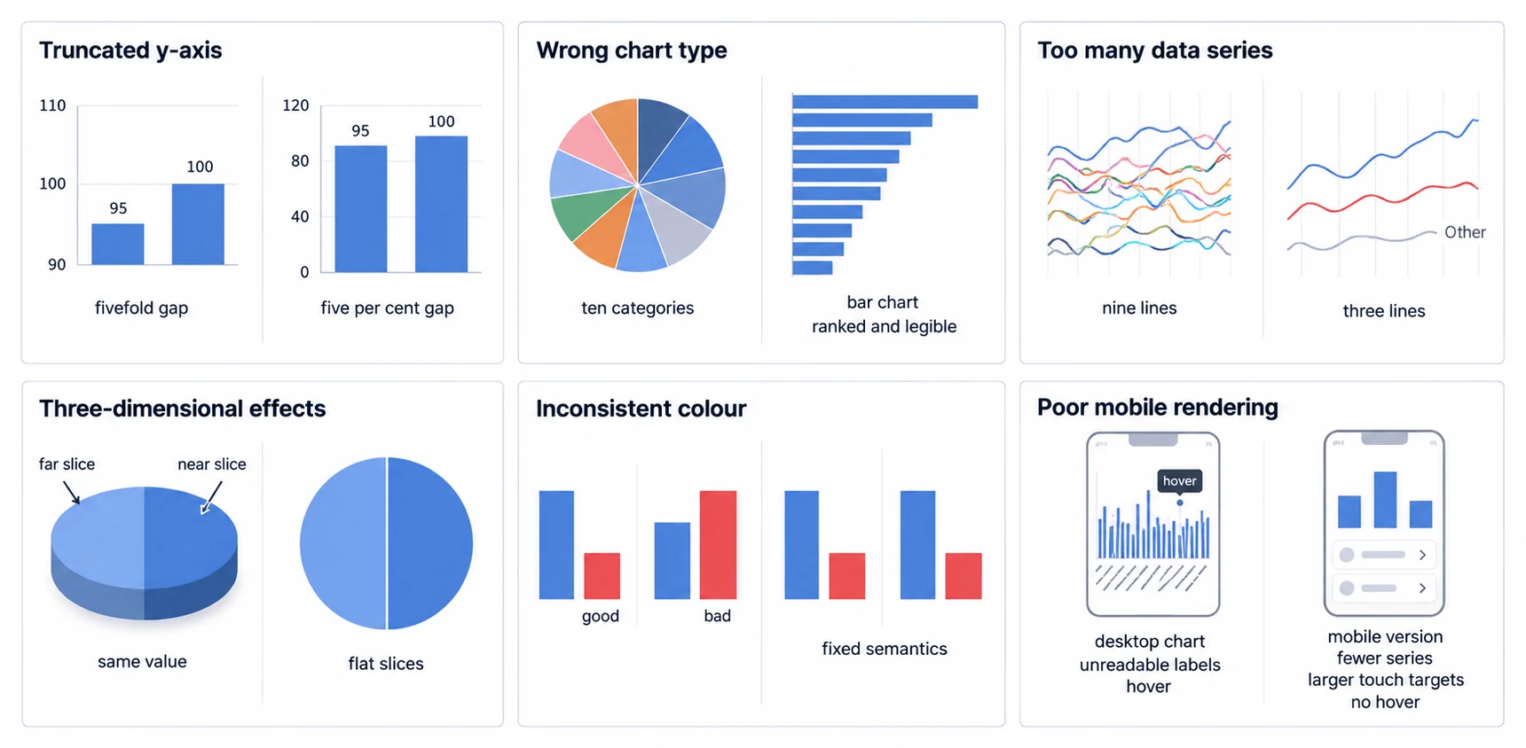
Truncating Y-axes to start above zero exaggerates differences in bar charts. Revenue bars starting at 90 instead of 0 make a 95-to-100 difference appear 5x rather than 5%. Line charts can start Y-axes above zero (slope communicates change, not magnitude), but bar charts must start at zero (length communicates magnitude). Always check: does Y-axis truncation mislead viewers?
Wrong Chart Type for Data
Using pie charts for 10+ categories, line charts for categorical data, or bar charts for continuous distributions creates confusion. Match chart to data type: categorical (bar), continuous time (line), percentage composition (stacked bar), correlation (scatter). When unsure, default to simple bar or line, they rarely mislead.
Too Many Data Series
More than 5-7 series in line charts creates visual spaghetti. More than 3 series in grouped bars creates clutter. Solution: aggregate minor series into "Other" category, use small multiples (separate charts per series), or implement filtering to show subset of series. Customer-facing principle: simplify ruthlessly, every additional series makes comprehension harder.
3D Effects & Chart Junk
3D effects distort perception and add no information. 3D pie charts make near slices appear larger than far slices. 3D bars make comparisons imprecise. Drop shadows, gradients, and decorative elements rarely improve comprehension. Follow Edward Tufte's principle: maximize data-ink ratio by removing non-data pixels. Clean, flat design ages better than effects-heavy styling.
Inconsistent Color Usage
Using red for "good" in one chart and "bad" in another creates confusion. Changing category colors between related charts breaks pattern recognition. Establish color semantics: green for positive/good, red for negative/bad, blue for neutral, gray for inactive. Maintain category color assignments across all charts in a dashboard.
Information Overload
Showing too many metrics, too many charts, or too much detail overwhelms users rather than informing them. Progressive disclosure helps: summary view first, click for details. Dashboard design principle: each screen should answer one question clearly rather than attempting complete coverage. Mobile: ruthlessly prioritize, vertical scrolling allows expansion but horizontal space remains constrained.
Poor Mobile Rendering
Desktop-optimized charts often fail on mobile: tiny text unreadable, hover interactions inaccessible, horizontal scrolling required, load times excessive. Mobile-first design principles include: larger touch targets (44px minimum), eliminate hover dependencies, vertical stacking, simplified detail, progressive image loading. Test actual devices, desktop browser resize misses touch interaction issues.
Multi-Tenant Data Leakage (Security Disaster)
Embedded analytics multi-tenancy failures expose customer A's data to customer B. See multi-tenant analytics architecture for proper isolation patterns. Row-level security must enforce data isolation. Common mistake: trusting client-side filtering instead of database-level isolation. Every query must include tenant_id filters or use separate schemas per tenant. Security testing requirement: verify customer A cannot access customer B's data through URL manipulation, API parameter changes, or cross-filtering.
Multi-tenant data leakage is a catastrophic failure in embedded analytics. Always implement row-level security at the database query level, never rely on client-side filtering. One data leak can destroy customer trust and violate data privacy regulations like GDPR.
The Chart Library Choice Sets Your Timeline and Your Ongoing Maintenance Burden
Choosing between JavaScript chart libraries, embedded analytics platforms, or custom development determines project timeline, ongoing maintenance burden, and feature capabilities. Three to four options exist with different trade-offs, understanding implementation reality helps avoid "we'll just use D3" naivety.
Popular JavaScript Chart Libraries (D3.js, Chart.js, Highcharts)
Open-source JavaScript libraries provide maximum control and customization. JavaScript charting libraries like D3.js (low-level), Chart.js (mid-level), and Highcharts (high-level) serve different complexity/control trade-offs. D3.js: ultimate flexibility but requires deep expertise and significant development time. Chart.js: easier but limited advanced features. Highcharts: complete but commercial licensing required for business use.
React Chart Libraries (Recharts, Victory, Nivo)
React chart libraries integrate naturally with React applications. Recharts emphasizes simplicity and composability. Victory offers animation and mobile optimization. Nivo provides rich theming and responsive design. See React dashboard components for a practical implementation guide. Trade-off versus vanilla JavaScript libraries: React-specific means tighter integration but framework dependency.
Embedded Analytics Platforms vs Chart Libraries
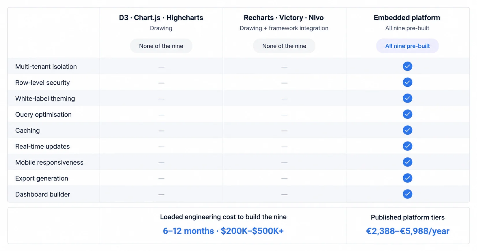
Building customer-facing analytics from chart libraries requires solving: multi-tenant analytics isolation, white-label analytics theming, row-level security enforcement, query optimization, caching, real-time updates, mobile responsiveness, export generation, and dashboard builder interfaces. Timeline: 6-12 months development. Cost: $200K-500K+ loaded cost (2-3 engineers × 12 months). Maintenance: a continuing share of engineering capacity ongoing.
Embedded analytics platforms provide these features pre-built. Sumboard, Sisense, Looker Embedded, and others offer white-labeled dashboards with built-in multi-tenancy, security, and theming. Trade-off: less customization flexibility, vendor dependency, licensing costs. Cost comparison: €2,388-€5,988 a year on Sumboard's published tiers for embedded platforms versus $200K-500K+ build cost plus a continuing share of engineering capacity. For detailed analysis, see our build vs buy embedded analytics guide.
Different Industries Expect Different Charts, Because Their Standard KPIs Differ
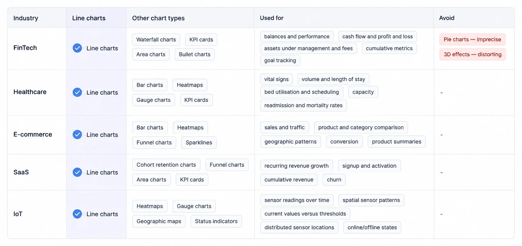
Different industries prioritize different chart types based on standard KPIs and user expectations. Understanding these patterns helps you design dashboards that feel familiar rather than forcing users to learn new visualization patterns.
FinTech & Financial Services Dashboards
Financial dashboards emphasize precise values, time-series analysis, and comparison across accounts or periods. Essential chart types include: line charts for account balances and investment performance, waterfall charts for cash flow and P&L statements, KPI cards for key metrics (AUM, deposits, fees), area charts for cumulative metrics, and bullet charts for goal tracking. Avoid: pie charts (imprecise for financial data), 3D effects (distort perception of value).
Healthcare & Medical Dashboards
Healthcare dashboards balance clinical metrics, operational efficiency, and patient outcomes. Key visualizations include: line charts for patient vital signs and trends, bar charts for patient volume and length of stay, heatmaps for hospital bed utilization and scheduling, gauge charts for capacity utilization, and KPI cards for key performance indicators (readmission rates, mortality rates, patient satisfaction). Security priority: HIPAA compliance requires reliable multi-tenant isolation.
E-Commerce & Retail Dashboards
Retail analytics focus on sales performance, inventory management, and customer behavior. Essential charts include: line charts for sales trends and traffic, bar charts for product comparison and category performance, heatmaps for geographic sales patterns, funnel charts for conversion funnels, and sparklines for product performance summaries. Real-time consideration: inventory levels and sales require frequent updates.
SaaS & Subscription Analytics
SaaS dashboards emphasize growth metrics, retention, and user engagement. Core visualizations include: line charts for MRR growth and user acquisition, cohort retention charts showing customer lifetime, funnel charts for signup and activation flows, area charts for cumulative revenue, and KPI cards for churn rate and expansion revenue. Dashboard design principle: focus on North Star Metric prominently, supporting metrics secondary.
IoT & Operational Dashboards
IoT dashboards require real-time monitoring and anomaly detection. Essential chart types include: line charts for sensor readings over time, heatmaps for spatial sensor patterns, gauge charts for current values versus thresholds, geographic maps for distributed sensor locations, and status indicators for online/offline states. Performance consideration: handle high-frequency data updates efficiently through aggregation or sampling.
Seven Design Principles Hold Across Industries and Use Cases
The seven principles below improve dashboard effectiveness across industries and use cases. They are the ones this guide applies to its own examples, not a ranked survey of the field.
Choose the Right Chart for Your Question
Match chart type to analytical question before considering aesthetics. Comparison: bar. Trend: line. Composition: stacked bar. Relationship: scatter. Distribution: histogram (for analytical users only). Decision framework: analytical question → chart category → specific chart type → design refinement.
Start Y-Axis at Zero (for Bar Charts)
Bar chart lengths communicate magnitude, so starting Y-axis above zero visually exaggerates differences and misleads viewers. Exception: line charts don't require zero baseline because slope communicates change rate rather than absolute magnitude. When unsure, include zero, it never misleads.
Limit Color Palettes to 5-7 Colors
Human color differentiation limits practical palette size to 5-7 distinct colors. More colors force similar hues that users confuse. Solution for 10+ categories: group minor categories into "Other", use patterns/textures alongside color, or filter to show top N categories. Accessibility requirement: ensure sufficient contrast between colors and background.
Use Consistent Color Semantics
Establish color meanings and maintain them across all charts: green for positive/good/increase, red for negative/bad/decrease, blue for neutral baseline, gray for inactive/historical. Breaking these conventions confuses users who've learned to interpret red as problematic, don't use red for your best-performing product.
Label Everything Clearly
All charts need clear labels: axis titles with units specified, legends when multiple series exist, data labels when precision matters, chart titles stating what's shown. Don't assume users infer meaning from unlabeled charts. Customer-facing principle: explicit labeling beats implicit, users shouldn't guess what charts represent.
Optimize for Scanning (Dashboard Layout)
Arrange charts for easy scanning: most important metrics top-left (F-pattern reading), related charts grouped together, consistent spacing between elements, clear visual hierarchy guides attention. Mobile: vertical stacking required, prioritize ruthlessly because vertical space unlimited but horizontal space constrained.
Test with Real Users
Always test charts with actual target audience users. What seems obvious to designers often confuses users. Embedded analytics: test with customer's end-users when possible, not just internal stakeholders. Comprehension check: can users answer questions from charts? Measure time to insight. User testing reveals disconnect between designer intent and user interpretation.
Chart Types Summary & Quick Reference
Complete Chart Types Table
| Chart Type | Category | Best For | Avoid When | Example Use Case |
|---|---|---|---|---|
| Bar Chart | Comparison | Comparing categories, long labels | Time series data | Revenue by product |
| Column Chart | Comparison | Time-based comparisons | Long category names | Monthly sales |
| Line Chart | Trend | Change over time, trends | Categorical data | Website traffic over time |
| Area Chart | Trend | Emphasizing magnitude over time | Precise value comparison | Cumulative revenue growth |
| Pie Chart | Composition | 2-4 simple categories | >5 categories, precision needed | Market share (3 competitors) |
| Scatter Plot | Relationship | Correlation between variables | Non-numeric data | Price vs sales volume |
| Histogram | Distribution | Frequency distribution | Categorical data | Customer age distribution |
| Heatmap | Relationship | Pattern recognition in matrix | Small datasets | Sales by region and month |
| Gauge Chart | Specialized | Single metric vs target | Multiple comparisons | Capacity utilization |
| Funnel Chart | Specialized | Stage progression | Precise comparisons | Conversion funnel |
| Sparkline | Trend | Inline micro trends | Detailed analysis | KPI card recent history |
| Bullet Chart | Comparison | KPI vs target vs ranges | Multiple series comparison | Sales target achievement |
| Waterfall Chart | Composition | Cumulative effect breakdown | Simple totals | P&L statement visualization |
| Sankey Diagram | Relationship | Flow visualization | Precise measurements | Customer journey mapping |
| Treemap | Composition | Hierarchical part-to-whole | Precise comparison | Disk space usage by folder |
| Box Plot | Distribution | Statistical distribution | Non-technical audiences | Regional salary comparison |
Chart Selection Decision Tree
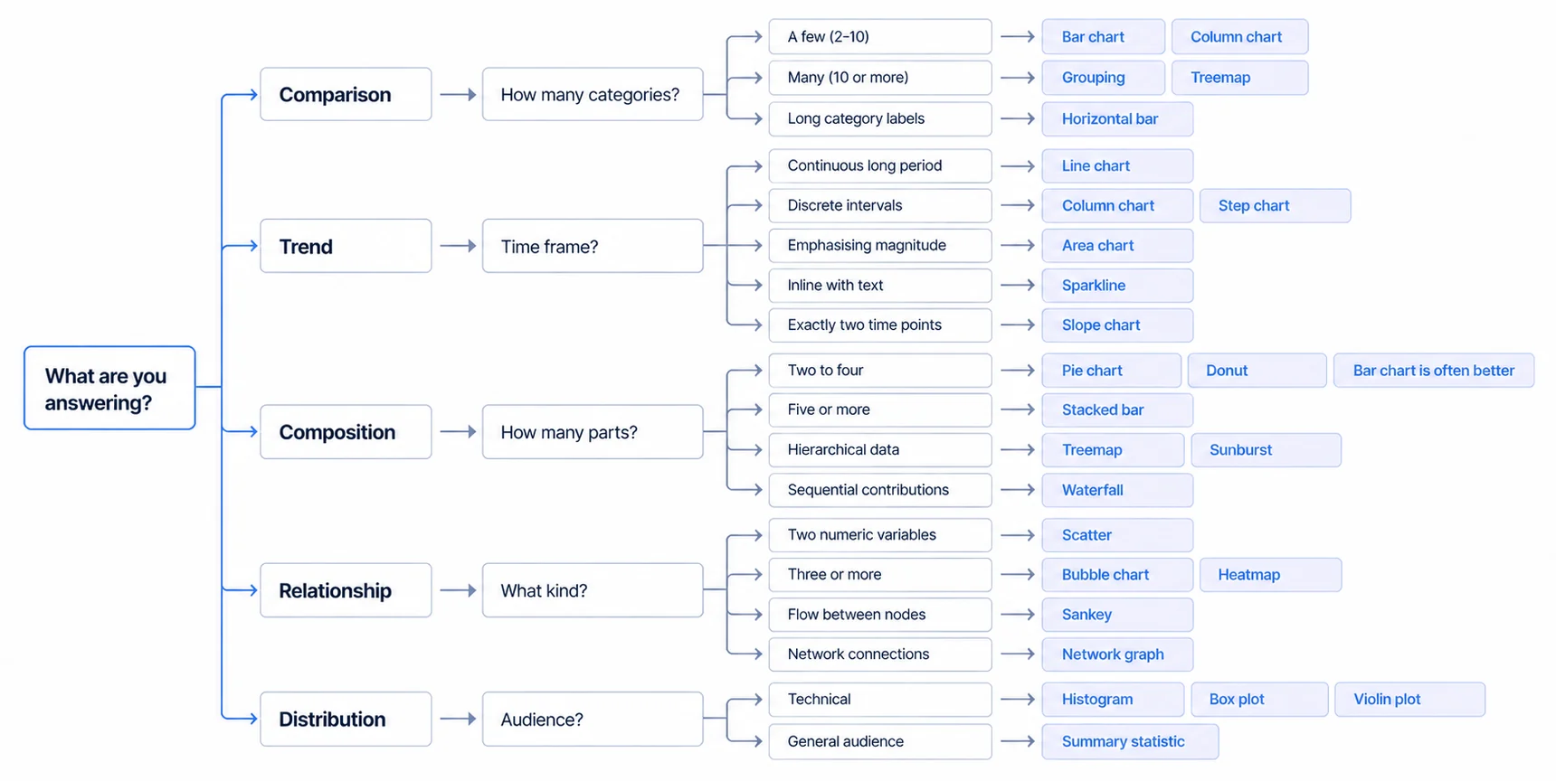
Comparison → How many categories?
- Few (2-10): Bar chart or column chart
- Many (10+): Consider grouping or treemap
- Need to show change over time?: Column chart
- Long category labels?: Horizontal bar chart
Trend → What's the time frame?
- Continuous long period: Line chart
- Discrete intervals: Column chart or step chart
- Need to emphasize magnitude: Area chart
- Inline with text/tables: Sparkline
- Just two time points: Slope chart
Composition → How many parts?
- 2-4 simple parts: Pie or donut chart (but consider bar chart)
- 5+ parts: Stacked bar chart
- Hierarchical: Treemap or sunburst
- Sequential contributions: Waterfall chart
Relationship → What type of relationship?
- Two numeric variables: Scatter plot
- Three+ variables: Bubble chart or heatmap
- Flow between nodes: Sankey diagram
- Network connections: Network graph
Distribution → Audience sophistication?
- Technical/analytical: Histogram, box plot, violin plot (see histogram vs bar chart for when each applies)
- General audience: Avoid, use summary statistics instead
Further Reading
- Dashboard Design Principles, how to arrange charts effectively in a dashboard layout
- Data Visualization Best Practices, complete guide to clear, accurate visualization
- Dashboard Color Theory, using color purposefully in data visualization
- Building analytics reports, the full process around the chart: purpose, data prep, structure and context
Ready to launch customer-facing analytics?
Stop losing customers to competitors with better analytics. Sumboard's customer-facing analytics platform lets you launch self-service dashboards in days, not months.