
We've been noticing a pattern in conversations with SaaS engineering teams. They start by asking about React charting libraries, then dive into component libraries like Material UI or Chakra, and eventually realize they're solving a harder problem than they thought.
The issue? Most React dashboard components are designed for internal admin panels, not customer-facing analytics. The requirements are fundamentally different, and choosing the wrong approach costs months of development time.
Most React Dashboard Templates Are Admin Panels, Which Is a Different Product
When you search "react dashboard components," you'll find hundreds of beautiful templates. Material UI dashboards, Tailwind admin panels, Bootstrap themes, they all look impressive in the screenshots.
But here's what's different when building for customers:
Admin panels serve your team. They prioritize feature density, power user workflows, and don't need to match your product's branding. Your support team can learn keyboard shortcuts.
Your operations team will tolerate complex interfaces if it means more capability.
Customer-facing dashboards serve your customers' customers. They need to be instantly intuitive, load in under 2 seconds, and smoothly match your product's design system.
Your customers won't spend time learning a new interface just to check their metrics.
From customer feedback, we're hearing the same thing: "The analytics feel bolted on, not built in."
A Heavy UI Kit Helps an Internal Tool and Costs You in a Customer-Facing One
Material UI, Ant Design and Chakra Earn Their Weight on Internal Tools
Full-featured React component libraries like Material UI, Ant Design, or Chakra UI shine when you're building internal tools where bundle size matters less.
They work well when your team already knows the design system, you need complete form controls and complex data entry, you want mature accessibility built-in, and desktop-first usage is your primary use case.
These libraries ship a large component inventory, and that comprehensiveness comes with trade-offs.
In Customer-Facing Analytics the Same Kits Fight Your Own Design System
For a customer-facing analytics product, ours included, heavy component libraries often create friction:
Bundle size bloat. Material UI's full package adds 350KB+ minified. When you only need charts and tables, you're shipping components your customers never see. This directly impacts your First Contentful Paint and Time to Interactive metrics.
Design system conflicts. Your product has a design system. The component library has its design system. Now you're fighting theme overrides, wrestling with CSS specificity, and maintaining two sources of truth for spacing, colors, and typography.
Performance overhead. Most UI kits weren't optimized for real-time data updates. When your dashboard needs to refresh metrics every 30 seconds, that extra JavaScript execution time becomes noticeable.
We've seen teams spend 3-4 months "just styling" components to match their product, time that could have been spent building features customers actually requested.
Customer-Facing Analytics Needs Four Component Categories, Not a Kit
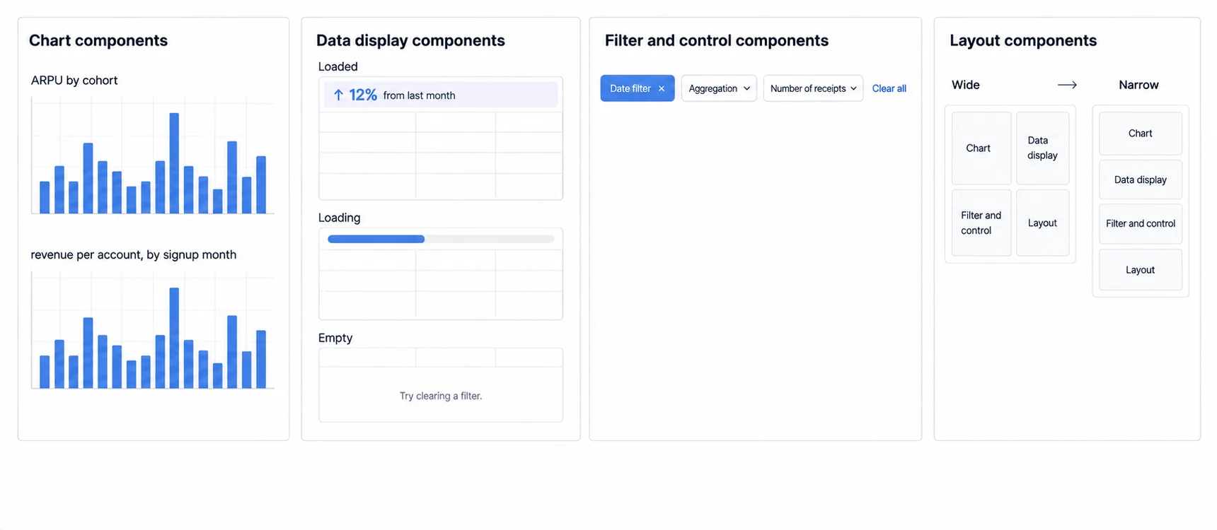
When building customer-facing analytics, you really only need four component categories:
1. Chart Components
This is where you should invest the most effort. Chart types directly impact how users understand their data.
Libraries like Recharts excel here, built specifically for React, composable, and performant for real-time updates. When comparing Recharts to alternatives like Victory, you'll find Recharts offers better performance for customer-facing dashboards while maintaining a simpler API.
Recharts gives you:
- Line, bar, area, pie, scatter plots
- Responsive containers out of box
- Animations that actually perform well
- Customizable tooltips and legends
The key difference from admin dashboard charts: customer-facing charts need to explain themselves. Internal users can figure out what "ARPU by cohort" means. External users need clearer labels, better defaults, and progressive disclosure of complexity.
For teams evaluating multiple options, our JavaScript charting libraries guide covers the full landscape beyond just React-specific solutions.
2. Data Display Components
Tables, metric cards, and KPI widgets. These are simpler than you'd think if you're not trying to support every possible data entry pattern. For displaying data, you need:
- Sortable tables with proper loading states
- Metric cards that highlight changes (↑ 12% from last month)
- Empty states that don't just say "No data"
Most generic component libraries over-engineer these. A well-designed metric card is 30 lines of React, not a 50KB package.
3. Filter and Control Components
Date pickers, dropdowns, search boxes, but simpler than form libraries suggest. Customer-facing filters need:
- Clear visual feedback on what's active
- Easy reset/clear functionality
- Mobile-friendly interaction patterns
You don't need the full form validation, multi-step wizards, or complex field dependencies that admin tools require.
4. Layout Components
Responsive grids, card containers, and dashboard layouts. This is where libraries like Tailwind CSS shine, utility-first CSS lets you build layouts without imposing design opinions.
The pattern we're seeing: teams use Tailwind for layout, Recharts for charts, and build their own simple components for metrics and filters. Total bundle impact: under 100KB.
Performance Matters More in a Customer-Facing Dashboard Than in an Internal One
Performance matters more for customer-facing dashboards than internal tools. Here's why:
Customer tolerance is lower. An internal user waiting on a slow report knows which system is slow and will wait for it, because the report is their job. A customer reads the same wait as your product being slow, and they never chose to open an analytics tool in the first place. Set the budget from a real task on the device and connection your customers actually use, rather than from a general threshold.
Mobile usage is higher. An internal admin panel is opened at a desk; a customer-facing dashboard is opened wherever the customer happens to be. Measure your own split before sizing anything, because it decides how much of the bundle budget is real. Every KB counts on a cellular connection.
Perception shapes retention. Slow dashboards create the impression that your entire product is slow, even if it's just the analytics module. First impressions stick.
Sumboard's architecture uses an optimized iFrame approach that prevents the bundle bloat typical of heavy UI libraries. This means customer dashboards load in seconds, not after extended loading spinner experiences that hurt first impressions.
Where Filter State Lives Decides Whether Anyone Can Send You Their Screen
Filters look like a component concern and are actually a support concern. If the selected date range, segment and drill path live only in component state, then two people looking at "the dashboard" are looking at different things, and neither can show the other what they mean.
Putting that state in the URL fixes it almost entirely. A link now carries the exact view, a customer can paste one into a support ticket, the browser back button behaves the way people expect, and a bookmarked view survives a reload. The costs are real and worth taking deliberately: the URL becomes an interface you have to keep stable across releases, and anything sensitive has to stay out of it, since links get pasted into places you do not control.
Decide this before the first filter ships. Retrofitting URL state after several components own their own is a refactor rather than an addition.
Build the React Components When the Analytics Is the Product, Embed When It Is Not
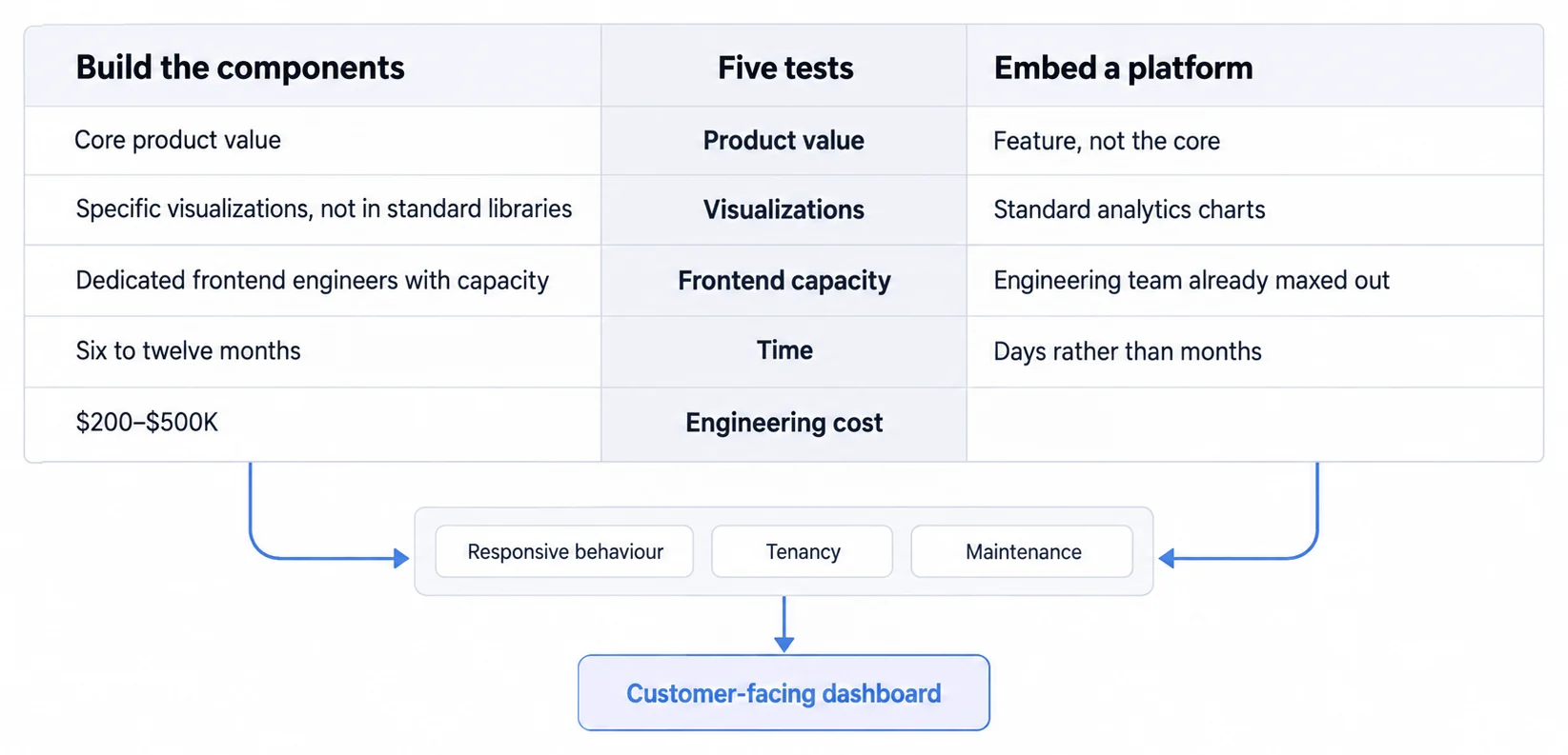
After talking with hundreds of SaaS teams, we've identified a clear decision point:
A custom build is defensible when analytics is core product behavior and the team can own its lifecycle.
- Analytics is core to your product value
- You need highly specific visualizations not found in standard libraries
- You have dedicated frontend engineers with capacity
- You're okay with 6-12 months of development time
Use an embedded analytics platform if:
- Analytics is a feature, not your core product
- You need to ship in days, not months
- Your engineering team is already maxed out
- You want no infrastructure for you to run burden going forward
The math is straightforward once the inputs are fixed: building custom dashboard components from scratch takes a dedicated frontend team something like 6-12 months, at $200K-500K+ in engineering cost, plus the maintenance that follows. That range is the planning band this site works from rather than a surveyed figure, so where your number lands inside it is the real question.
For teams working through the embedded analytics alternatives before an implementation, choosing the right approach upfront saves months of backtracking. We've seen companies start with custom builds only to realize the ongoing maintenance burden outweighs the initial control benefits.
Embedded analytics platforms like Sumboard take a different approach. Instead of giving you 500 generic UI components, we built specifically for customer-facing analytics:
- React SDK integration in 10 minutes
- Pre-built chart components optimized for analytics use cases
- Automatic responsive design
- Multi-tenant security built-in
- White-labeling that actually works
We often hear from teams who spent months building custom dashboards, only to realize the complexity multiplies when adding features like scheduled reports, PDF exports, and multi-language support, features that seem simple until you're actually implementing them.
Where to go next
- JavaScript charting libraries guide: where each library stops, and what that costs you at the boundary.
- Chart.js Tutorial: chart.js renders to canvas.
- Charting Libraries articles: every article in this cluster.
Ready to launch customer-facing analytics?
Stop losing customers to competitors with better analytics. Sumboard's customer-facing analytics platform lets you launch self-service dashboards in days, not months.