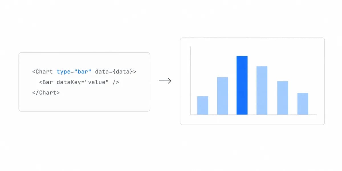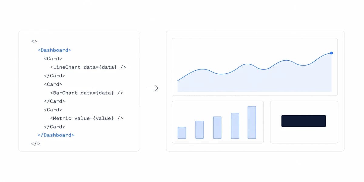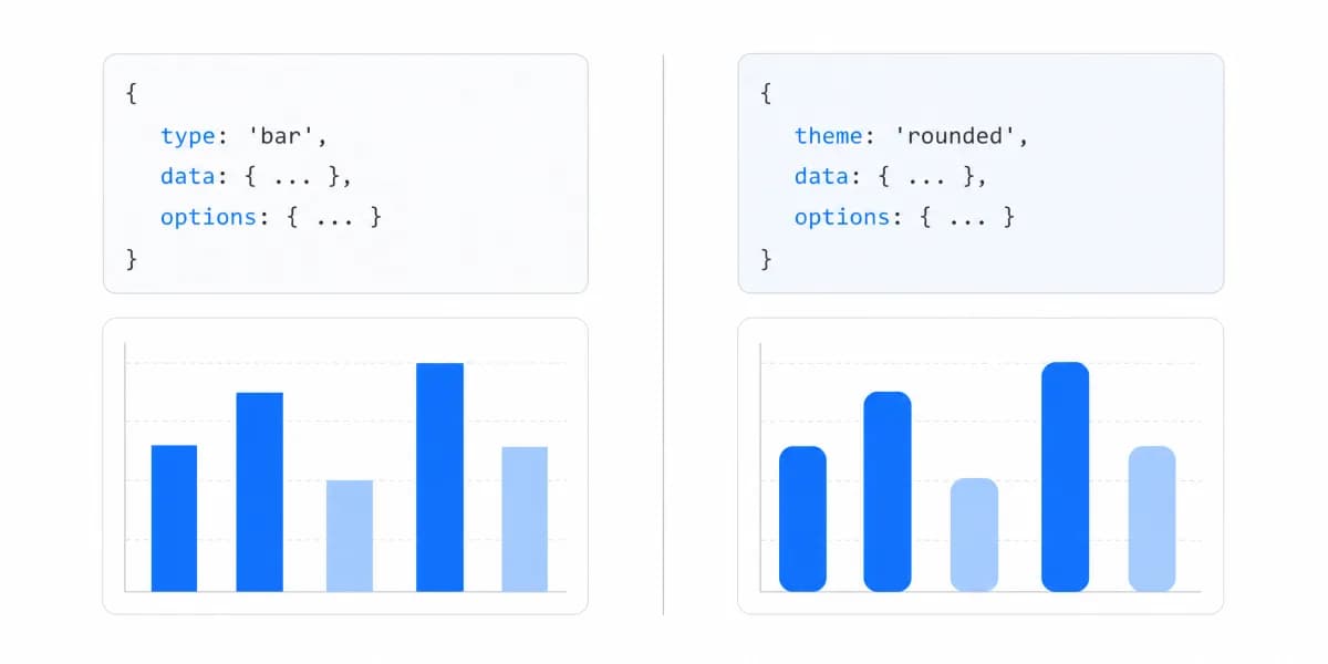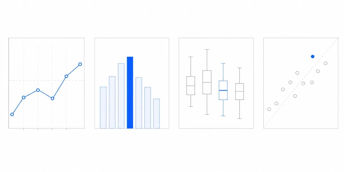
We've been noticing something interesting in our conversations with React developers: when it comes to adding charts to their applications, they're tired of wrestling with complex D3.js code or settling for inflexible chart libraries. They want something that just works with React, naturally, declaratively, and without the headache.
That's exactly what Recharts delivers.
If you're building a React app and need charts that look professional, respond to data changes smoothly, and don't require a PhD in data visualization to implement, Recharts might be exactly what you're looking for. But like any tool, it has specific strengths and limitations worth understanding before you commit.
Recharts Combines React's Component Model With D3's Charting Power
Recharts is a composable charting library built specifically for React applications. It combines React's declarative component model with D3.js's powerful charting capabilities, giving you the best of both worlds: D3's visualization power without the imperative complexity.
The library is open source under the MIT license. Popularity counters change continuously, so they are better checked at evaluation time than treated as a product capability.
Here's the core principle that makes Recharts different: every chart element is an independent React component. Instead of writing imperative code to manipulate SVG elements, you declare what you want using familiar JSX syntax.
Here's what a simple line chart looks like:
import { LineChart, Line, XAxis, YAxis, Tooltip, Legend } from 'recharts';

const data = [
 { month: 'Jan', revenue: 4000 },
 { month: 'Feb', revenue: 3000 },
 { month: 'Mar', revenue: 5000 },
];

function RevenueChart() {
 return (
 <LineChart width={600} height={300} data={data}>
 <XAxis dataKey="month" />
 <YAxis />
 <Tooltip />
 <Legend />
 <Line type="monotone" dataKey="revenue" stroke="#2563EB" />
 </LineChart>
);
}
If you know React, this looks immediately familiar. No complex setup, no imperative DOM manipulation, just composable components.
Why Recharts Stands Out: The Component Architecture Advantage
Recharts isn't trying to be everything to everyone. It has a clear design philosophy that makes it particularly good at certain things.
Declarative, React-Native Syntax
With traditional charting libraries, you tell the library how to build the chart, step by step, element by element. With Recharts, you tell it what you want, and it figures out the how.
Compare this to D3.js, where you'd write imperative code like "select this SVG element, append a circle, set its attributes, bind data, update on changes." With Recharts, you just declare <Scatter data={myData} /> and you're done.
For React developers, this isn't just convenient. It's natural. It fits the mental model you're already using for the rest of your application.
Composable Components
Recharts provides components in five main categories: Charts (LineChart, BarChart, etc.), General Components (Tooltip, Legend), Cartesian Components (XAxis, YAxis, CartesianGrid), Polar Components (PolarGrid, PolarAngleAxis), and Shapes (Rectangle, Sector).
You combine these like LEGO blocks. Want a line chart with a grid, tooltip, and legend? Just compose them:
<LineChart data={data}>
 <CartesianGrid strokeDasharray="3 3" />
 <XAxis dataKey="name" />
 <YAxis />
 <Tooltip />
 <Legend />
 <Line dataKey="value" stroke="#2563EB" />
</LineChart>
Each component is independent. You can add, remove, or modify them without affecting the others.
Developer Experience Insight: React knowledge transfers to component composition and props. Chart selection, scales, accessibility, labeling, and interaction design remain separate skills that the library does not replace.
SVG-Based Rendering
Recharts uses SVG for rendering, which means your charts are responsive and scalable by default. Zoom in, zoom out, resize the window, the charts stay crisp.
This is different from Canvas-based libraries like Chart.js, which render to a bitmap. SVG gives you better quality and easier DOM manipulation, but it comes with trade-offs we'll discuss in the performance section.
Recharts Supports the Chart Types a Modern Dashboard Expects
Recharts supports all the chart types you'd expect for modern dashboards:
- Line charts for trends over time
- Bar charts for comparisons
- Area charts for cumulative data
- Pie charts for proportions
- Scatter plots for correlations
- Radar charts for multi-variable analysis
- Treemaps for hierarchical data
- Funnel charts for conversion flows
- Radial bar charts for circular progress
Each chart type is customizable. Change colors, themes, animations, tooltips, legends, and axes. If the built-in components don't meet your needs, you can create custom components and integrate them smoothly.
Understanding when to use each visualization type is critical for effective data communication. Our guide on choosing the right chart type covers decision frameworks for selecting the most appropriate visualization for your data story.
For embedded analytics use cases, this flexibility matters. When you're building customer-facing dashboards, you need charts that can match your product's brand and user experience expectations. Recharts makes this straightforward.
Installing Recharts Is One npm Command and One Import
Getting Recharts running is simple:
npm install recharts
That's it. Import the components you need and start building:
import { BarChart, Bar, XAxis, YAxis } from 'recharts';

function MyChart() {
 const data = [
 { name: 'Product A', sales: 4000 },
 { name: 'Product B', sales: 3000 },
 { name: 'Product C', sales: 2000 },
 ];

 return (
 <BarChart width={500} height={300} data={data}>
 <XAxis dataKey="name" />
 <YAxis />
 <Bar dataKey="sales" fill="#2563EB" />
 </BarChart>
);
}
Recharts ships its TypeScript definitions with the npm package. Test the exact Recharts and React versions in your own framework build, including server/client boundaries where applicable, rather than assuming every toolchain needs the same setup.
Choosing a Charting Library Is About Trade-Offs, Not Feature Counts
Choosing a charting library isn't just about features. It's about trade-offs. Here's how Recharts compares to the main alternatives.
Recharts vs Chart.js (react-chartjs-2)
Chart.js is framework-agnostic and uses Canvas rendering instead of SVG. For React projects, you'd use the react-chartjs-2 wrapper.
- Recharts: React-specific, SVG rendering, component-based architecture. Better integration with React, more flexible composition.
- Chart.js: Framework-agnostic core, Canvas rendering, and a configuration-oriented API when used through a React wrapper.
If you want the chart structure to live in a React component tree, Recharts is a strong candidate. If Canvas output or a framework-neutral chart core matters, test Chart.js as a candidate. Bundle and runtime outcomes depend on the imports and workload you ship, so measure both production builds.
Recharts vs D3.js
D3.js is the low-level powerhouse that Recharts is built on top of.
- Recharts: Higher-level chart components and a declarative API for supported chart structures.
- D3.js: Maximum control, steep learning curve, imperative code. Unlimited flexibility but requires deep expertise.
Choose D3.js if you need total control for highly custom visualizations. Choose Recharts if you want to ship charts quickly without becoming a D3.js expert.
Victory is similar to Recharts, both are React-specific and built on D3.js.
- Recharts: Simpler API, better documentation, gentler learning curve. Larger community and more npm downloads.
- Victory: More opinionated, modular architecture, steeper learning curve. Fully overridable for advanced customization.
Both should be evaluated against the components, customization boundaries, accessibility behavior, maintenance signals, and production workload your team needs.
Recharts vs ApexCharts
ApexCharts focuses on interactive, dashboard-ready charts out of the box.
- Recharts: Better React integration, component-based composition.
- ApexCharts: More interactive features out-of-box, excellent for dashboards, diverse chart types including mixed charts.
ApexCharts gives you more interactivity with less configuration. Recharts gives you better React integration and more flexibility for custom components.
Here's a quick decision framework:
| Choose Recharts if... | Choose Alternative if... |
|---|---|
| Building React-specific app | Using Angular/Vue (Chart.js) |
| Need component composition | Need a different renderer contract |
| Workload meets measured budget | Workload misses measured budget |
| Quick implementation | Need total control (D3.js) |
| Team knows React well | Production bundle misses budget |
Recharts Performs Well for Most Dashboards, but It Is Not Unlimited
Recharts performs well for most dashboard use cases, but it's not unlimited. Understanding the performance characteristics helps you make better decisions.
When Recharts Performs Well
Recharts can fit dashboard workloads, but a dataset row count alone does not predict the result. A line without point markers, a labeled scatter plot, and dozens of small charts can create very different amounts of work from the same number of records.
The SVG rendering gives you crisp visuals at any zoom level, and the React component model makes updates smooth when data changes.
Performance Challenges
Performance pressure grows with rendered marks, labels, charts, animation, updates, and interaction work. Some series map records to many SVG nodes; other presentations aggregate records into far fewer visible marks.
Canvas and SVG have different rendering contracts, but the renderer name does not settle application performance. Compare representative chart shapes in production builds on target devices.
Frequent updates add another dimension to the workload. Record update rate, retained history, animation, tooltip behavior, and interaction latency in the benchmark.
Technical Reality Check: No percentage or point-count threshold can replace a workload-specific benchmark. Keep the library only when it meets the product's render, update, interaction, memory, accessibility, and visual-correctness budgets.
Optimization Strategies
If you're hitting performance limits:
- Aggregate data before passing it to Recharts. Show hourly averages instead of per-second data points.
- Use windowing to display only visible data points, especially for time-series charts.
- Memoize components with React.memo to prevent unnecessary re-renders.
- Limit rendered elements, do you really need 10,000 data points visible at once?
Apply optimizations in response to measured bottlenecks, then rerun the same benchmark to verify the change.
When to Choose Recharts (Decision Framework)
✅ Choose Recharts if:
- You're building React-specific applications
- You need quick, beautiful charts with minimal setup
- You want declarative, component-based architecture that fits React's mental model
- Your representative workload meets its measured budgets
- Your team is already comfortable with React
- You value good documentation and active community support
❌ Consider alternatives if:
- You're building for Angular or Vue (Recharts only works with React)
- The representative workload misses its performance budget after reasonable optimization
- You require 3D charts or highly specialized visualizations (consider D3.js)
- Bundle size is critical and you need the smallest possible footprint
- Your update and interaction contract calls for a different renderer or architecture
A design pattern where complex systems are built by combining simple, independent components. In Recharts, this means you create sophisticated charts by assembling basic building blocks like axes, tooltips, and data lines, similar to how you build React UIs from smaller components.
For Customer-Facing Analytics in a SaaS Product, Recharts Is a Strong Choice
If you're building customer-facing analytics into your SaaS product, Recharts is a strong choice.
The component-based architecture integrates smoothly with React applications, which is what most modern embedded analytics platforms are built on. You can embed professional-looking charts without building a charting system from scratch.
White-labeling is straightforward, customize colors, themes, fonts, and styling to match your product's brand. Since Recharts uses standard CSS and React props, you have full control over appearance.
Performance must be proven with the charts, data density, update pattern, interactions, and devices in the product. Revenue and user-behavior dashboards can still differ radically in rendered marks and update cost.
For SaaS companies, Recharts can supply chart primitives while the product team retains responsibility for data contracts, authorization, accessibility, interaction design, loading states, and visual QA.
Common Pitfalls and How to Avoid Them
1. React-Only Limitation
Recharts only works with React. If you're building for Angular, Vue, or vanilla JavaScript, you'll need a different solution.
Solution: Verify your framework before committing. If you're in React, you're good. If not, look at Chart.js (framework-agnostic) or framework-specific alternatives.
2. Performance with Large Datasets
SVG rendering creates visible DOM work, but the threshold depends on marks, labels, updates, animation, charts, browser, and device.
Solution: Benchmark first. If rendering is the bottleneck, aggregate to the decision grain, limit visible marks, remove unnecessary animation, and test a different renderer when the measured contract still fails.
3. Steep Learning Curve for Advanced Customization
Basic charts are easy. Complex customizations require understanding Recharts' component composition model and sometimes diving into D3.js concepts.
Solution: Start simple. Use default components and gradually add customization as you learn. The documentation is good, use it. Don't try to build custom chart types on day one.
4. Bundle Size Impact
Treat bundle size as a measured production constraint rather than a library reputation.
Solution: Import the components you use, inspect the production bundle, and compare transferred, parsed, and executed JavaScript against the same route budget for each candidate.
Five Steps From npm Install to a Styled Chart
Ready to try Recharts? Here's your quick-start checklist:
- Install via npm:
npm install recharts - Import chart components you need (LineChart, BarChart, etc.)
- Prepare your data in the correct format (array of objects with consistent keys)
- Compose your chart using declarative components
- Customize styling with props and CSS
The React chart libraries guide covers additional options if you want to compare alternatives side-by-side.
Should You Choose Recharts?
Recharts brings the power of D3.js to React developers without the complexity. Its component-based, declarative approach makes creating beautiful, interactive charts faster and more intuitive than traditional charting libraries.
For React applications, Recharts is a credible candidate when its component model and SVG output fit the product. Validate customization boundaries and the production workload before standardizing on it.
Its React-only API and rendering contract are design constraints, not universal defects. Put Recharts on the shortlist when those constraints match your architecture, then keep it only if the evidence meets your budgets.
Where to go next
- JavaScript charting libraries guide: where each library stops, and what that costs you at the boundary.
- Chart.js Tutorial: chart.js renders to canvas.
- Charting Libraries articles: every article in this cluster.
Ready to launch customer-facing analytics?
Stop losing customers to competitors with better analytics. Sumboard's customer-facing analytics platform lets you launch self-service dashboards in days, not months.