

A dashboard is a visual interface that consolidates and displays key performance indicators (KPIs) and metrics from multiple data sources in a single view, enabling real-time monitoring and data-driven decision-making.
Dashboard Definition for Monitoring Business Metrics
A dashboard is a visual interface that consolidates and displays key performance indicators (KPIs) and metrics from multiple data sources in a single view, enabling users to monitor performance, identify trends, and make data-driven decisions at a glance. For B2B SaaS companies, embedded analytics platforms provide customer-facing analytics directly within their applications.
Dashboards transform raw data into interactive charts, graphs, and tables that make complex data accessible. Like an automobile dashboard displaying vehicle performance, a business dashboard presents critical KPIs that help teams work through operations and strategy.
Modern dashboards combine data visualization with interactivity, allowing users to drill down into metrics, filter data, and explore relationships without requiring technical expertise or SQL knowledge. This creates a unified product experience while enabling SaaS companies to monetize analytics as a premium feature tier.
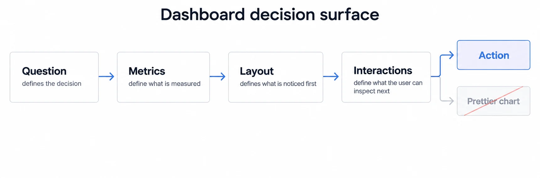
Dashboard Characteristics That Support Fast Decisions
- Real-time Data Integration: Dashboards connect to multiple data sources (databases, APIs, cloud services) providing up-to-date information. This real-time capability ensures stakeholders work with current data rather than outdated reports.
- Visual Data Representation: Using charts, graphs, gauges, and tables, dashboards make complex data accessible. The visual format enables quick pattern recognition and trend identification impossible in raw data tables.
- Customizable Views: Different roles require different information. Dashboards can be tailored to show relevant KPIs for executives, managers, or frontline teams, ensuring each user sees metrics that matter to their responsibilities.
- Interactive Exploration: Unlike static reports, dashboards allow users to interact with data, applying filters, changing date ranges, and drilling down into segments without waiting for custom reports.
Dashboard Types for Operational, Strategic, and Analytical Needs
Organizations use various dashboard types depending on their goals, from operational dashboards that monitor day-to-day activities, to strategic dashboards tracking long-term KPIs, to analytical dashboards enabling deep-dive exploration. Each type serves different organizational roles and decision-making needs. For design fundamentals, dashboard design principles and KPI dashboard examples cover how to structure and populate each type effectively.
For B2B SaaS companies, embedded dashboards have become essential, providing end-users with self-service access to their data, reducing support requests and increasing product value. Industry-specific implementations like financial dashboards focus on revenue and profitability metrics critical to their domain. Applications requiring continuous data monitoring benefit from real-time dashboard patterns built for streaming data.
A Dashboard Differs From a Report by Whether the Reader Can Ask a Second Question
A report answers a question someone else chose. A dashboard exists so the reader can follow up: filter to their segment, change the period, open the detail behind a number that looks wrong.
That is the whole distinction, and it decides most design arguments. If the follow-up questions are known and few, a report or even a single well-labelled number serves better and costs less to maintain. If they branch, the interactivity earns its cost. Building a dashboard for a question that does not branch spends the reader's attention on navigation, and the result is usually reported later as an adoption problem.
The Common Failure Is Not Missing Data, It Is a Screen With No Reading Order
Dashboards rarely fail because a metric is absent. They fail because twelve tiles arrive with equal weight and nothing tells the reader where to start, so each person invents their own order and they stop agreeing about what the screen says.
A usable dashboard has an argument: one thing it wants read first, a small number of supporting views, and detail available rather than displayed. Deciding that order is design work that happens before any chart is chosen, and skipping it is what produces a screen that is technically complete and practically unread.
A Customer-Facing Dashboard Inherits Requirements an Internal One Never Had
The same charts change obligations when the reader is a customer rather than a colleague.
The tenant boundary has to be enforced in the query layer rather than by a filter in the interface. Performance has to hold under concurrency you do not control, at whatever hour your customers work. Empty, loading, permission-denied and error states are read by someone outside your company, so they are product copy. Branding has to survive every one of those states. And a definition change now needs a changelog rather than an announcement in a stand-up. The complete guide to embedded analytics covers the contracts that shift.
A Dashboard Without an Owner Becomes an Artefact
Dashboards decay quietly. A source system changes a field, a metric definition is revised somewhere upstream, the person who requested it moves teams, and none of that produces an error. The board keeps rendering, which is exactly the problem, because a screen that looks maintained is trusted like one.
Three things keep it honest. A named owner, so there is somebody to ask what a number means. A review on a cadence, checking that definitions still match their source and that the questions the board was built for are still being asked. And a usage signal, because a dashboard nobody has opened in a quarter is telling you something that no amount of redesign will change.
Removing one is a legitimate outcome of that review, and usually a better one than leaving it in place to be half-trusted.
Related Dashboard Concepts and Design Guides
- Dashboard types guide: the four dashboard types sorted by how fast the reader has to act.
- Dashboard types guide: the four dashboard types sorted by how fast the reader has to act, which is the decision that comes before layout.
- KPI dashboard examples: for worked examples by team and use case
- Chart types guide: for choosing a chart by the question it answers
- Dashboard design principles: for what changes when a customer reads the dashboard
Ready to build powerful dashboards for your product?
See how Sumboard delivers embedded analytics in days, not months