
Finance leaders face a dual challenge in 2026. Internal teams need faster access to financial data for strategic decisions, CFOs can't wait weeks for monthly reports when market conditions shift daily. Simultaneously, FinTech companies face mounting pressure to provide transparent financial analytics directly to customers. Payment platforms must show merchants real-time transaction data, lending platforms need borrower dashboards displaying loan performance, and banking apps require account holder insights that build trust through transparency.
This guide covers both dimensions: how finance teams build internal dashboard types for strategic decision-making, and how FinTech SaaS companies embed customer-facing analytics using modern embedded BI platforms. Whether you're a CFO evaluating dashboard solutions or a FinTech product manager shipping customer-facing analytics, this complete guide provides the financial metrics, implementation strategies, and platform selection criteria you need.
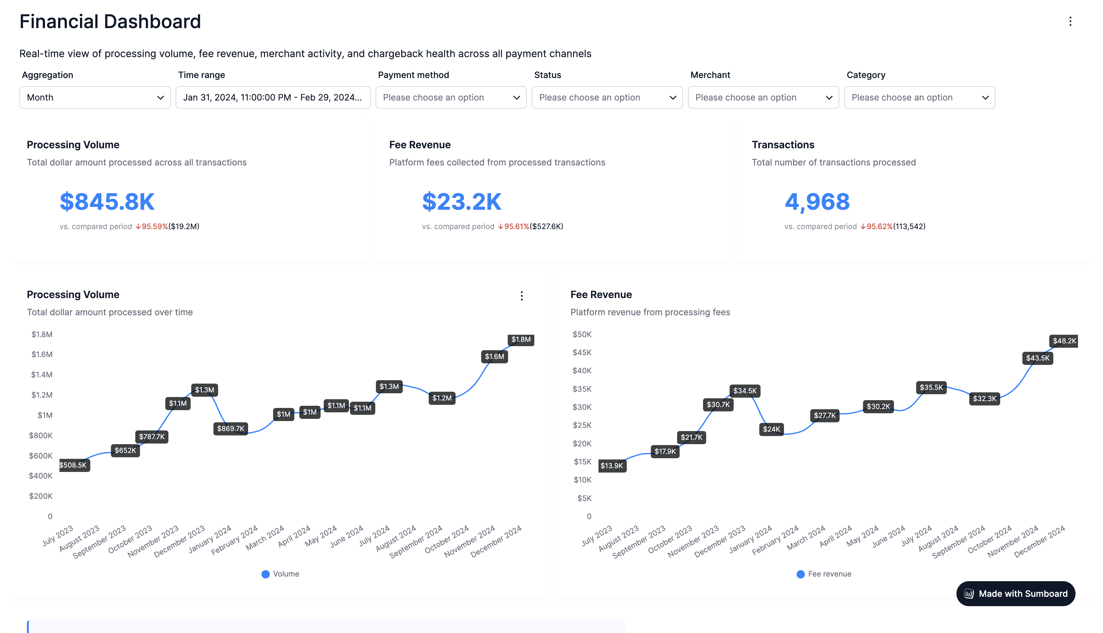
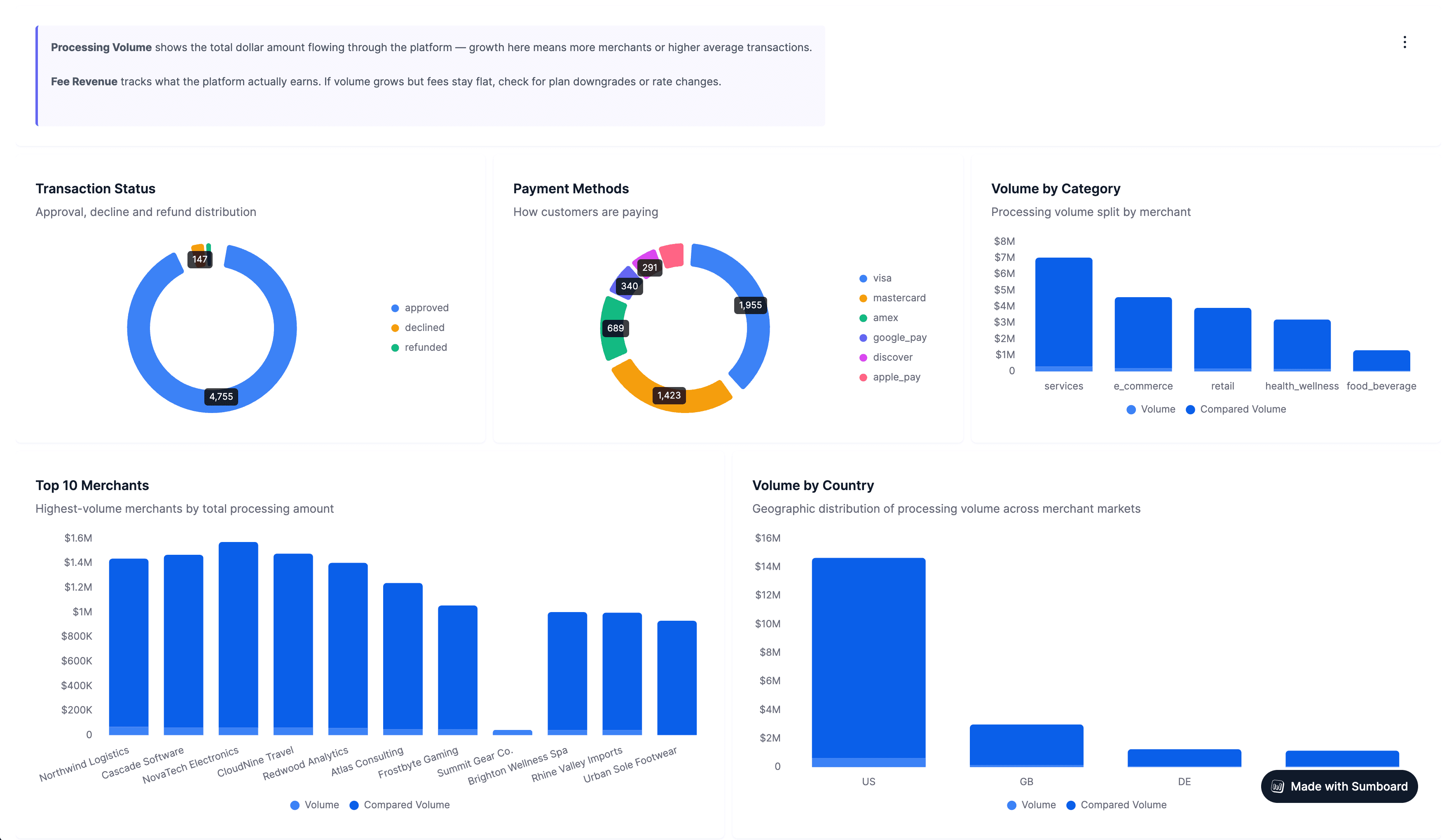
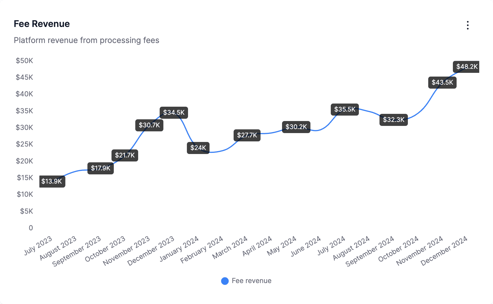
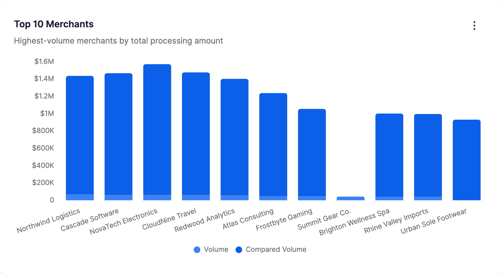
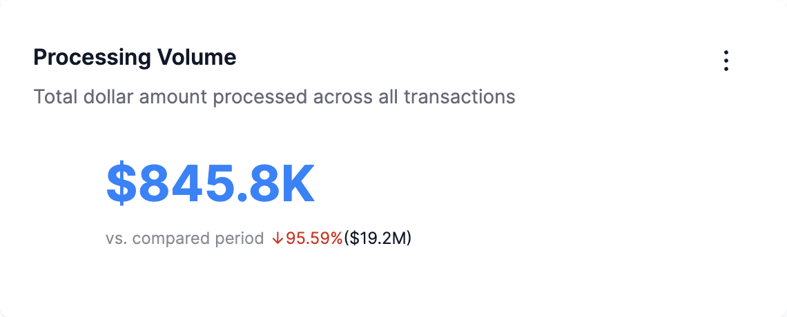
Live demo: Interactive merchant payment dashboard built with Sumboard, explore transaction volume, fee revenue, chargebacks, and settlement analytics.
A Financial Dashboard Is the Executive Summary While Accounting Software Keeps the Ledger
A visual interface that consolidates key financial metrics (revenue, expenses, cash flow, profitability, and forecasts) into real-time or near-real-time displays for strategic decision-making.
A financial dashboard is a visual interface that consolidates key financial metrics (revenue, expenses, cash flow, profitability, and forecasts) into real-time or near-real-time displays. Unlike accounting software that tracks every transaction in detailed ledgers, financial dashboards focus on high-level KPIs that drive strategic decisions.
Think of accounting software as your financial transaction history, complete, detailed, compliance-focused. Financial dashboards are the executive summary, strategic, visual, decision-oriented. A CFO doesn't need to see every invoice; they need to know whether cash runway extends six months or sixteen, whether gross margins improved quarter-over-quarter, and which business segments drive profitability.
The distinction becomes critical in two contexts. For internal finance teams, dashboards pull data from accounting systems (QuickBooks, Xero, NetSuite) and transform granular transactions into actionable insights. For FinTech companies, dashboards surface financial data that already exists in their platforms (transaction volumes, settlement timing, lending performance) and present it to customers in branded, intuitive interfaces.
Six Components Recur in Every Financial Dashboard, Internal or Customer-Facing
Modern financial dashboards share six essential components, whether serving internal finance teams or external customers:
Revenue metrics track top-line growth through total revenue, recurring revenue (MRR/ARR for SaaS), revenue by product line or region, and year-over-year growth rates. Payment platforms show merchant transaction volumes; lending platforms display origination volumes.
Expense tracking monitors cost structures including operating expenses, cost of goods sold (COGS), departmental budgets, and burn rate for startups. FinTech platforms might show processing fees, compliance costs, or fraud prevention expenses.
Cash flow visualization displays operating cash flow, free cash flow, cash runway projections, and working capital management. For lending platforms, this includes capital deployment and reserve requirements. Effective cash flow visualization techniques transform complex financial data into intuitive displays.
Profitability indicators reveal gross profit, gross margin percentage, EBITDA, net profit margins, and unit economics. Merchant dashboards might show net revenue after fees; borrower dashboards display total interest paid.
Budget versus actual comparisons enable variance analysis by tracking planned spending against reality, identifying overruns early, and forecasting adjustments. FP&A teams rely heavily on this component.
Forecasting capabilities project future performance through rolling forecasts, scenario modeling, sensitivity analysis, and predictive analytics. FinTech platforms forecast settlement timing, default probabilities, or merchant churn risk.
A Financial Dashboard Consumes What Accounting Software Certifies, So Both Stay
| Aspect | Financial Dashboard | Accounting Software |
|---|---|---|
| Purpose | Strategic KPI monitoring | Transaction recording & compliance |
| View | High-level summary metrics | Detailed transaction ledgers |
| Update Frequency | Real-time to daily | Transaction-by-transaction |
| Users | Executives, managers, customers | Accountants, bookkeepers, auditors |
| Presentation | Visual charts and graphs | Tables, reports, journals |
| Data Scope | Aggregated financial KPIs | Every financial transaction |
| Focus | Decision-making insights | Regulatory compliance & accuracy |
Both systems complement each other. Accounting software provides the source of truth for financial transactions, ensuring GAAP compliance and audit trails. Dashboards consume that data, applying data visualization principles to transform numbers into insights that drive strategy.
For FinTech companies, the dashboard layer sits between their application database (where customer financial data resides) and their customer interface, providing transparency without exposing raw transaction logs.
Whether a Financial Dashboard's Reader Has Anyone to Ask Decides the Architecture
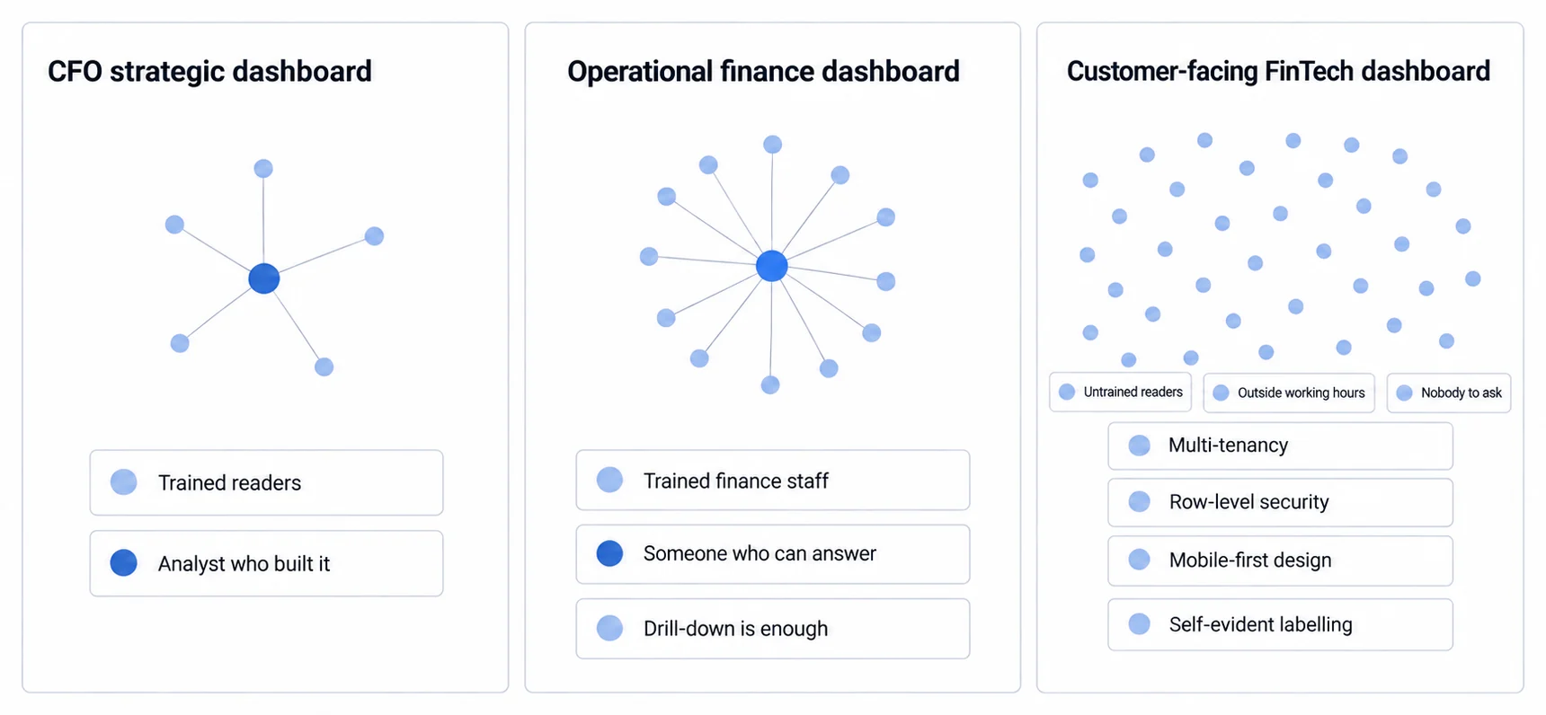
Financial dashboards are usually sorted by audience and refresh rate, which makes the three categories look like three points on one scale. The difference that changes what you have to build is quieter: a CFO who distrusts a figure asks the analyst who produced it, and a merchant looking at a settlement amount at eleven at night has nobody to ask and has never been trained.
CFO Dashboards Are Built to Be Board-Ready, Which Is Why They Refresh Weekly
CFO dashboards aggregate company-wide financial health for executive decision-making. These high-level views update weekly or monthly, focusing on metrics that inform board presentations and strategic planning.
Key metrics include revenue growth rate, EBITDA margins, profit and loss trends, cash position and runway, capital efficiency ratios, and segment profitability. CFOs compare current performance against plans, identify trends requiring intervention, and model scenarios for strategic initiatives.
A SaaS company CFO dashboard might track monthly recurring revenue (MRR), customer acquisition cost (CAC) payback periods, and cash burn rate alongside traditional P&L metrics. The audience consists of C-suite executives, board members, and investors who need strategic context, not operational detail.
These dashboards prioritize board-ready visualizations, clean charts suitable for investor updates, year-over-year comparisons showing growth trajectories, and variance analysis explaining deviations from budget.
Operational Finance Dashboards Live or Die on Drill-Down to Transaction Detail
Operational dashboards drill into specific financial processes, accounts receivable aging, accounts payable management, cash conversion cycles, or departmental budget tracking. Finance managers use these daily or weekly to maintain operational efficiency.
Real-time analytics enable faster decision-making when operational dashboards update continuously rather than monthly. A collections manager tracking AR aging benefits from real-time updates showing which accounts require immediate attention. Treasury teams monitoring daily cash positions can optimize working capital deployment when data reflects current rather than historical states.
Operational dashboards emphasize drill-down capability, enabling finance users to investigate summarized metrics by clicking through to transaction-level detail, filtering data by time period, customer segment, or geographic region, and exporting subsets for detailed analysis or dispute resolution.
Customer-Facing FinTech Dashboards Serve Untrained Users, So Zero Training Is a Requirement
FinTech companies embed financial dashboards directly into their products, providing transparency to merchants, borrowers, account holders, or business customers. These dashboards serve thousands or millions of users simultaneously, requiring fundamentally different architecture than internal finance tools.
Architecture enabling a single application instance to serve multiple customers (tenants) while maintaining complete data isolation between them, critical for FinTech platforms serving thousands of users.
Customer-facing dashboards must support multi-tenancy with data isolation ensuring customers access only their data, white label analytics matching FinTech platform branding, row-level security enforcing access controls at the data level, mobile-first design for smartphone-primary users, and zero training requirements since customer users never receive dashboard training.
A payment processing platform might embed merchant dashboards showing today's transaction volume and value, settlement timelines and hold amounts, chargeback tracking and dispute management, payment method breakdown (card, ACH, digital wallet), and fee calculations with transparent breakdown.
Implementation requires embedding capabilities through embedded dashboard solutions rather than traditional BI tools designed for internal analysts.
The Right Financial Metrics Follow From Stage and Business Model, Not From a Universal List
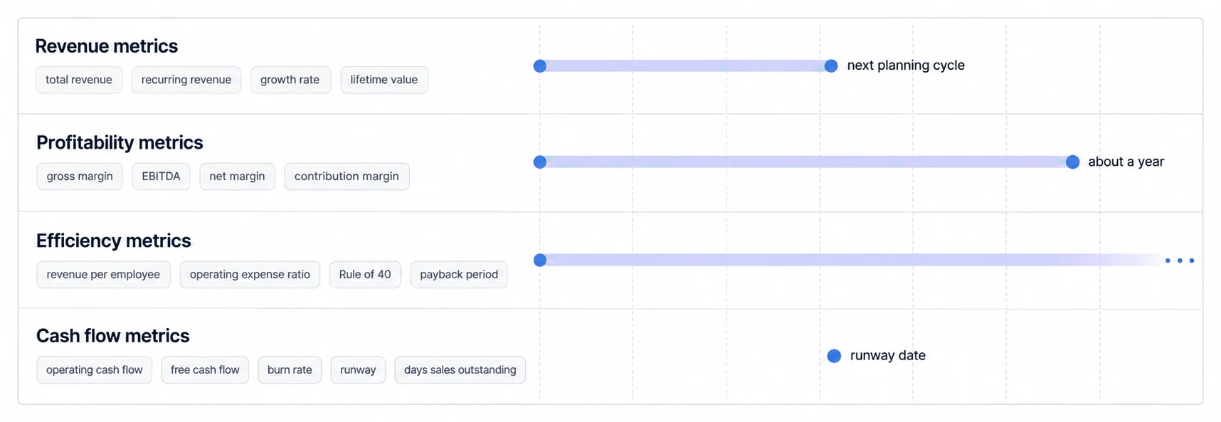
Financial dashboards consolidate dozens of potential metrics. Selecting the right KPIs depends on company stage, industry, and business model. This section breaks down essential metrics by category.
Revenue Metrics Carry the Valuation Story: Total, Recurring, Growth Rate, and LTV
Revenue performance drives business valuation and growth trajectories. Revenue dashboard metrics provide the foundation for strategic decision-making across all business models.
Total Revenue measures top-line sales performance, broken down by product line, geographic region, customer segment, and sales channel. Year-over-year and quarter-over-quarter growth rates identify momentum or stagnation.
Monthly Recurring Revenue (MRR) and Annual Recurring Revenue (ARR) track predictable revenue streams for subscription businesses. SaaS companies monitor new MRR (new customers), expansion MRR (upsells/cross-sells), contraction MRR (downgrades), churned MRR (canceled customers), and net new MRR (sum of movements).
Revenue Growth Rate calculates percentage increase period-over-period. What counts as healthy differs by stage, so the target belongs in your own plan rather than in a general band. Growth decelerating below your target signals demand issues requiring immediate attention.
Customer Lifetime Value (LTV) projects total revenue from average customer relationships. SaaS companies calculate LTV as average revenue per customer divided by churn rate. A widely used rule of thumb holds that LTV should exceed customer acquisition cost several times over before the unit economics are considered sustainable. Where you set that multiple is a judgement about your own payback period rather than a threshold anyone has established.
Effective financial KPI tracking enables teams to monitor these metrics continuously rather than monthly.
Profitability Metrics Expose the Unit Economics That Revenue Growth Can Hide
Gross Profit and Gross Margin reveal fundamental unit economics. Gross profit equals revenue minus cost of goods sold (COGS). Gross margin expresses this as percentage: (Revenue - COGS) / Revenue.
Gross margin varies enormously by what the business actually sells, since a company shipping software carries a different cost of goods than one shipping hardware. Improving gross margin through pricing optimization, cost reduction, or product mix changes directly impacts bottom-line profitability.
EBITDA (Earnings Before Interest, Taxes, Depreciation, Amortization) measures operating profitability before capital structure and accounting decisions. EBITDA margin (EBITDA / Revenue) enables comparison across companies with different capital structures or depreciation methods.
Net Profit Margin shows bottom-line profitability: (Net Income / Revenue). Early-stage companies often operate at negative margins, prioritizing growth over profitability. What a mature company should target depends heavily on its industry, so compare against peers you can name rather than against a general figure.
Contribution Margin analyzes profitability at the product or customer level. Calculate revenue minus variable costs for each product line, revealing which offerings drive profits and which destroy value.
Cash Flow Metrics Answer the One Question With a Deadline: How Long the Runway Is
Operating Cash Flow measures cash generated from core business operations, excluding financing and investing activities. Positive operating cash flow demonstrates the business generates cash from operations rather than relying on external funding.
Free Cash Flow subtracts capital expenditures from operating cash flow, showing cash available for debt repayment, dividends, or expansion. Investors favor companies generating consistent free cash flow, demonstrating self-sustainability.
Burn Rate tracks monthly cash consumption for unprofitable companies. Calculated as operating cash flow divided by number of months, burn rate determines runway until additional funding becomes necessary.
Cash Runway projects months of operation remaining at current burn rate: Cash Balance / Monthly Burn Rate. Startups monitor runway obsessively, because the number determines how long the current plan survives without new money. How much cushion is enough depends on how long your own fundraising cycle takes, and the point at which it becomes urgent is the point at which you could no longer close a round before the cash runs out.
Days Sales Outstanding (DSO) measures average collection time for accounts receivable. Calculate as (Accounts Receivable / Revenue) × Number of Days. Lower DSO improves cash flow; rising DSO indicates collection problems or customer payment delays.
Efficiency Metrics Mean Something Against Your Own Trend and Named Peers, Not a Published Band
Revenue Per Employee benchmarks productivity: Total Revenue / Employee Count. It varies widely by business model, so the useful comparison is against your own trend and against peers you can actually name rather than against a published industry band. Rising revenue per employee indicates operational leverage.
Operating Expense Ratio measures cost structure efficiency: Operating Expenses / Revenue. What counts as healthy depends on where you are in the growth curve, since companies still buying growth carry a ratio that would look alarming in a mature business. Rising OpEx ratio signals scaling challenges.
Rule of 40 combines growth and profitability for SaaS businesses: Revenue Growth Rate + Profit Margin should exceed 40%. A company growing 30% annually with 15% profit margin scores 45%, exceeding the benchmark. This metric balances growth investment against profitability.
CAC Payback Period calculates months required to recoup customer acquisition costs: CAC / (Monthly Recurring Revenue per Customer × Gross Margin). SaaS companies target 12-18 month payback; shorter payback enables faster growth through reinvestment.
Dashboard clutter reduces effectiveness. Limit each dashboard to 5-8 critical metrics aligned with specific roles. CFOs need strategic overview; department managers need operational detail; customers need transparency without overwhelming complexity.
Financial Dashboard Design Either Reveals the Pattern or Buries It
Effective financial dashboards balance complete data with intuitive design. Poor design obscures insights beneath cluttered interfaces; exceptional design reveals patterns instantly.
Visual Hierarchy Puts Cash and Revenue First, Because That Is the Order People Scan
Top-to-bottom information flow places highest-priority metrics prominently at dashboard top, with supporting detail below. CFO dashboards lead with revenue, cash position, and profitability before drilling into departmental breakdowns.
Left-to-right scanning aligns with Western reading patterns. Position primary KPIs left-side, with comparisons or trends flowing rightward. Time-series charts typically show oldest data left, newest right.
Grid-based layouts maintain visual consistency through standardized component sizes. Modern dashboards use 12-column grids, allowing flexible arrangements while maintaining alignment. Misaligned charts create visual chaos.
White space prevents information overload. Cramming too many metrics into limited space overwhelms users. Strategic white space guides attention to critical data points.
Green and Red Carry Variance, and Colour Alone Fails a Colourblind Reader
Green-red convention signals performance against targets. Green indicates favorable variance (revenue above plan, expenses below budget); red flags negative variance. However, avoid relying solely on color, colorblind users need additional indicators like icons or labels.
Consistent color schemes maintain cognitive flow. Assign specific colors to departments or products consistently across all dashboards. Marketing always blue; sales always purple; engineering always orange. Users internalize these associations.
Neutral backgrounds prevent visual fatigue. Dark mode dashboards use dark gray (#1a1a1a) rather than pure black; light mode uses off-white (#f5f5f5) rather than harsh white. True black or white creates excessive contrast, straining eyes during extended viewing.
Accent colors draw attention to critical alerts or deviations requiring immediate action. Reserve bright red or orange for genuine problems, not every negative variance.
Each Financial Metric Has a Chart That Fits, and a Line Chart Breaks Past Five Series
| Metric Type | Best Chart | Why |
|---|---|---|
| Revenue over time | Line chart | Shows trends and seasonality clearly |
| Department budget comparison | Bar chart | Enables easy size comparison |
| Profit margin breakdown | Waterfall chart | Illustrates components building to total |
| Cash flow sources | Sankey diagram | Reveals flow between categories |
| Portfolio composition | Pie chart | Shows percentage breakdown |
| Performance vs targets | Bullet chart | Compact comparison with context |
Line charts excel at showing trends over time, revenue growth, expense patterns, cash flow projections. Avoid cluttering line charts with more than 5 series; users cannot track numerous overlapping lines.
Bar charts enable direct size comparisons. Horizontal bars work well for comparing many categories; vertical bars suit time-series data with fewer periods.
Tables display precise values when exactness matters. Dashboards emphasize visual patterns; tables complement charts by providing exact figures for detailed analysis.
KPI cards highlight single critical numbers, current cash position, this month's revenue, days until runway exhaustion. Pair headline numbers with mini sparklines showing recent trends.
FinTech Readers Are Smartphone-First, So Do Not Compress a Desktop Dashboard Into 375 Pixels
FinTech customer-facing dashboards prioritize mobile experience. Merchants check daily transaction volumes on smartphones; borrowers review payment schedules on tablets.
Vertical stacking adapts desktop multi-column layouts to narrow mobile screens. Desktop dashboards displaying four charts side-by-side stack vertically on mobile, maintaining readability without horizontal scrolling.
Touch-optimized interactions replace desktop hover tooltips with tap interactions. Mobile users cannot hover; all interactive elements must respond to touch input with appropriate target sizes (minimum 44×44 pixels).
Simplified mobile views reduce information density for small screens. Display top 3-5 KPIs on mobile overview, with drill-down capability to access full detail. Don't attempt cramming entire desktop dashboard into 375-pixel width.
Progressive disclosure reveals complexity gradually. Mobile financial dashboards show high-level summary by default, with "See More" or "Details" buttons expanding additional context when users need it.
FinTech Customers Have No Finance Training and Expect a Consumer-Grade Dashboard
Customer-facing financial dashboards require different approaches than internal CFO tools. Customers lack finance training, use mobile devices primarily, and expect consumer-grade experiences.
White-Label Analytics Has to Hold at the Domain, the Fonts, and the Vocabulary
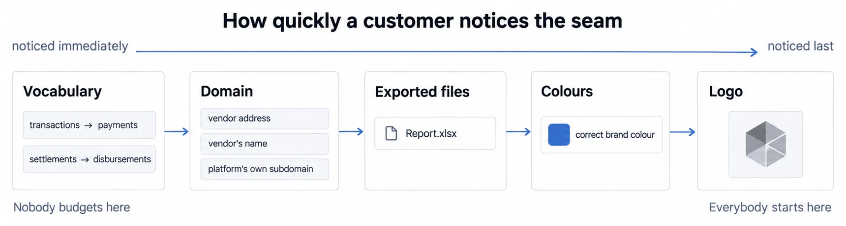
FinTech platforms must embed dashboards that appear native to their applications. Users should never perceive third-party tools disrupting their experience. How far that customization actually goes, and which touchpoints break first, is the subject of our complete guide to white-label analytics.
Custom domains serve dashboards from platform-owned URLs rather than vendor domains. Customers access dashboard.yourplatform.com, not analytics.vendorplatform.com.
Brand consistency matches dashboard styling to platform design systems, fonts, colors, button styles, spacing, iconography. Sumboard's white-label capabilities enable complete customization maintaining brand continuity.
Logo and identity replace vendor branding with platform logos. Customers associate positive dashboard experiences with your platform, not underlying technology providers.
Custom terminology adapts dashboard language to platform vocabulary. A lending platform refers to "loans" rather than generic "transactions"; payment processors use "settlements" instead of "disbursements."
One Multi-Tenant Misconfiguration Ends the Trust a FinTech Dashboard Runs On
Customer-facing dashboards serve thousands of users simultaneously, requiring multi-tenant architecture preventing data leakage between customers.
A single security misconfiguration exposing Customer A's financial data to Customer B destroys trust irreparably. FinTech platforms cannot afford multi-tenancy failures. Choose platforms with proven track records securing sensitive financial data across thousands of tenants.
Database-level isolation stores each customer's data in separate schemas or databases, preventing queries from accidentally crossing tenant boundaries. Row-level security adds additional isolation layer, filtering data based on authenticated user context.
API-level authentication validates every dashboard request against user identity. Token-based authentication (JWT) can embed user ID and tenant ID in cryptographically signed tokens, enabling stateless authentication at scale. What varies by vendor is what JWT authentication puts inside the signature, and that is what decides how much the signature is worth.
Audit logging records every data access, tracking which users viewed what financial data when. FinTech platforms often face regulatory requirements mandating complete audit trails.
Row-level security implementation varies by platform. Some rely on application-layer filtering; others push security to database level through policies applied automatically to all queries. Database-level approaches reduce risk of application bugs exposing data inappropriately.
Real-Time Financial Dashboards Need Event-Driven Updates, Not Faster Batches
Customer expectations shifted from monthly reports to real-time dashboards. Merchants want transaction data updated immediately; borrowers expect payment applications reflected instantly.
Event-driven updates push new data to dashboards as events occur. When a merchant processes a transaction, the payment platform publishes an event triggering dashboard refresh, eliminating 15-minute batch processing delays.
Incremental data loading avoids reprocessing entire datasets hourly. Load only changed records since last update, dramatically reducing latency and infrastructure costs for high-volume platforms.
Change data capture (CDC) monitors database transaction logs, identifying new or modified records without impacting application performance. CDC patterns enable real-time dashboards without significant application refactoring.
Caching strategies balance freshness against performance. Cache aggregated metrics for 60 seconds; cache dimension tables for 5 minutes; never cache real-time alerts. Define appropriate staleness tolerance for each metric.
Materialized views pre-aggregate common queries, delivering instant dashboard loads for complex calculations. Update materialized views incrementally as underlying data changes rather than full recalculation.
Internal Finance and FinTech Buy Different Dashboards for Different Reasons
Financial dashboard selection depends on use case. Internal finance teams evaluating CFO dashboards follow different criteria than FinTech product managers embedding customer-facing analytics.
Internal Finance Buys Tableau, Power BI, or Looker, and Only Two of the Three Publish a Price
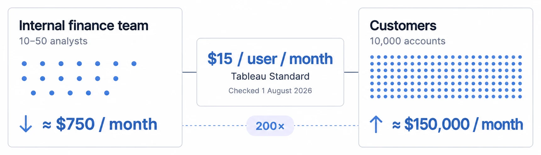
Finance teams need traditional BI tools optimizing for 10-50 analyst users exploring data interactively.
Tableau provides complete visualization capabilities with drag-and-drop interface, extensive chart library, and strong data source connectivity. Finance analysts create ad-hoc analyses without developer assistance. Tableau publishes Standard from $15 per user per month and Enterprise from $35, billed annually, and every deployment requires at least one Creator licence (Tableau pricing, checked 7 August 2026).
Power BI offers deep Microsoft ecosystem integration, connecting natively to Excel, Azure, Dynamics 365, and SharePoint. Finance teams already invested in Microsoft find Power BI natural extension. Power BI Pro is $14.00 per user per month and Premium Per User $24.00, paid yearly; embedded and Fabric capacity is listed as variable and routed to sales (Power BI pricing, checked 7 August 2026).
Looker emphasizes semantic modeling through LookML, enabling consistent metric definitions across organization. Finance creates reusable business logic preventing metric inconsistency. Google publishes no licence price for Looker: Standard, Enterprise and Embed all read "Call sales" (Looker pricing, checked 7 August 2026), so budget for it by asking rather than by planning against a number.
We would budget six to twelve weeks for implementation, covering data source integration, semantic model development, dashboard creation and user training. That is our own planning figure. Finance teams typically engage BI consultants for initial setup.
Per-User Pricing Breaks Down for a FinTech Serving Ten Thousand Customers
Customer-facing dashboards serve thousands of users, requiring fundamentally different platform capabilities.
Multi-tenant analytics architecture provides built-in data isolation, eliminating custom security code. Platforms designed for embedding handle tenant separation automatically through row-level security and API-level filtering.
SDK integration enables native mobile and web experiences. React, Vue, Angular, iOS, and Android SDKs embed dashboards into existing applications without iframe wrappers disrupting user experience.
Flat-rate pricing replaces per-user fees with predictable monthly costs. FinTech platforms serving 10,000 customers cannot afford $15/user pricing (scaling to $150,000 monthly). Embedded analytics pricing models vary dramatically, evaluate total cost of ownership across expected user growth.
White-label capability maintains brand consistency through customizable styling, custom domains, and removable vendor branding. Users should never perceive third-party analytics tools.
Fast deployment enables production-ready dashboards in weeks rather than 6-12 months. Modern embedded platforms provide pre-built components, accelerating time-to-market for FinTech product managers facing competitive pressure.
Row-level security must operate transparently without application code filtering queries manually. Database-level security policies applied automatically reduce risk of developer errors exposing sensitive financial data.
Iframe embedding versus SDK integration represents critical architectural decision. Iframe-based approaches create UX friction through nested scrolling, authentication challenges, and mobile responsiveness limitations. SDK integration provides smooth native experiences but requires deeper platform integration.
Embedded analytics implementation timelines vary by approach. Template-based platforms enable 2-4 week implementations; custom builds extend to 6-12 months. Evaluate platform capabilities against time-to-market requirements and engineering capacity.
Internal finance teams: Prioritize analytical depth, Excel integration, and ad-hoc exploration capability. Choose traditional BI tools like Tableau, Power BI, or Looker.
FinTech platforms: Prioritize multi-tenancy, white-label capability, SDK integration, and flat-rate pricing. Choose embedded analytics platforms purpose-built for customer-facing use cases.
Industry-Specific Dashboards Win Inside Their Niche and Lose Outside It
Some financial dashboards specialize in particular industries or use cases.
Retail financial analytics track inventory turn, gross margin return on investment (GMROI), and same-store sales growth. Retail dashboard guide covers metrics specific to retail operations.
Healthcare financial dashboards monitor revenue cycle metrics, claims processing, payer mix, and margin by service line. Healthcare dashboard guide explores healthcare-specific KPIs and compliance requirements.
Supply chain financial dashboards track procurement costs, inventory carrying costs, supplier payment terms, and working capital tied up in inventory. Supply chain dashboard guide details operational finance metrics for logistics and manufacturing.
SaaS financial analytics emphasize subscription metrics, MRR, churn, expansion revenue, payback periods. Platforms like ChartMogul and Baremetrics specialize in SaaS financial analysis, integrating directly with Stripe, Chargebee, or Recurly.
Accounting-specific dashboards from Fathom, Spotlight Reporting, or Jirav integrate deeply with QuickBooks or Xero, providing pre-built financial statement analysis, budgeting workflows, and cash flow forecasting tailored to accounting workflows.
Specialized solutions excel within their niches but lack flexibility for custom requirements or multiple use cases. General-purpose platforms provide broader applicability at cost of industry-specific optimization.
A Multi-Currency Dashboard Has to Decide Which Currency "Revenue" Means
Everything above assumes one currency. Once more than one currency is in play, "revenue" stops being a single number and becomes a definition, and the definition is usually settled by whoever wrote the first query rather than by the CFO.
The clearest way to see how many candidates there are is to read a payment processor's own vocabulary. Stripe's currencies documentation separates three things a single charge carries: "the customer's payment method currency, such as their credit card or bank account", "the currency of the charge, called the presentment currency", and "the currency accepted by your destination bank account or debit card, called the settlement currency".
The documentation then names one more, without saying whether it is a fourth currency or a role played by one of the three. "Integration currency" is the one set on the Price or PaymentIntent, and the documentation notes it "appears in the Stripe Dashboard and the currency Stripe Tax uses when recording tax liability in the Stripe Tax reports" (Stripe supported currencies).
Where charge and settlement differ, the conversion is not neutral either: "If the charge currency differs from your settlement currency, Stripe converts the charge to your settlement currency."
What that means for the dashboard, in four questions
These are roles rather than four separate currencies, and a sale where every role holds the same currency raises no question at all, whether or not it crosses a border. The question starts when two roles hold different currencies, and the documentation names one such case directly: where the charge currency differs from your settlement currency, Stripe converts between them.
In that case a dashboard reading this data is reading one of several amounts for the same transaction. It is not wrong to pick one, but it is wrong to leave the pick undocumented, because the person comparing this quarter to last then has no way to tell whether the movement is trade or currency.
Before the first chart, answer these and write the answers next to the metric definition:
- Which currency is the reported figure in, and is it the presentment currency, the settlement currency, or a reporting currency you translate into separately?
- Which rate translates it, and as of when: the transaction date, a period average, or a period-end rate?
- Do closed periods get re-translated when rates move? If they do, last quarter's revenue changes after it was reported, and the board will notice before the dashboard explains it.
- Is the currency effect separable from the underlying movement, so a constant-currency comparison is available next to the reported one?
Two limits are worth stating plainly. Stripe's documentation describes payment currencies, not revenue recognition, so questions 3 and 4 are accounting decisions your finance function owns rather than anything a processor page settles. And we did not verify from a public page how Stripe fixes the rate for a given conversion or how often it refreshes, so treat the timing questions as ones to answer against your own processor's documentation.
What carries beyond Stripe is not the vocabulary but the question it forces. The revenue figure may come from a processor role, from the ledger, or from a reporting currency you translate into yourself, and a dashboard that does not say which of those it is showing is not reporting a number, it is reporting a preference.
Financial Dashboard Projects Fail on Data Quality and Adoption, Not on Charts
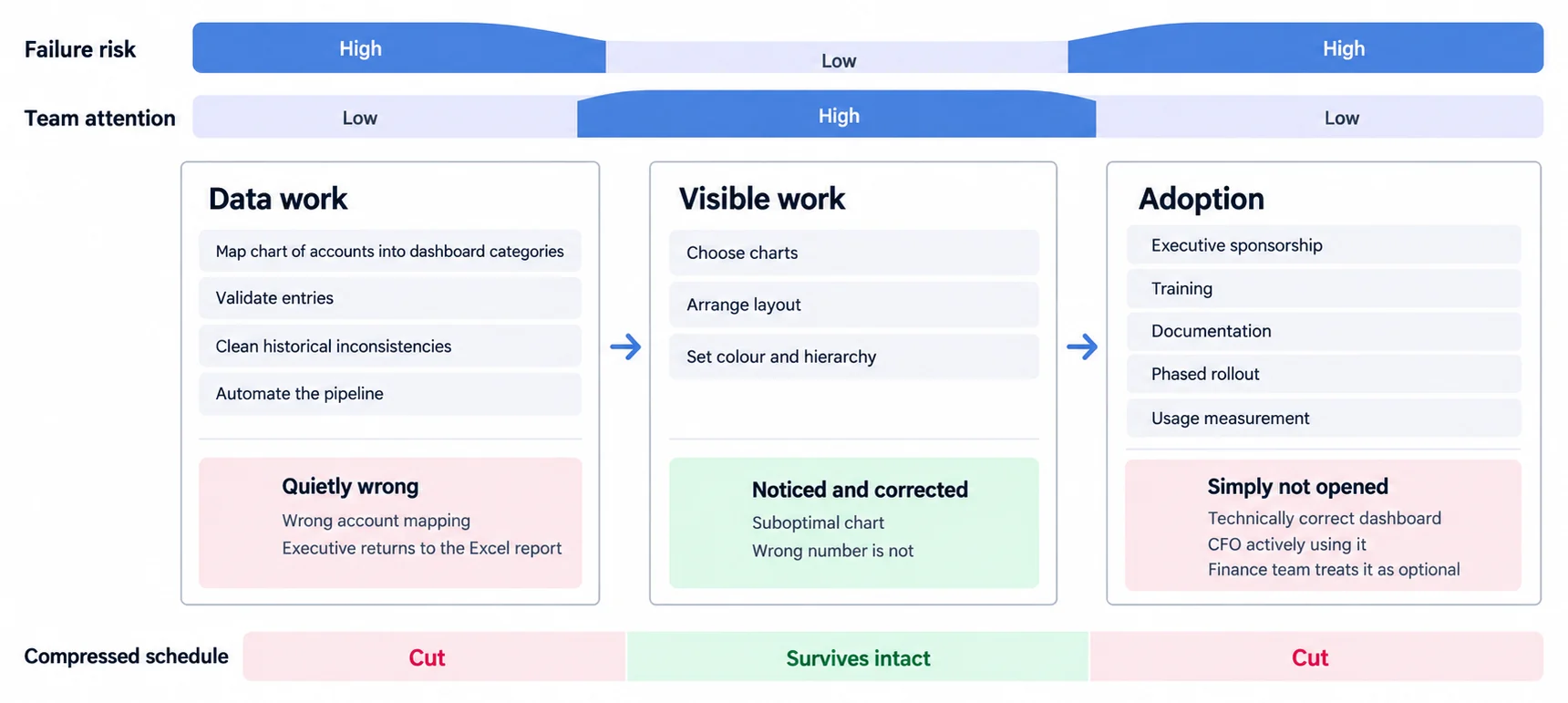
Successful financial dashboard implementations follow structured approaches avoiding common pitfalls that derail projects.
Bad Data Sends Executives Back to the Excel Report They Already Trust
Garbage in, garbage out applies forcefully to financial dashboards. Dashboards displaying inaccurate data undermine trust, causing executives to revert to manual Excel reports they understand.
Chart of accounts mapping ensures consistent categorization. Accounting systems use granular accounts; dashboards group into broader categories (Operating Expenses, COGS, Administrative). Maintain mapping tables translating detailed accounts to dashboard dimensions.
Data validation rules catch anomalies before they reach dashboards. Flag revenue entries exceeding $1M for human review; reject negative quantities where illogical; validate expense categories against approved lists.
Historical data cleaning addresses legacy data inconsistencies. Categories renamed over time create confusion; data entry errors compound across years. Invest upfront effort standardizing historical data before dashboard launch.
Automated data pipelines reduce manual intervention. Finance teams copying data between systems introduce errors and delays. Automated ETL (extract, transform, load) processes improve accuracy and timeliness.
Ship One Financial Dashboard First, Because a Six-Month Rollout Delays All of the Value
Start with one dashboard rather than attempting complete deployment immediately. CFO strategic dashboard provides maximum impact with manageable scope. Iterate based on user feedback before expanding coverage.
MVP mindset delivers initial value quickly. Launch dashboards with 5-7 critical metrics, gathering user feedback on what additional data would enhance decision-making. Avoid six-month projects attempting complete coverage delaying all value.
User testing validates design assumptions. Finance users might expect different chart types, require additional filters, or need specific drill-down capabilities. Testing with 3-5 representative users before company-wide rollout prevents costly redesigns.
Feedback loops incorporate user input continuously. Dashboard value compounds through iterative refinement responding to evolving business needs. Static dashboards become obsolete as business context shifts.
Without CFO Sponsorship a Financial Dashboard Rollout Does Not Get Adopted
Executive sponsorship proves critical for adoption. CFO endorsement signals importance; finance team prioritizes tools leadership uses actively. Lack of executive engagement dooms dashboard projects to low adoption.
Training programs accelerate proficiency. Don't assume users understand dashboard interactions, provide guided walkthroughs explaining key metrics, demonstrating drill-down capabilities, and highlighting actionable insights.
Documentation reduces support burden. Maintain FAQ covering common questions, glossary defining business metrics, and video walkthroughs demonstrating workflows. Users prefer self-service learning over scheduling training sessions.
Gradual rollout builds confidence. Launch dashboards to finance team first, incorporating feedback before extending access to department managers company-wide. Phased approach catches issues before they impact broad user bases.
Success metrics measure adoption and impact. Track daily active users, time spent in dashboards, and reduction in ad-hoc reporting requests. Increased dashboard usage replacing manual reports signals successful implementation.
Embedded FinTech Rollouts Turn on the Design System and the Authentication Flow
Embedded dashboard implementation follows different patterns than internal finance deployments.
Design system integration ensures dashboards match platform aesthetics. React chart libraries and React dashboard components provide building blocks maintaining consistency with existing application UI.
Authentication flow enables smooth single sign-on. Users authenticate once to FinTech platform; embedded dashboards inherit authentication without separate login prompts. Token-based authentication (JWT) passes user identity securely to analytics backend.
Progressive feature rollout validates assumptions incrementally. Launch dashboards to subset of customers (10% beta group) before full deployment, gathering feedback on usefulness, performance, and any discovered bugs.
Analytics instrumentation tracks feature usage. Monitor which dashboard features customers engage with frequently versus those ignored. Data-driven refinement focuses development on high-value capabilities.
Competitor benchmarking validates feature parity. Evaluate embedded analytics alternatives understanding what competitors provide, ensuring your offering meets or exceeds market expectations.
Three Constructed Financial Dashboard Scenarios, Carrying Assumptions Rather Than Results
The walkthroughs below are constructed scenarios. They illustrate how a rollout is structured and which metrics a team would watch; the companies, timelines and figures in them are assumptions rather than reported results.
Merchant Dashboards: Settlement Timing Is the Number That Removes the Support Call
A payment processing platform serving 15,000+ merchants processes $2B+ annual transaction volume. Merchants previously received monthly PDF statements summarizing transactions, with no real-time visibility into daily performance.
The platform embedded merchant dashboards displaying current day transaction count and value, settlement timeline and hold amounts, chargeback rate and dispute tracking, payment method breakdown with conversion rates, and fee calculation transparency with itemized breakdown.
In this scenario the rollout is scoped at around five weeks on an embedded analytics platform, with real-time data synchronization from payment core system, white-label customization matching mobile app branding, and mobile-first responsive design prioritizing smartphone access.
The outcomes such a rollout is aimed at are fewer "when will I receive my funds?" support calls, better merchant retention through transparency, and more active performance tracking by merchants. We are not attaching percentages to those, because this is a scenario rather than a measured deployment.
The feature such a rollout would expect to matter most is settlement timeline visibility, because it removes uncertainty about fund availability and enables better cash flow planning for small businesses operating on thin margins.
Borrower Dashboards: Amortization and Payoff Views Replace the Balance Enquiry
A consumer lending fintech serving 50,000+ borrowers provides personal loans, auto financing, and debt consolidation products. Borrowers previously accessed minimal account information through online portal, relying on customer service for balance inquiries and payment schedules.
The platform embeds borrower dashboards displaying current loan balance and next payment due, amortization schedule with principal versus interest breakdown, early payoff calculators with savings projections, payment history and on-time payment tracking, and financial wellness insights (debt-to-income impact, credit score factors).
In this scenario the rollout is scoped at around three weeks on an embedded analytics platform, with real-time data synchronization from the lending core system, white-label customization matching mobile app branding, and mobile-first responsive design prioritizing smartphone access.
The outcomes such a rollout is aimed at are fewer balance-related support calls and fewer missed payments through better visibility. Again, no percentages: this is a scenario.
The intended effect is that borrowers feel more in control of their loans, which builds trust with demographics historically underserved by traditional financial institutions.
CFO Scenario: Replacing a Manual Month Close That Reports Six-Week-Old Reality
Consider a 200-employee professional services firm relying on monthly Excel-based financial reports assembled manually by the finance team over 3-5 days following month close. Executive decisions lag current reality by 6+ weeks (month close delay plus assembly time).
The CFO implements a real-time financial dashboard integrating with NetSuite, replacing Excel reports with interactive dashboards refreshing daily, providing department managers with budget versus actual views, and enabling scenario modeling for strategic initiatives.
Implementation typically requires 8 weeks for data source integration, semantic model development, dashboard design iteration, and user training. The finance team handles implementation with external consulting support (40 hours), avoiding prolonged IT projects.
The outcomes such a rollout is aimed at are a shorter month close through automated consolidation, lower external audit cost through better documentation, and executives working from current data rather than six-week-old reports. Departmental variance analysis is where teams usually find the savings that pay for the work. No figures here: this is a scenario, and the savings depend entirely on what the manual process was costing you.
Whether the investment pays back quickly depends on your finance team's hourly cost and on how much of the month close is manual today. Work it against your own numbers rather than against a payback period we cannot know.
Choose Financial Dashboards by User Type, Governance, and Delivery Model
Financial dashboards transform raw financial data into strategic insights, serving both internal finance teams monitoring company health and FinTech companies providing transparency to customers. The gap between traditional CFO dashboard literature (focused on internal BI) and FinTech embedded analytics requirements (customer-facing, white-labeled, multi-tenant) creates confusion for product managers selecting platforms.
Internal finance teams should evaluate traditional BI tools (Tableau, Power BI, Looker) or specialized financial dashboard platforms with strong accounting integrations. These solutions optimize for 10-50 finance users analyzing company performance, supporting board presentations, and managing FP&A workflows.
FinTech companies embedding customer-facing financial dashboards require fundamentally different platforms. White-label capability, multi-tenant architecture, flat-rate pricing, SDK integration, and rapid deployment determine whether FinTech platforms ship competitive analytics features in weeks or remain blocked for 6-12 months on custom development.
The financial metrics, design principles, and security requirements covered in this guide apply across both contexts, but implementation approaches diverge dramatically. Understanding which path matches your use case determines whether financial dashboards accelerate strategic decisions or become expensive technical debt.
For FinTech product managers evaluating customer-facing dashboard solutions, exploring embedded analytics platforms purpose-built for SaaS product embedding provides significantly faster time-to-value than adapting internal BI tools or building from scratch.
Ship real-time financial dashboards to customers
Sumboard's embedded analytics platform handles multi-tenant security, real-time updates, and white-label customization out-of-box.