Marketing dashboards consolidate multi-channel metrics (traffic, conversions, attribution, ROI) into unified interfaces for campaign optimization. This guide covers dashboard types (operational, analytical, customer-facing), technical implementation (build vs. embedded platforms), MarTech use cases, and emerging 2026 trends (AI-powered insights, privacy-first attribution, conversational analytics). For MarTech SaaS companies, embedded white-label dashboards enable customer-facing analytics without 6-12 month builds.
Marketing teams drown in data fragmentation. Google Analytics tracks website behavior. Facebook Ads Manager reports social performance. HubSpot measures email engagement. Salesforce logs pipeline progression. Each tool operates in isolation, forcing marketers to toggle between platforms, export CSVs, and manually reconcile metrics in spreadsheets.
Marketing dashboards solve this by aggregating cross-channel data into unified visual interfaces. Rather than working through five tools to answer "Which campaign drove the most qualified leads this quarter?", dashboards surface the answer in seconds through consolidated KPIs, attribution models, and drill-down capabilities.
This guide explains what marketing dashboards are, types of dashboards (operational, analytical, customer-facing), core components and KPIs, implementation approaches (build vs. buy), technical architecture for embedded solutions, real-world use cases, and emerging 2026 trends like AI-powered insights and privacy-first attribution.
For MarTech SaaS companies, marketing automation platforms, SEO tools, social media management software, this guide also covers how to embed white-label marketing dashboards for customers, enabling product differentiation without 6-12 month builds.
Live demo: Interactive marketing dashboard built with Sumboard, explore campaign ROAS, channel conversions, CTR trends, lead pipeline, and web traffic analytics.
What is a Marketing Dashboard?
A marketing dashboard is a visual interface that aggregates key marketing metrics, website traffic, conversion rates, campaign ROI, customer acquisition cost, from multiple data sources (Google Analytics, Facebook Ads, CRM systems, email platforms) into a unified display.
A visual interface consolidating multi-channel marketing metrics, traffic sources, campaign performance, conversion funnels, attribution models, ROI, into real-time or near-real-time displays. Unlike analytics tools that track granular interactions, dashboards surface high-level KPIs for strategic decision-making and cross-channel optimization.
Unlike raw analytics tools (Google Analytics, Mixpanel) that track every user interaction, dashboards focus on high-level KPIs tied to business objectives. A marketing analyst might review hundreds of data points in Google Analytics, but a dashboard surfaces the 10-15 metrics executives need to assess campaign health and allocate budget.
Marketing dashboards serve three primary audiences:
- Internal teams: CMOs, marketing managers, and analysts use operational dashboards to monitor daily campaign performance, identify underperforming channels, and optimize spend allocation.
- Executives: Leadership teams use strategic dashboards with high-level metrics (CAC, LTV, marketing ROI, pipeline contribution) for quarterly business reviews and budget planning.
- External clients: Agencies and MarTech SaaS companies use customer-facing dashboards to deliver transparent reporting, demonstrate ROI, and differentiate their offerings. These require white-label customization (custom logos, colors, domains) and multi-tenant architecture for client data isolation.
The shift toward customer-facing marketing analytics represents a major trend. Reporting has moved from a premium add-on to an expected part of a MarTech product, for a structural reason: buyers already see it in the tools they use daily, so its absence reads as a gap rather than a missing upsell. Where that shows up first is in evaluations, so check your own lost-deal notes for reporting objections rather than taking a market average for it.
For a complete overview of different visualization formats, see our complete dashboard types guide. For technical definitions and industry terminology, consult our business intelligence glossary.
Marketing Dashboards Are Named After Their Purpose or Their Source, and the Two Cuts Overlap
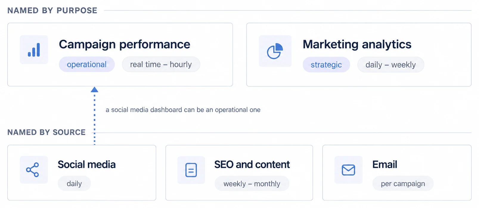
Marketing dashboards get named after two different things: what they are for, and where their data comes from. Both cuts appear below, which is worth knowing before you try to sort your own estate by this list.
Pro Tip: Organize dashboards by role, not by data source. Create separate views for:
- Campaign Managers: Real-time performance, budget pacing, A/B test results
- Marketing Directors: Week-over-week trends, channel comparison, attribution insights
- Executives: Monthly revenue impact, CAC:LTV ratio, pipeline contribution
Role-based dashboards reduce cognitive load and improve decision velocity.
Campaign Performance: Need real-time metrics? → Operational dashboard
Strategic Planning: Monthly/quarterly reviews? → Analytics dashboard
Client Reporting: External stakeholders? → White-label embedded solution
The first two look at the same data and will disagree with each other
Five dashboard types follow, and the first two are worth taking together because most marketing teams run both and are surprised when they conflict.
Campaign performance dashboards are operational. They track CTR by channel and campaign, cost per click and per acquisition, conversion rate by landing page, return on ad spend, and budget pacing against plan. They refresh in real time or hourly, they are read by paid media managers, and they exist so somebody can move money this afternoon. A SaaS team running a launch checks ROAS hourly and shifts budget out of underperforming Facebook ads into converting Google search.
Marketing analytics dashboards are strategic. MQLs and SQLs, customer acquisition cost against lifetime value, CAC payback period, marketing's contribution to pipeline and revenue, channel mix and attribution. They refresh daily or weekly and they are read by a CMO preparing a quarterly review.
Here is why they disagree. A channel that looks strong on the hourly view can be the weaker channel on payback, and the CMO example in this guide is exactly that shape: content marketing showing a six-month CAC payback against twelve months for paid search. Nothing on a real-time ROAS dashboard could have told you that, because the quantity being compared takes two quarters to resolve. So the operational view optimises what you can change today, the strategic view measures what you should have changed six months ago, and a team that only trusts the fast one will keep making a defensible daily decision that adds up to the wrong annual one.
Run both, and expect them to conflict rather than treating the conflict as a data problem.
The remaining three are shaped by how fast their subject actually moves
Social media dashboards track follower growth, engagement rate, reach and impressions, social conversions and sentiment, refreshed daily for social and brand teams. The characteristic use is a pattern nobody predicted: an e-commerce team noticing that user-generated content out-engages product photography by a wide margin and moving the content strategy toward customer stories.
SEO and content dashboards move slowest of the five, and their update frequency should say so: weekly to monthly, because rankings and backlinks do not resolve faster than that and a daily view invites reacting to noise. They cover organic traffic by page and keyword, rankings, backlink growth, content engagement and organic conversions. A SaaS SEO team finding that bottom-funnel keywords such as "best category software" drive materially more demo requests than top-funnel educational content will reshape an editorial calendar around it, though the size of that gap depends on your catalogue and price point, so measure it before planning around it.
Email dashboards are per-campaign rather than continuous: open and click-through rates, unsubscribes and spam complaints, attributed conversions and revenue, list growth, and A/B results. The classic finding is a send-time effect, such as a team measuring materially better open rates on Tuesday mornings than Friday afternoons and standardising around it. Worth noting that open rate has become a less reliable metric since mail privacy features began pre-fetching images, so treat it as directional and judge on clicks.
Across all five, the update frequency is not a preference. It is a statement about how fast the underlying thing changes, and setting it faster than that buys noise.
Customer-Facing Marketing Analytics for MarTech SaaS
For MarTech SaaS companies, marketing automation platforms, SEO tools, social media schedulers, email marketing software, embedded marketing dashboards have become table stakes, not differentiators. Customers expect to see campaign performance, ROI, and optimization recommendations within the product, not exported to external BI tools.
This section explains why customer-facing analytics matter, technical requirements (multi-tenancy, white-labeling), and implementation approaches.
Why MarTech Companies Need Embedded Dashboards
Customer retention: Marketing software without built-in reporting forces customers to export data and build dashboards in Tableau or Looker. This creates churn risk, if customers rely on external tools for insights, switching vendors becomes easier. Embedded dashboards increase product stickiness.
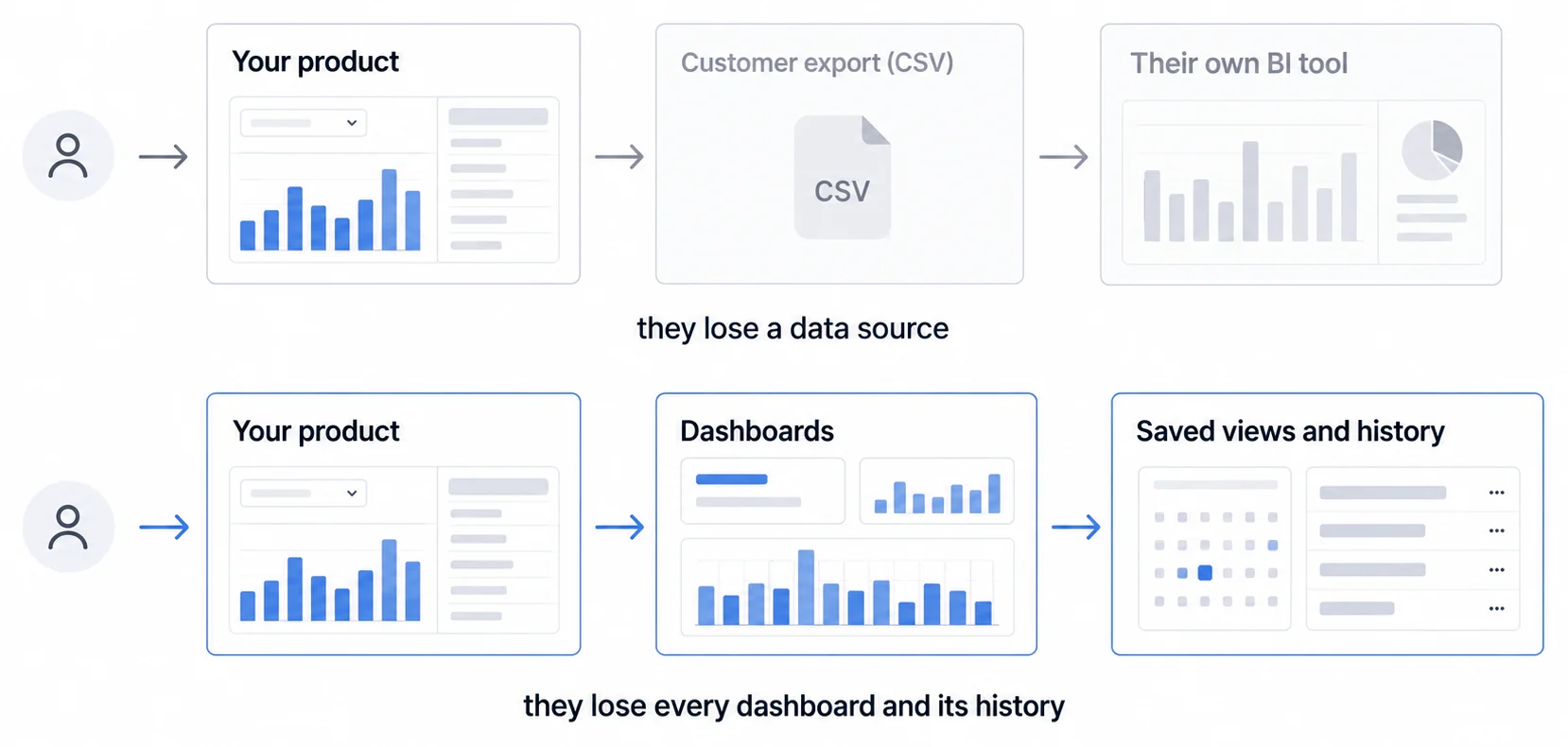
Competitive positioning: When evaluating marketing automation platforms, buyers compare feature lists side-by-side. "Advanced analytics" and "custom dashboards" influence purchase decisions. We are not putting a number on how often it decides a deal, because we could not find a buyer study that publishes its method.
Premium tier monetization: Many MarTech companies offer basic dashboards in standard plans but charge for advanced analytics (custom dashboards, white-labeling, API access) in enterprise tiers. This creates expansion revenue without significant marginal cost.
Reduced support burden: When customers can self-serve insights through dashboards, support tickets decrease. Instead of emailing "How many leads did our last campaign generate?", users check dashboards themselves.
Companies like HubSpot (marketing automation), Ahrefs (SEO), and Hootsuite (social media management) have made embedded analytics core to their value proposition. HubSpot's dashboard builder enables customers to track campaign performance without leaving the platform. We are not attaching a retention figure to that, since any causal share we assigned to the dashboard would be invented.
Our customer-facing analytics guide works the build-or-buy decision through in depth, and the customer-facing analytics product page sets out what Sumboard ships for it.
A Marketing SaaS Platform Serves Thousands of Tenants, Each Expecting Only Their Own Data
Marketing SaaS platforms serve thousands of customers, each with distinct data sets. A social media scheduler might have 10,000 agency customers, each managing dashboards for 5-50 end clients. This requires multi-tenant architecture where each customer's data remains isolated while sharing the same infrastructure.
Marketing attribution is the process of identifying which marketing touchpoints contributed to a conversion. Multi-touch attribution models (linear, time-decay, U-shaped, W-shaped, algorithmic) assign fractional credit across the customer journey, enabling marketers to understand true channel ROI beyond last-click attribution.
Multi-tenancy means:
- Customer A's dashboard queries only return Customer A's data
- Customer B cannot access Customer A's campaigns, metrics, or audience lists
- The platform scales to thousands of tenants without duplicating infrastructure
Technical implementation requires:
- Row-level security (RLS): Database queries automatically filter by tenant_id, ensuring customers only retrieve their own data
- API token scoping: Authentication tokens encode tenant_id, preventing cross-tenant API access
- Data partitioning: Large platforms partition data by tenant to improve query performance
For embedded dashboards, Multi-tenancy and row-level security are non-negotiable. A single data leak (Customer A seeing Customer B's metrics) violates data privacy regulations (GDPR, CCPA) and destroys customer trust.
For technical architecture details, see our guide on multi-tenant analytics architecture.
White-Labelling Makes the Dashboard Read as the Agency's Own Product Rather Than the Vendor's
Agencies and MarTech SaaS companies delivering customer-facing dashboards require white-labeling: custom branding (logos, colors, domains) that makes dashboards appear native to their product or client portal.
There are three reasons it matters, and they are commercial rather than aesthetic.
Brand consistency: When a marketing agency sends a client report, the dashboard should display the agency's logo and color scheme, not "Powered by [vendor]". Generic branding signals that the agency relies on third-party tools rather than proprietary technology.
Premium positioning: White-labeled dashboards enable agencies to charge premium rates. A client paying $10,000/month for social media management expects polished, branded reporting, not dashboards with another vendor's logo.
Competitive differentiation: In crowded markets (email marketing, SEO tools, social schedulers), white-label analytics help vendors differentiate. When competitors offer basic reporting, custom-branded dashboards become a selling point.
White-label features include:
- Custom logos (header, PDF exports, email reports)
- Color scheme customization (matching brand guidelines)
- Custom domains (reports.agency.com instead of vendor.com/reports)
- Branded PDF exports (remove "Powered by" footers)
- Email whitelabeling (reports sent from [email protected])
Platforms like Sumboard enable full white-labeling for white label analytics, allowing MarTech companies to embed dashboards that look native to their product.
Tenant Customization Goes Past Branding to What Each Customer Can Change Themselves
Beyond white-labeling (applying the vendor's brand), tenant-specific customization enables each end customer to tailor dashboards for their use case.
Examples:
- Custom KPIs: A B2B SaaS company tracks "MQLs" and "pipeline contribution," while an e-commerce brand tracks "average order value" and "cart abandonment rate." The same platform should support both.
- Industry templates: A marketing automation platform might offer pre-built dashboard templates for SaaS, e-commerce, healthcare, and financial services, each with industry-appropriate metrics.
- User role permissions: Marketing managers see campaign-level metrics; executives see aggregated ROI; clients see only their specific campaign data.
For detailed implementation patterns, see our article on multi-tenant analytics architecture.
Core Marketing Dashboard Components
Effective marketing dashboards share common structural elements regardless of industry or tool.
1. Summary cards, and the discipline of stopping at six
The single-value cards at the top of a dashboard, sometimes called hero metrics, exist so somebody can check status without reading a chart. That only works while there are few enough of them to take in at once, which in practice means four to six. A row of twelve is not a summary, it is a second dashboard that has to be read like the first one.
[Total Website Visits]     [Conversion Rate]      [Cost Per Lead]
      47,382                     3.2%                  $42
    ↑ 12% vs last month      ↓ 0.3% vs last month   ↓ $8 vs last month
Each card needs a trend indicator, because a number with no direction is not a status check: 3.2% conversion means nothing until you know whether it was 2.9% or 4.1% last month. Use colour sparingly and only where the direction is unambiguously good or bad, since a dashboard where everything is coloured has told you nothing about what to look at first. And every card should be a link, because the card's job ends at raising the question.
2. Channel breakdown, where traffic share and conversion share disagree
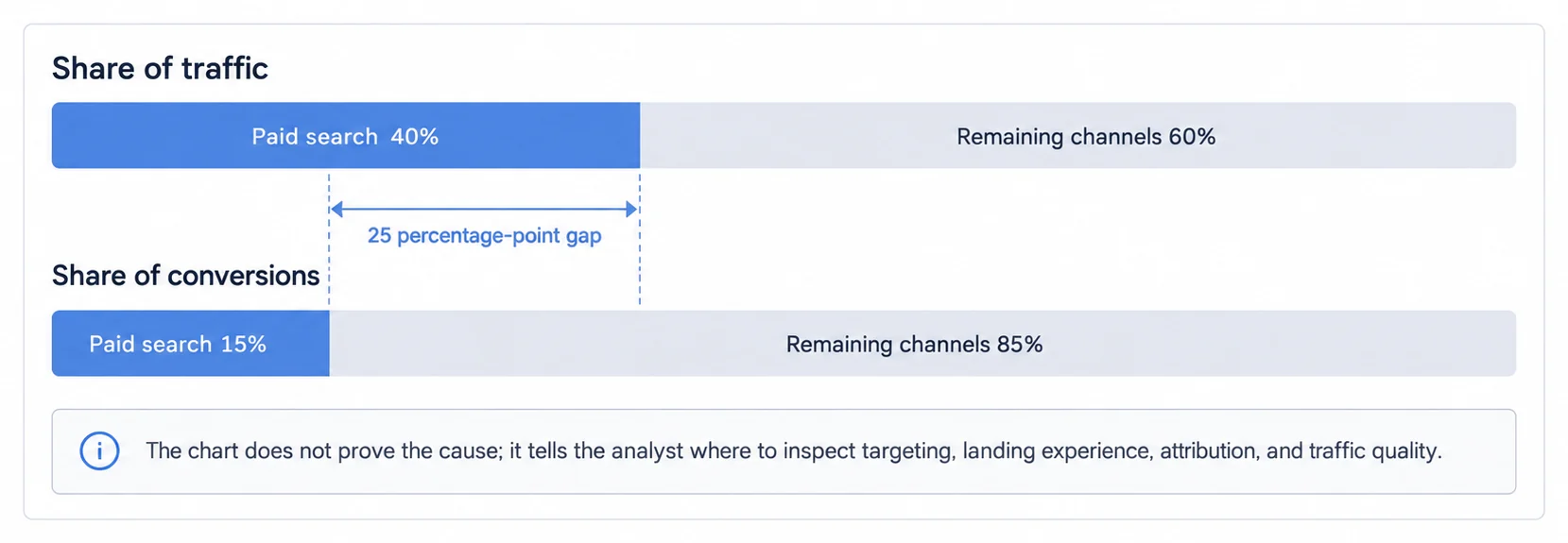
The channel view shows which of organic search, paid search, social, email and direct drives traffic, conversions and revenue, usually as stacked bars or a funnel. The metrics that matter per channel are traffic volume and share, conversion rate and total conversions, cost per acquisition on the paid channels, and attributed revenue.
The reason to draw traffic share and conversion share side by side rather than separately is that the gap between them is the finding. A manager seeing paid search at 40% of traffic and 15% of conversions is looking at a keyword targeting problem or a landing page mismatch, and neither number alone would have said so.
3. Attribution models, which is where the same journey gets six different answers
A methodology that assigns fractional credit to multiple marketing touchpoints in a customer's journey, rather than attributing 100% to a single interaction. Common models include linear (equal credit), time-decay (recent touches weighted higher), U-shaped (first and last touch emphasized), and algorithmic (data-driven weighting).
Critical mistake: Using last-click or first-click attribution in multi-channel campaigns creates false conclusions. Example: A customer sees 6 Facebook ads, reads 3 blog posts, attends 1 webinar, then converts via Google search. Last-click gives 100% credit to Google, ignoring Facebook's 6 touchpoints. This leads to under-investing in awareness channels and over-allocating to bottom-funnel search.
Six models, and the important thing about them is that they are not degrees of accuracy. They are different questions.
Last-click gives everything to the final touchpoint, which is simple and ignores every stage that created the demand. First-click does the reverse, useful for judging awareness campaigns and blind to nurture. Linear splits evenly, which is fair and assumes every touch mattered equally, which none of them did. Time-decay weights recent touches, reflecting how influence actually fades and systematically undervaluing top-funnel content. U-shaped gives 40% each to first and last with 20% shared among the middle, which is a reasonable compromise and still a guess with numbers on it. Algorithmic derives weights from your own conversion patterns, which is the most defensible and needs enough volume to learn from, typically several hundred conversions a month before the weights mean anything.
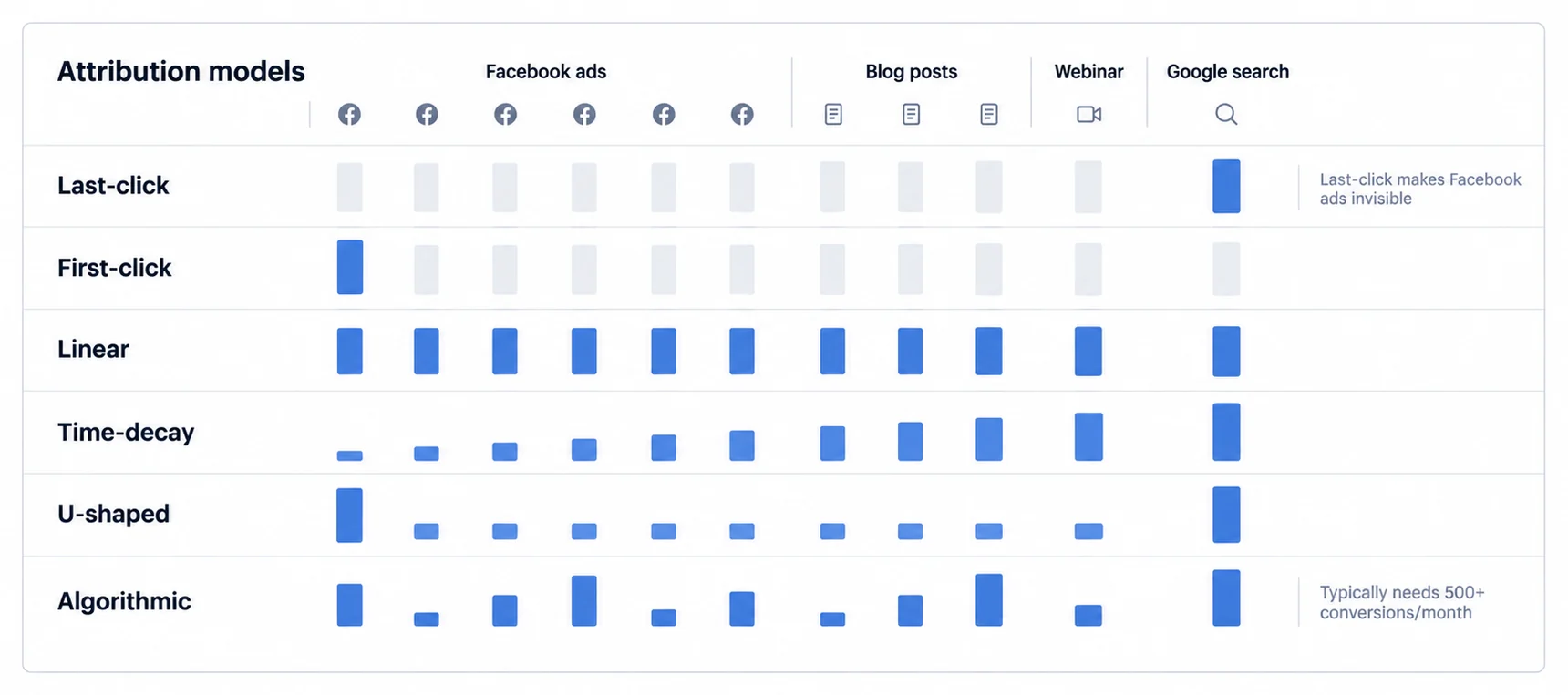
The consequence of picking without thinking is predictable in one direction: last-click over-credits paid search and retargeting, so budget drifts toward the bottom of the funnel and away from whatever was filling it. That is why the model is a budget decision rather than a reporting preference.
4. Campaign tables, which is the one place a table beats a chart
Comparing active campaigns is a job for a table, because the reader is scanning for outliers across several dimensions at once and no chart does that better.
| Campaign Name | Impressions | Clicks | CTR | Conversions | CPA | ROAS |
|---|---|---|---|---|---|---|
| Q1 Brand Awareness | 2.4M | 48K | 2.0% | 1,200 | $38 | 4.2x |
| Product Launch | 890K | 35K | 3.9% | 980 | $42 | 3.8x |
| Competitor Conquest | 1.1M | 22K | 2.0% | 440 | $68 | 1.9x |
What makes it usable rather than decorative: sorting on any column, since the interesting campaign is different depending on whether you are protecting CPA or chasing ROAS; filters for date range, type and status; drill-down to the campaign itself; and highlighting the extremes, because the middle of a campaign table is rarely where the decision is.
The three rows above show the pattern worth naming. Competitor conquest has the same CTR as brand awareness and nearly twice its CPA, which means the click is not the problem and the intent behind it is.
5. Funnels, drawn to width so the drop-off is visible rather than calculated
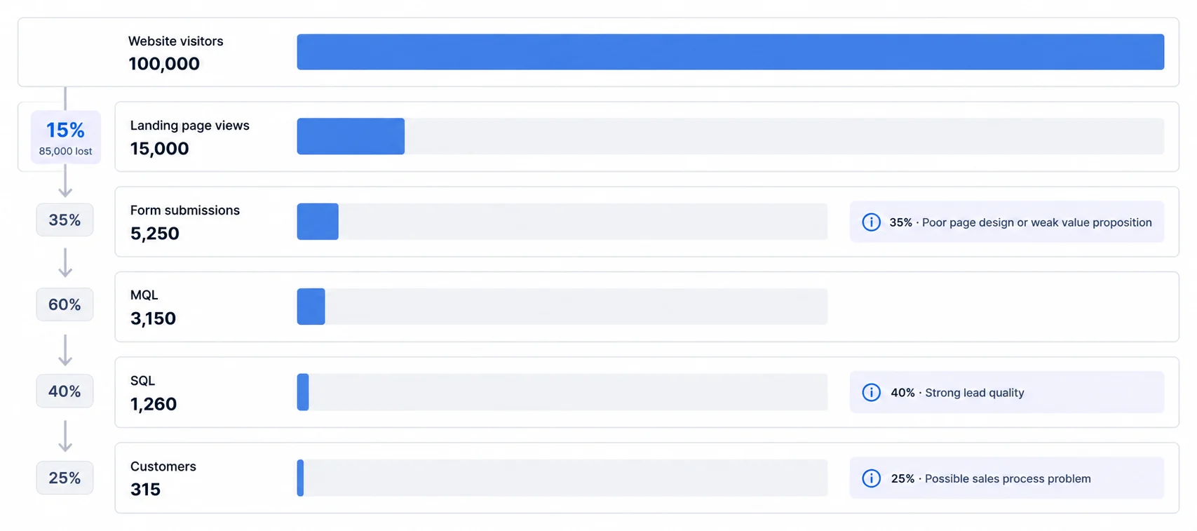
A funnel exists to show where people leave, which means it has to be drawn to scale; a funnel with equal-width stages is a list with a shape around it.
Read stage by stage, each drop tells you which team owns the problem. A landing page to form conversion around 35% points at page design or a value proposition that is not landing. MQL to SQL at 40% suggests lead quality is genuinely good. And SQL to customer at 25%, sitting under a healthy MQL-to-SQL rate, points at the sales process rather than at marketing, which is the most useful thing a marketing dashboard can occasionally tell you.
For visualisation conventions see our data visualization glossary and the KPI definition.
6. Time series, where the annotation matters more than the line
Plotting metrics over time is how you see trends, seasonality and anomalies. Line charts for most things, area charts where the parts stack, such as traffic by channel.
What a time-series view is actually for is answering "why did that happen", and it can only do that if the chart carries the events alongside the numbers. Annotate campaign launches, algorithm updates and holidays directly on the line. Without them a spike is a mystery somebody has to reconstruct from memory, and with them it is a fact.
The other three requirements are ordinary and worth stating anyway: selectable date ranges including a custom one, comparison against the previous period and against last year, since B2B lead generation drops in summer and e-commerce peaks in Q4 whether or not anything changed, and drill-down from daily to hourly or monthly to weekly so a spike can be located rather than just noticed.
7. Segmentation, because the average is the one number nobody is
Breaking performance down by demographics, behaviour or custom segments exists for a single reason: aggregate metrics hide the pattern you needed.
A 3% overall conversion rate can be enterprise prospects converting at 12% and SMB leads at 1.5%, which is not a 3% business, it is two businesses averaged into a number that describes neither. The same happens by geography, where North America might convert at 4.2% against EMEA at 2.8%, and by device, where mobile can be 60% of visits and 30% of conversions, which is a design problem stated as an arithmetic one. Lifecycle segmentation is usually the starkest, with first-time visitors converting at a fraction of returning ones.
Every one of those splits changes what you would do next, and none of them is visible in the headline. That is the argument for segmentation, and it is also the argument against reporting a single conversion rate to anyone who might act on it.
Funnel-Stage KPIs Earn Their Place by Replacing Vanity Metrics With Actionable Ones
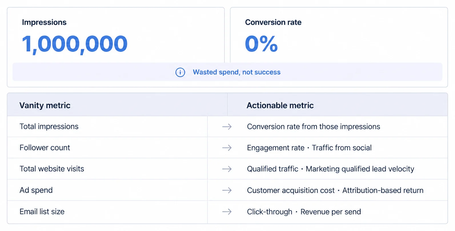
Avoid over-indexing on "vanity metrics" like total impressions or follower counts that don't correlate with revenue. Focus on actionable metrics tied to business outcomes: conversion rates, CAC, MQL velocity, and attribution-based ROI. A dashboard showing 1M impressions but 0% conversion rate signals wasted spend, not success.
Marketing dashboards should mirror the customer journey, tracking metrics from awareness to advocacy.
The metrics that justify the budget sit at the bottom. The spending they justify happens at the top
Marketing dashboards mirror the customer journey, and the four stages below each have their own metrics. What is worth noticing before the lists is the structural awkwardness they contain: the numbers that persuade a board are bottom-of-funnel, and the activity most in need of persuasion is top-of-funnel. That gap is where most measurement arguments actually live.
Top of funnel is about generating awareness and qualified traffic, measured through total visits and unique visitors by source, ad impressions and social reach, engagement in the form of likes, comments, shares, video views and content downloads, and branded keyword search volume as the closest thing to a demand signal.
These matter for a reason that makes them awkward to defend: awareness work does not drive immediate conversions, it builds the pipeline that later stages convert. Tracking it is what stops short-term optimisation from quietly eating long-term growth, and not tracking it is how a team discovers, two quarters later, that the pipeline stopped being refilled.
Middle of funnel is nurture, and it is where quality first becomes measurable.
A prospect who has demonstrated intent to purchase through specific engagement behaviors (downloading whitepapers, attending webinars, requesting demos) and meets defined criteria (company size, industry, role). MQLs represent the handoff point from marketing to sales teams in B2B funnels.
The metrics are MQLs against your lead scoring criteria, engagement depth through pages per session, time on site and repeat visits, content consumption in whitepapers, webinars and demo requests, and email engagement on nurture campaigns. Their diagnostic value is a ratio rather than a level: high traffic with low MQLs means the targeting or the message is wrong, and that is a conclusion you cannot reach from either number alone.
Bottom of funnel is conversion: SQLs, meaning MQLs that sales has accepted as ready, conversion rate from visitor to customer, sales cycle length from first touch to close, and win rate on SQLs. These determine marketing's revenue contribution and they are what a CMO takes into a budget conversation, which is exactly the tension named above.
Post-purchase is retention and advocacy: lifetime value, churn rate, net promoter score, and referral traffic. These matter because acquisition is expensive enough that CAC frequently exceeds first-year revenue, so whether the business works at all is decided after the sale rather than at it.
Cost metrics are what stop the other four from lying to you
The total cost to acquire a new customer, calculated as (Marketing Spend + Sales Spend) ÷ Number of New Customers. CAC includes all expenses: ad spend, salaries, software tools, and agency fees. A sustainable business model requires CAC < LTV (Customer Lifetime Value), typically with a 3:1 LTV:CAC ratio.
The cost layer runs across all four stages: CAC as total marketing and sales spend over new customers, CAC payback period in months, marketing ROI as revenue minus spend over spend, ROAS as ad revenue over ad spend, and cost per lead.
Without them every metric above is optimisable in the wrong direction, because traffic and impressions can always be bought. The comparison that makes this concrete: a campaign delivering 100,000 impressions at a $200 CAC is worse than one delivering 10,000 at $40, and nothing on the awareness dashboard would tell you that. Which is the same point the vanity-metric warning above makes, arriving from the other end.
Building In-House, Embedding a Platform, and Using a BI Tool Are Three Different Commitments
Marketing teams have three options for creating dashboards: in-house development, embedded analytics platforms, or business intelligence tools.
Build it, when marketing analytics is the product rather than a view of it
Building from scratch gives you complete control of the interface, your own attribution logic rather than someone else's model, and no per-seat licensing. Those are real advantages and they are worth roughly six to twelve months to an MVP, $200K to $500K or more of dedicated engineering, and a maintenance load that does not end at launch.
The opportunity cost is the part that decides it. Engineers building a dashboard are not building whatever makes customers choose you, and the test is the same one that applies everywhere in this guide: if a customer would not renew for the dashboards alone, the dashboards are a feature.
So build when marketing analytics genuinely is the core product, as it is for Google Analytics or Mixpanel; when your customisation requirements are extreme enough that no platform covers them, which is worth testing against two or three vendors before accepting; or at a scale where platform fees stop making sense. Do not build when the dashboards are a feature, when you need them in weeks, or when engineering is already the constraint. The build versus buy comparison works the numbers through.
Buy an embedded platform, and accept a roadmap you do not control
Platforms built for embedding, meaning Sumboard, Explo, Luzmo and GoodData among others, get you to production in days or weeks with pre-built charts, filters and drill-downs, white-labelling and multi-tenancy in the default path, and the infrastructure, scaling and security updates on the vendor's side. Pricing is predictable where it is published; ours is €199 and €499.
What you give up is genuine and worth stating plainly: less interface customisation than building, a dependency on somebody else's roadmap for anything missing, and data that has to reach the platform, which is an integration you own even when the platform is not.
This is the right route when the dashboards face customers, when the timeline is weeks, when a predictable monthly cost beats a large upfront one, or when there is no in-house BI engineering to assign. Four things are worth checking before signing: how deep the white-labelling actually goes on logos, colours and domains; whether multi-tenant isolation is enforced by row-level security rather than by query construction; what the integration options are, meaning REST APIs, SQL connectors and pre-built sources; and which meter the pricing uses, since per-dashboard, per-tenant and flat rate scale very differently as you grow. Our implementation guide covers the patterns.
Use a BI tool for your own team, and think hard before pointing it at customers
Looker, Tableau and Power BI bring powerful modelling and transformation, mature ecosystems with consultants available, and enterprise-grade security and governance. For an internal marketing team that already has one, extending it to marketing reporting is the cheapest thing on this page.
Pointing it at customers is a different proposition. The user experience, identity path, white-label surface, workload, and commercial meter all need a representative prototype. Tableau's public pricing page lists edition starting prices rather than role rates, while its licensing documentation also defines analytical-impression usage-based and capacity-based models alongside the limited-use Embedded Analytics offering; the applicable embedded quote still has to be validated (Tableau licensing models, checked 7 August 2026). Google publishes no licence amount for Looker.
Existing content, trained operators, governance, and complex modelling can make enterprise BI the right choice. Customer-facing work does not make it an automatic no; it makes tenant isolation, brand coverage, runtime behavior, accessibility, and the quoted meter acceptance criteria rather than assumptions.
Technical Architecture for Embedded Marketing Dashboards
This section covers technical implementation for MarTech SaaS companies building customer-facing marketing dashboards.
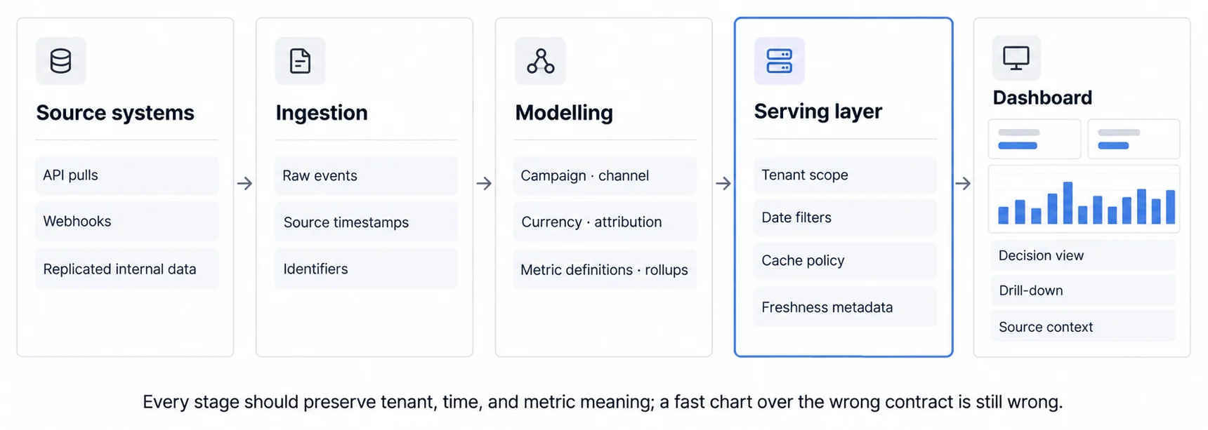
Data architecture: three layers, and the third one is why dashboards stay fast
Marketing dashboards pull from web analytics, ad platforms, CRM, email and social, which is more source systems than most products touch. Three layers sit between those and the screen.
Ingestion connects to the sources, and there are three shapes of connection rather than one. REST or GraphQL APIs for Google Analytics, Facebook Ads and LinkedIn Ads, which are rate-limited and will shape your refresh cadence whether you plan for it or not. Webhooks for real-time events such as a new lead, a form submission or an email open. And direct database replication for internal data such as customers and transactions.
Transformation cleans and models the raw feeds into analytics-ready tables, typically with Fivetran, Airbyte or dbt writing into PostgreSQL, Snowflake, BigQuery or Redshift. This is also where aggregation tables get built, pre-computing the metrics everyone asks for.
The query layer is the part that decides whether the dashboard feels fast, and the rule is short: dashboards query the warehouse, never the source systems. Cache what is asked for constantly, such as today's traffic and month-to-date conversions. Store rollups so a monthly view is not recomputed from daily rows every time somebody opens it. And index on tenant_id and date, because those are the two columns every query in a multi-tenant marketing dashboard filters on.
Frontend: three common stacks, and the choice is mostly about your team
Most marketing dashboards are a JavaScript framework plus a chart library, and the three combinations that come up are React with Recharts, which is the most common because Recharts is built for React; Vue with Chart.js, which is lighter and covers the standard chart types; and Angular with D3, which is the enterprise choice and buys maximum control at the cost of a steeper curve.
None of these is wrong. The deciding factor is which one your team already maintains, because a dashboard written in a framework nobody else uses becomes the thing one person owns. Our guides on React chart libraries and React dashboard components go into the specifics.
// Example React dashboard component
import { LineChart, BarChart, PieChart } from 'recharts';

function MarketingDashboard() {
  const [dateRange, setDateRange] = useState('last_30_days');
  const [metrics, setMetrics] = useState(null);

  useEffect(() => {
    fetchMetrics(dateRange).then(setMetrics);
  }, [dateRange]);

  return (
    <div>
      <KPISummary metrics={metrics.kpis} />
      <LineChart data={metrics.trafficOverTime} />
      <BarChart data={metrics.channelPerformance} />
      <AttributionFunnel data={metrics.attribution} />
    </div>
  );
}
Integration Labels Do Not Replace Acceptance Tests
An iframe preserves a separate document boundary.
<iframe src="https://analytics.yourapp.com/dashboard?token=xyz" />
The host controls the frame and the embedded application controls its document. Styling does not automatically cross that boundary. Loading, focus, resizing, mobile behavior, authentication, and errors can be implemented well or badly, so measure the actual embed rather than assigning the boundary a universal outcome.
An SDK exposes components or APIs inside the application's integration path.
import { Sumboard } from '@sumboard/sdk';

const sumboard = new Sumboard();
// the page needs <div id="sumboard"></div>; init() rejects without it
await sumboard.init({ token: userToken, dashboardId: 'campaign-performance' });
// theming is configured on the dashboard, not passed from the host
That can make state coordination and host-owned controls easier, but an SDK does not guarantee native rendering, inherited styling, complete control, or a particular load time. Verify the supported surface and the runtime beneath it.
Headless hands you the data and nothing else.
const metrics = await fetch('https://api.sumboard.io/metrics', {
  headers: { Authorization: `Bearer ${token}` }
});
// Render with your own components
The host owns rendering, accessibility, interaction, and visual states while the provider may still own query execution or semantics. That is maximum interface control and a larger product surface to operate. Our glossaries cover iframe embedding and SDK integration in more detail.
Authentication: the tenant claim belongs in the token, not in the query
Customer-facing dashboards need authentication that cannot be argued with by a URL parameter, and the pattern is short.
Issue short-lived JWTs scoped to the tenant, so the identity travels with the request rather than being asserted alongside it. The decision underneath that line is how JWT authentication carries a row scope, because a scope that rides outside the signature is protected by whatever else protects the request:
const token = jwt.sign(
  { tenantId: 'customer-123', role: 'viewer' },
  SECRET_KEY,
  { expiresIn: '1h' }
);
Then enforce tenant scope in a database policy or trusted server-side query layer and test the missing-claim path explicitly. A predicate such as the one below illustrates the intended scope, but its presence in one query is not proof of row-level security:
SELECT * FROM marketing_metrics
WHERE tenant_id = :current_user_tenant_id
  AND date >= :start_date;
The acceptance condition is that a missing, malformed, expired, or unauthorized tenant context returns no protected rows. Test direct requests and every export or scheduled-delivery path, not only the dashboard view. Document encryption, key ownership, audit, incident, and recovery controls rather than reducing security to one algorithm name.
Browser privacy controls, consent choices, platform restrictions, and identifier loss make third-party signals incomplete and unstable. Define which first-party events, server-side records, consent states, and identity joins support each attribution metric. Show missing coverage rather than silently turning partial observation into a complete customer journey.
Six use cases, and in two of them the dashboard reverses the ranking
The six situations below split into two groups with different reasons for existing, and the second group contains the more interesting argument.
For MarTech products, the reason is churn
Email marketing platforms such as Mailchimp, HubSpot and ActiveCampaign embed campaign performance, list health and revenue attribution: open and click rates, unsubscribes, deliverability and engagement scores, sales attributed to campaigns, and A/B results on subject lines and send times.
Social media schedulers such as Hootsuite, Buffer and Sprout Social embed post-level reach, engagement and clicks, follower demographics, optimal posting times and competitor benchmarks. Their users have a specific job the dashboard does: proving ROI to an executive who was not in the room, which is why screenshot-and-share reporting matters more here than depth.
Marketing automation platforms such as Marketo, Pardot and HubSpot embed lead scoring trends, campaign ROI, funnel conversion from MQL to SQL to customer, and attribution. Their users are data-literate and will notice a thin report, which raises the bar rather than lowering it.
The common thread across all three is not a feature. It is that a customer whose analytics live in Tableau has already done the hard part of leaving you. Export-driven reporting means the insight lives outside your product, and once it does, switching costs you a login rather than a workflow. That is the churn argument for customer-facing analytics, and it is stronger than the feature-parity one.
Agencies are the fourth variant and the one where white-labelling stops being cosmetic. An agency delivering traffic, conversions, channel ROI, lead generation and benchmarks on a monthly retainer is selling judgement, and a report carrying somebody else's logo says the judgement was bought too. The white-label guide covers how deep that customisation actually has to go.
For the brands themselves, the reason is that the obvious metric ranks things wrongly
E-commerce teams track revenue by channel, CAC by channel, LTV by acquisition source and cart abandonment. The finding that justifies the dashboard is a reversal: Instagram at a $45 CAC against Google Shopping at $22 looks like a clear loss until lifetime value arrives at $180 against $95. Instagram acquires the more profitable customer at twice the price, and every ranking built on CAC alone had it backwards.
B2B SaaS teams track marketing-sourced pipeline, campaign influence on closed deals, CAC by channel and sales cycle length. The same shape appears: content marketing touching 78% of closed deals while receiving 15% of last-click credit. Nothing was wrong with the last-click number; it was answering a different question, and the budget was being set from it.
Those two cases are the honest argument for this whole category. The dashboard did not surface a metric nobody had. It surfaced a second metric that disagreed with the first one, and the disagreement is where the money was. See also the real-time dashboard guide for the architecture that makes this kind of comparison fast enough to be used.
Four advanced features, and three of them are the same idea
The features below get sold separately and mostly do one thing: shorten the distance between a number changing and somebody understanding why.
Predictive lead scoring trains on your historical conversions, meaning demographics, behaviour and engagement, then scores new leads on conversion probability and surfaces the high ones with a recommended action. The value is prioritisation, letting sales work the leads most likely to close rather than the newest ones. Two cautions worth carrying: the model learns from the leads you converted, so it will reproduce whatever selection bias your sales team already had, and it needs enough history to have learned anything at all.
Automated anomaly detection flags unusual movement before somebody notices it in a weekly review. The alerts that earn their place look like this:
- Website traffic down 35% against yesterday, possibly a tracking issue
- Facebook CPM up 60% overnight, check campaign settings
- Conversion rate at 8% against a 3% average, investigate the traffic source
Notice that the third one is a positive anomaly, and it is the one most teams do not alert on. An unexplained conversion spike is usually either a measurement fault or something worth repeating, and both are worth knowing within the hour.
Natural language querying lets somebody ask rather than build.
Conversational analytics enable users to query marketing data using natural language instead of SQL or pre-built dashboards. Systems powered by large language models translate questions like "Which campaign had the best ROAS last month?" into database queries, democratizing data access for non-technical marketers.
"Which campaign had the highest ROAS last quarter", "show me conversion trends by device", "compare Facebook against Google Ads". It removes the analyst from the middle of simple questions, which is where most of the queue is. It does not remove them from the hard ones, and the failure mode to watch is a confidently wrong answer to an ambiguous question, since the system will happily pick one reading of "best".
Collaborative annotation is the least fashionable of the four and probably the most useful.
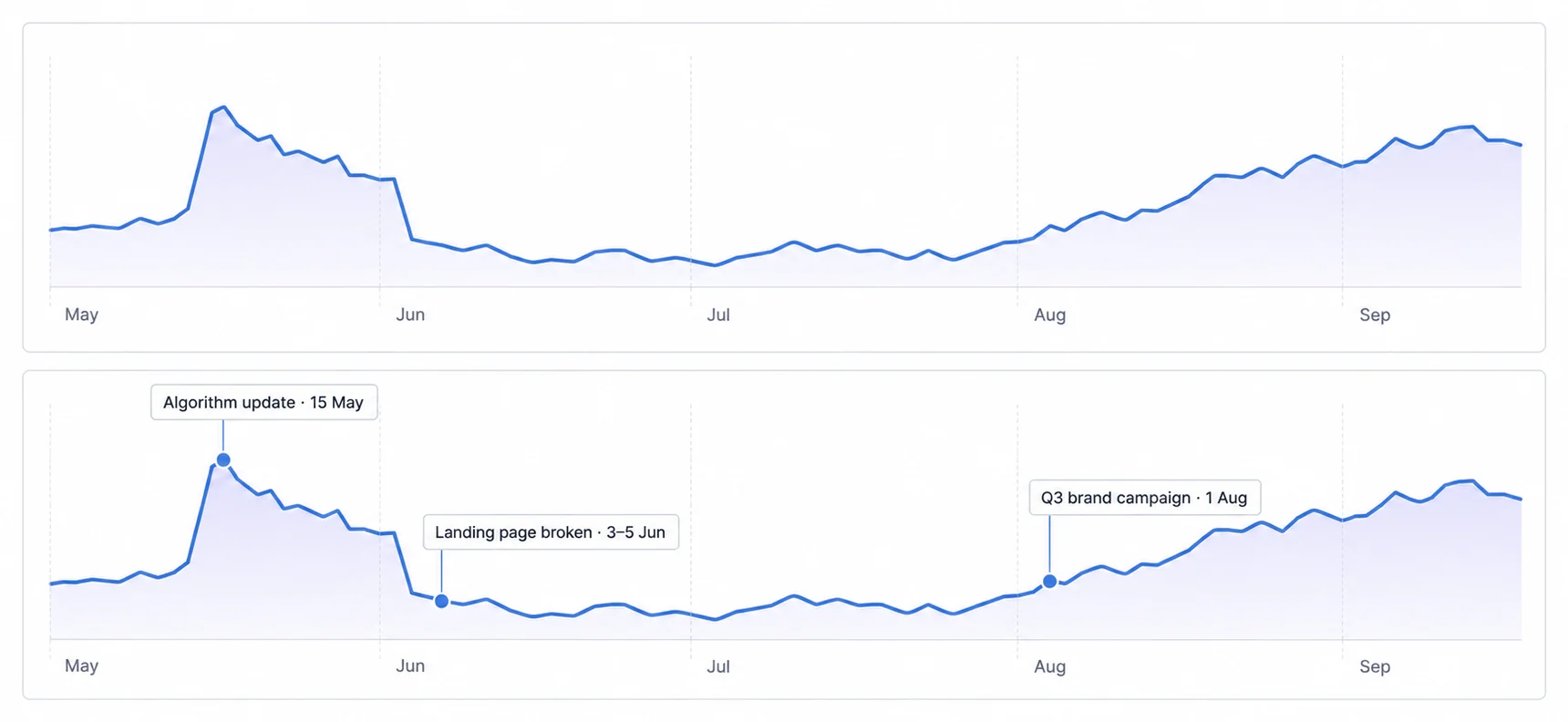
Comments placed directly on the chart, marking the algorithm update on 15 May, the landing page that broke between 3 and 5 June, the brand campaign that started on 1 August. What that turns a chart into is institutional memory: a new joiner can read last year without asking anybody, and the recurring argument about what caused a dip stops recurring.
Which is the through-line for three of these four. Anomaly detection shortens the delay before somebody looks, natural language shortens the delay before somebody asks, and annotation removes the delay entirely by keeping the answer attached to the chart. Only the lead scoring is doing something genuinely different. See the real-time analytics glossary for the architecture underneath.
Sixteen weeks, and half of them are upstream of the dashboard
The plan below runs about four months, and the shape is worth noticing before the detail: weeks five to eight are a data pipeline, which is not a dashboard task at all. Most timelines that slip do so there rather than in the design, because the design is the part everyone is looking at.
Weeks one and two are requirements, and they are conversations rather than documents. Interview the people who will use it, meaning the CMO, marketing managers, sales and whoever presents to the board, since those four want different things and finding that out later is expensive. Define the primary use case, which is internal monitoring, executive reporting or client dashboards, and pick one to be primary. Identify the data sources you will actually connect: analytics, ad platforms, CRM, email. List the metrics. And decide the update frequency, which as the earlier section argues should follow how fast the reader can act rather than how fast the data could move.
What you should hold at the end of it is a requirements document naming metrics, sources and audiences, wireframes rough enough to argue with, and credentials for every source, which is the item that quietly takes the longest. Our implementation guide covers the methodology.
Weeks three and four are vendor evaluation. Six things decide it: how deep white-labelling goes on logos, colours, domains and PDF exports; whether integrations are pre-built or your own API work; whether multi-tenancy means row-level security or configuration; which meter the pricing uses, since per-dashboard, per-tenant, flat and usage-based scale very differently; query performance under your data volumes; and what support actually covers, meaning onboarding, documentation and response times in writing.
For embedded use cases the shortlist is normally Sumboard, Explo, Luzmo or GoodData. Trial each with your own sample data rather than theirs, because a demo dataset is chosen to make the product look fast.
Weeks five to eight are the data pipeline, and this is the phase that determines whether the rest of the plan holds. Connect the sources, set up ETL or ELT with Fivetran, Airbyte or your own scripts, design the warehouse schema with fact and dimension tables, and implement the transformations including your attribution logic, which is where the arguments happen.
The step teams skip is the last one: reconcile the dashboard's numbers against the source systems before anybody sees them. A dashboard that disagrees with Google Analytics on session count loses its audience permanently on the first day, and finding that in week five costs an afternoon while finding it in week fourteen costs the project.
Weeks nine to twelve are design and build. Layouts, filters, drill-downs, branding, and testing on a phone and a tablet rather than only a laptop. What you want at the end is not just working dashboards but user acceptance sign-off from the people interviewed in week one, which is what makes the requirements document worth having written.
Weeks thirteen to sixteen are pilot and rollout. Start with ten to twenty percent of the intended audience, gather feedback on usability, missing metrics and speed, iterate, then train through live demos, documentation and short videos before the full rollout.
Three things are worth measuring afterwards, and only the first one is usually tracked: what share of users log in weekly, how quickly somebody can answer a question they arrived with, and whether support tickets asking where to find something have fallen. That last one is the cleanest evidence the dashboard is doing its job, because it is a number somebody else was already counting.
The Right Stack Depends on Who Opens the Dashboard
For Internal Marketing Dashboards
For an internal marketing dashboard, combine these four layers:
- Data warehouse: Snowflake or BigQuery (scalable, cost-effective)
- ETL: Fivetran or Airbyte (pre-built connectors to marketing platforms)
- BI tool: Looker, Tableau, or Metabase (if open-source)
- Hosting: Cloud-based (AWS, GCP, Azure)
Why this stack: Internal dashboards prioritize flexibility and advanced analytics over white-labeling. BI tools like Looker enable complex data modeling without custom code.
For Customer-Facing Embedded Dashboards
For customer-facing dashboards, use a stack designed around tenant isolation and product integration:
- Embedded platform: Sumboard, Explo, or Luzmo
- Data warehouse: PostgreSQL (if small scale) or Snowflake (if high volume)
- Frontend: React + SDK integration for native look/feel
- Authentication: JWT tokens with row-level security
Why this stack: Embedded platforms handle white-labeling, multi-tenancy, and infrastructure management, enabling fast time-to-market without dedicated BI engineering.
For Agencies (Client Reporting)
For agency client reporting, prioritize reusable onboarding and branded delivery:
- White-label platform: Sumboard or Luzmo (full branding customization)
- Data aggregation: Google Data Studio (free, easy client onboarding) or embedded platform (for premium positioning)
- Reporting automation: Schedule PDF exports, email delivery
Why this stack: Agencies need fast client onboarding (days, not weeks) and polished branding. White-label platforms justify premium pricing.
Marketing Dashboard Costs Fall Into Bands, and the Band Decides How Much You Operate
DIY Tools (Free to $50/month)
Google Data Studio and open-source Metabase are common DIY choices. They keep licence cost low and give the operator direct control, but require manual setup and offer fewer pre-built integrations or support paths. This route best suits small businesses, individual marketers, and internal dashboards.
Embedded Analytics Platforms ($200-$1,000/month)
Sumboard, Explo, and Luzmo are examples of purpose-built embedded analytics platforms. Vendors in this category commonly use one of three pricing meters. The ranges below are planning bands rather than quoted prices, because most vendors here route you to sales instead of publishing a rate:
- Flat rate: $200-$500/month for unlimited dashboards and viewers
- Per-dashboard: $50-$200/dashboard/month
- Usage-based: Charged by query volume or data processed
This category best suits MarTech SaaS companies, agencies, and B2B SaaS products with customer-facing analytics requirements.
For detailed pricing analysis, see our comparison of embedded analytics platforms.
Enterprise BI Tools ($3,000-$10,000/month)
Looker, Tableau, and Power BI represent the enterprise BI category. Their commercial models typically combine one or both of these meters, and the same caveat applies to the bands:
- Per-user: $70-$200/user/month
- Platform fees: $3,000-$5,000/month base + per-user
This category best suits large enterprises with dedicated BI teams and internal dashboard requirements.
In-House Build ($200K-$500K+ upfront)
An in-house build combines three continuing cost centres rather than one upfront project fee:
- Development: 6-12 months of dedicated engineering, $200K-$500K+
- Infrastructure: a data warehouse and hosting bill that scales with your data, priced by your provider
- Maintenance: a standing share of an engineer, costed at your own loaded rate
Building in-house is most defensible when marketing analytics is the product itself, not merely one feature within it.
For TCO analysis, see our deep dive on multi-tenant analytics cost structures.
Emerging Trends: Marketing Analytics in 2026
1. Privacy-First Attribution
With third-party cookie deprecation (2024-2026), marketing dashboards shift to first-party data strategies:
- Server-side tracking: Track events on backend servers, not browsers
- Customer Data Platforms (CDPs): Unify customer data across touchpoints
- Consent-driven identity resolution: Match users across devices with explicit consent
Business impact: Dashboards that rely on cookie-based attribution lose accuracy. First-party data strategies become competitive advantages.
2. AI-Powered Marketing Insights
Generative AI augments dashboards with natural language summaries and recommendations.
The useful product patterns are concrete outputs rather than a generic “AI” badge:
- Auto-generated insights: "Instagram engagement up 45% due to video content shift"
- Recommended actions: "Increase Facebook budget by 20% based on ROAS trends"
- Anomaly explanations: "Traffic drop caused by Google algorithm update"
Business impact: Marketers spend less time interpreting data, more time acting on insights. For detailed coverage, see our AI-powered analytics guide.
3. Cross-Platform Identity Resolution
As customers interact across devices (mobile, desktop, tablet) and platforms (website, app, email), dashboards unify fragmented data into single customer views.
Identity resolution usually combines these technical approaches according to the available consent and identifiers:
- Deterministic matching: Link interactions via email, user ID, phone number
- Probabilistic matching: Use ML to infer same user across devices
- Consent-based tracking: Request explicit permission for cross-device tracking
Business impact: Accurate attribution and customer journey mapping despite device fragmentation.
4. Real-Time Competitive Benchmarking
Dashboards integrate competitive intelligence data (from SEMrush, SimilarWeb, SpyFu) to show performance vs. competitors.
Competitive context becomes useful when the dashboard expresses the comparison directly, for example:
- "Your organic traffic grew 12% this quarter; competitors averaged 8%"
- "Your paid search CTR (3.2%) exceeds industry benchmark (2.1%)"
Business impact: Contextualize performance, is 10% growth good or bad? Benchmarks provide answers.
5. Automated Budget Optimization
AI models recommend budget reallocations based on performance trends.
An automated recommendation should connect the proposed action to the evidence and expected outcome:
- "Shift $5,000 from Facebook (2.1x ROAS) to Google Search (4.3x ROAS) to increase total conversions by 18%"
Business impact: Continuous optimization without manual analysis.
Build Marketing Dashboards Around Attribution, Optimization, and Client Reporting
Marketing dashboards consolidate fragmented multi-channel data into unified visual interfaces, enabling campaign optimization, strategic planning, and transparent client reporting. Whether building operational dashboards for internal teams, strategic dashboards for executives, or customer-facing analytics for MarTech SaaS products, effective dashboards share common elements: KPI summaries, attribution models, conversion funnels, and time-series trend analysis.
For internal use cases, marketing teams can use DIY tools (Google Data Studio), business intelligence platforms (Looker, Tableau), or build custom dashboards if analytics is core to the product. For customer-facing use cases, agencies delivering client reports or MarTech SaaS companies embedding white-label analytics, embedded analytics platforms offer the fastest path to market without 6-12 month builds.
As marketing analytics evolves toward privacy-first attribution, AI-powered insights, and real-time competitive benchmarking, dashboards will shift from static reporting tools to intelligent decision-making systems. The platforms that adapt fastest, supporting first-party data strategies, conversational queries, and automated optimization, will win the next generation of data-driven marketers.
For MarTech SaaS Companies
If you're a marketing automation platform, SEO tool, social media scheduler, or email marketing software considering embedded analytics, start here:
- Evaluate requirements: Interview customers to understand what metrics they need
- Review embedded platforms: Compare embedded analytics platform options (Sumboard, Explo, Luzmo) based on white-label depth, multi-tenancy, and pricing
- Start with pilot: Deploy dashboards for 10-20 pilot customers, gather feedback, iterate
- Scale gradually: Roll out to broader customer base after validating value
For implementation guidance, consult our white label analytics guide and explore industry-specific examples in our retail dashboard and financial dashboard guides.
For Marketing Teams
If you're building internal marketing dashboards:
- Define primary use cases: Operational monitoring? Executive reporting? Both?
- Inventory data sources: List all marketing platforms (Google Analytics, Facebook Ads, HubSpot, Salesforce)
- Choose tech stack: DIY (free, time-intensive) vs. BI tool (powerful, expensive) vs. embedded platform (fast, moderate cost)
- Start simple: Build 3-5 core metrics first, expand iteratively based on usage
The best marketing dashboard is the one your team actually uses. Start with high-impact metrics, gather feedback, and iterate.
Ready to Embed Marketing Analytics?
Join B2B SaaS companies using Sumboard to deliver white-label marketing dashboards to their customers, without owning the stack underneath it.