
What Dashboard Types Mean for Audience, Freshness, and Decisions
A visual display of the most important information needed to achieve one or more objectives, consolidated on a single screen for at-a-glance monitoring. The term originates from automobile dashboards, which provide drivers with critical real-time information (speed, fuel level, engine temperature) without requiring them to stop and analyze detailed reports.
In business contexts, dashboards serve the same purpose: they surface key metrics, trends, and alerts that enable fast, informed decision-making. A well-designed dashboard answers specific questions instantly, "Are we on track?" "What needs attention?" "Where should we focus?", without forcing users to dig through raw data or wait for analyst support.
The foundation of effective dashboard design comes from visual perception research. Stephen Few, author of Information Dashboard Design and instructor at UC Berkeley's MBA program, emphasizes that dashboards must respect how the human brain processes visual information. This means minimizing cognitive load, using pre-attentive attributes (color, size, position) strategically, and eliminating "data junk" that obscures insights. See dashboard design principles and dashboard color theory for implementation guidance.
Dashboards are not the same as reports. Reports provide complete documentation of past performance, often printed or exported for review. Dashboards provide live, visual monitoring for immediate action. If you're looking at static data that never changes, you're viewing a report, not a dashboard.
For B2B SaaS companies, this distinction matters even more. Your customers expect the kind of customer-facing analytics product that updates in real-time, responds to their actions, and integrates smoothly with their workflows, not monthly PDF reports that require manual refresh.
Four Dashboard Types, Separated by How Long the Reader Has to Respond
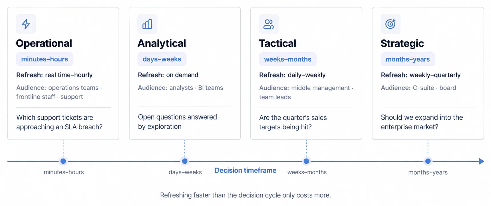
Not all dashboards serve the same purpose. The four primary categories (operational, strategic, analytical, and tactical) differ fundamentally in update frequency, user personas, and decision-making timeframes. Understanding these distinctions prevents the common mistake of building "one dashboard to rule them all" that ultimately satisfies no one.
Four Dashboard Types, Separated by Update Frequency and Decision Timeframe
| Type | Purpose | Update Frequency | Primary Users | Decision Timeframe | Key Features |
|---|---|---|---|---|---|
| Operational | Real-time monitoring & immediate action | Real-time to hourly | Operations teams, frontline staff, support | Minutes to hours | Live data feeds, alert systems, simple visualizations, detailed metrics |
| Strategic | High-level organizational performance vs goals | Weekly to quarterly | C-suite, board members, senior leadership | Months to years | Trend lines, forecast models, external benchmarks, summary KPIs |
| Analytical | Ad-hoc data exploration & deep-dive analysis | On-demand | Data analysts, BI teams, researchers | Days to weeks | Drill-down capabilities, complex charts, interactive filters, historical data |
| Tactical | Mid-term progress tracking toward objectives | Daily to weekly | Middle management, department heads, team leads | Weeks to months | Department-specific metrics, action items, tactical KPIs, team performance |
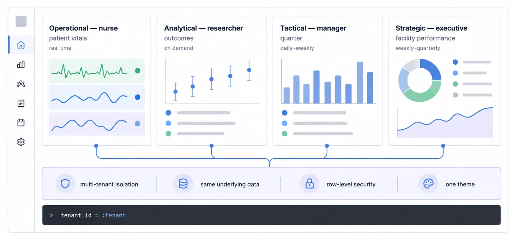
A B2B SaaS product may serve several decision contexts from the same governed data. A healthcare platform, for example, could separate short-window operational monitoring, executive goals, research exploration, and department progress. Verify that the chosen architecture can support each required pattern with independently tested multi-tenant isolation and row-level security; do not infer those controls from a template label.
Operational Dashboards: Something Is Wrong Now, and the Reader Acts Today
A real-time monitoring interface designed to enable immediate action on fast-changing conditions. These dashboards update continuously and surface alerts the moment metrics cross critical thresholds.
Operational dashboards exist for one purpose: enable immediate action on fast-changing conditions. Think air traffic control displays, emergency department triage screens, or e-commerce order fulfillment systems. These dashboards update continuously (often in real-time) and surface alerts the moment metrics cross critical thresholds.
Operational Dashboards Lose Their Value the Moment the Data Goes Stale
Update Frequency: Real-time to hourly. Operational dashboards lose value if data is stale. A customer support dashboard showing yesterday's ticket queue is useless; support teams need to see current queue depth, longest wait times, and SLA violations happening right now.
Visual Design: Simple, scannable, focused. Operational dashboards prioritize clarity over complexity. Few (2013) emphasizes using pre-attentive visual attributes, color coding for status (green/yellow/red), size for magnitude, position for priority, so users can assess the situation in seconds without reading labels or legends.
Alert Systems: Threshold-based notifications are essential. When server response time exceeds 500ms, inventory drops below reorder point, or customer wait time hits 10 minutes, operational dashboards must surface visual alerts (color changes, icons, popups) and trigger external notifications (emails, Slack messages, SMS).
Data Granularity: Unlike strategic dashboards that show aggregated trends, operational dashboards display granular, detailed data. A warehouse operations dashboard doesn't just show "orders processed today", it shows which orders are stuck, which items are out of stock, and which shipping zones are delayed.
Operational Dashboards Turn Up Wherever Somebody Is Watching a Queue
E-commerce Operations: Real-time order volume, inventory stock levels, shipping delays, payment processing errors, cart abandonment rates by minute. Operations teams use these dashboards to spot fulfillment bottlenecks, inventory shortages, or payment gateway issues before they escalate.
SaaS Platform Operations: API response times, server uptime, error rates by endpoint, active user sessions, database connection pool status. DevOps and engineering teams monitor these dashboards 24/7 to catch performance degradation or service outages instantly.
Customer Support Centers: Current ticket queue depth, longest wait time, SLA compliance percentage, agent availability, escalation rate. Support managers use operational dashboards to balance workload, identify agents who need help, and ensure no customer waits beyond acceptable limits.
Manufacturing Floor: Machine uptime percentage, production line speed, defect rate per hour, material consumption rate, maintenance alert status. Plant managers monitor these dashboards to prevent downtime, optimize throughput, and respond to quality issues immediately.
An operational dashboard is defined by its decision window, not by a mandatory technology list. Some use cases need a stream and push transport; others are satisfied by event-triggered refresh or polling. Specify source-to-visible freshness, ordering, reconnect behavior, alert delivery, backpressure, and recovery for the real-time analytics workload, then select the simplest architecture that passes those tests.
Operational Dashboards Demand Streaming Infrastructure, Not a Nightly Batch
Operational dashboards demand different technical architecture than other dashboard types. You'll need:
- Streaming data infrastructure: Real-time data pipelines using technologies like Kafka, Kinesis, or Pub/Sub to push updates to dashboards without manual refresh
- Efficient rendering: Dashboards that update every second must avoid full page reloads; use differential updates and optimized charting libraries like that redraw only changed elements
- Mobile optimization: Operations teams are often on the move; operational dashboards must work flawlessly on tablets and smartphones, not just desktop monitors
- Alert configuration UI: Non-technical users must be able to set threshold alerts without writing code or SQL queries
Strategic Dashboards: the Plan Was Wrong, and Nobody in the Room Can Change This Year
A high-level monitoring interface that tracks long-term organizational performance against strategic goals. These dashboards display aggregated KPIs, trend analysis, and forecasts for executive decision-making.
Strategic dashboards serve the opposite use case from operational dashboards. Instead of monitoring minute-by-minute changes, strategic dashboards track long-term organizational performance against high-level goals. These are the dashboards CEOs review in Monday morning executive meetings, boards examine during quarterly reviews, and investors analyze to assess company health.
Strategic Dashboards Aggregate, Because Strategy Does Not Change Daily
Update Frequency: Weekly to quarterly. Strategic decisions don't change daily, so strategic dashboards don't need real-time data. A CEO tracking annual revenue growth, customer acquisition cost trends, or market share evolution needs accurate weekly or monthly snapshots, not live-updating numbers that create analysis paralysis.
Aggregated Metrics: Strategic dashboards show summary KPIs, not granular details. Instead of individual transaction records, you see total monthly recurring revenue (MRR). Instead of every customer support ticket, you see average customer satisfaction score. Instead of each sales rep's performance, you see overall quota attainment percentage.
Trend Visualization: Strategic dashboards emphasize time-series trends, year-over-year comparisons, and forecast projections. Line charts showing 12-month revenue trends, sparklines indicating directional movement, and variance indicators (↑ 15% vs last quarter) help executives spot patterns and evaluate strategy effectiveness.
External Context: Unlike operational dashboards that focus purely on internal metrics, strategic dashboards often incorporate external benchmarks, industry averages, competitor performance (when available), market growth rates, economic indicators, to contextualize company performance.
Every Department Has Its Own Strategic KPI, and They Rarely Overlap
Finance & Revenue: Annual recurring revenue (ARR), revenue growth rate, gross margin percentage, burn rate, cash runway months, EBITDA margin, customer lifetime value (LTV), customer acquisition cost (CAC), LTV:CAC ratio
Growth & Marketing: Monthly recurring revenue (MRR), customer acquisition cost (CAC), marketing qualified leads (MQLs), SQL conversion rate, customer churn rate, net revenue retention (NRR), market share percentage
Operations: Overall operational efficiency ratio, return on investment (ROI) by initiative, cost per transaction, gross profit margin by product line, inventory turnover ratio
Product & Engineering: Product adoption rate, feature utilization percentage, time to value (TTV), product-qualified leads (PQLs), net promoter score (NPS)
Different Industries Need Different Strategic Metrics, So the Guides Are Split
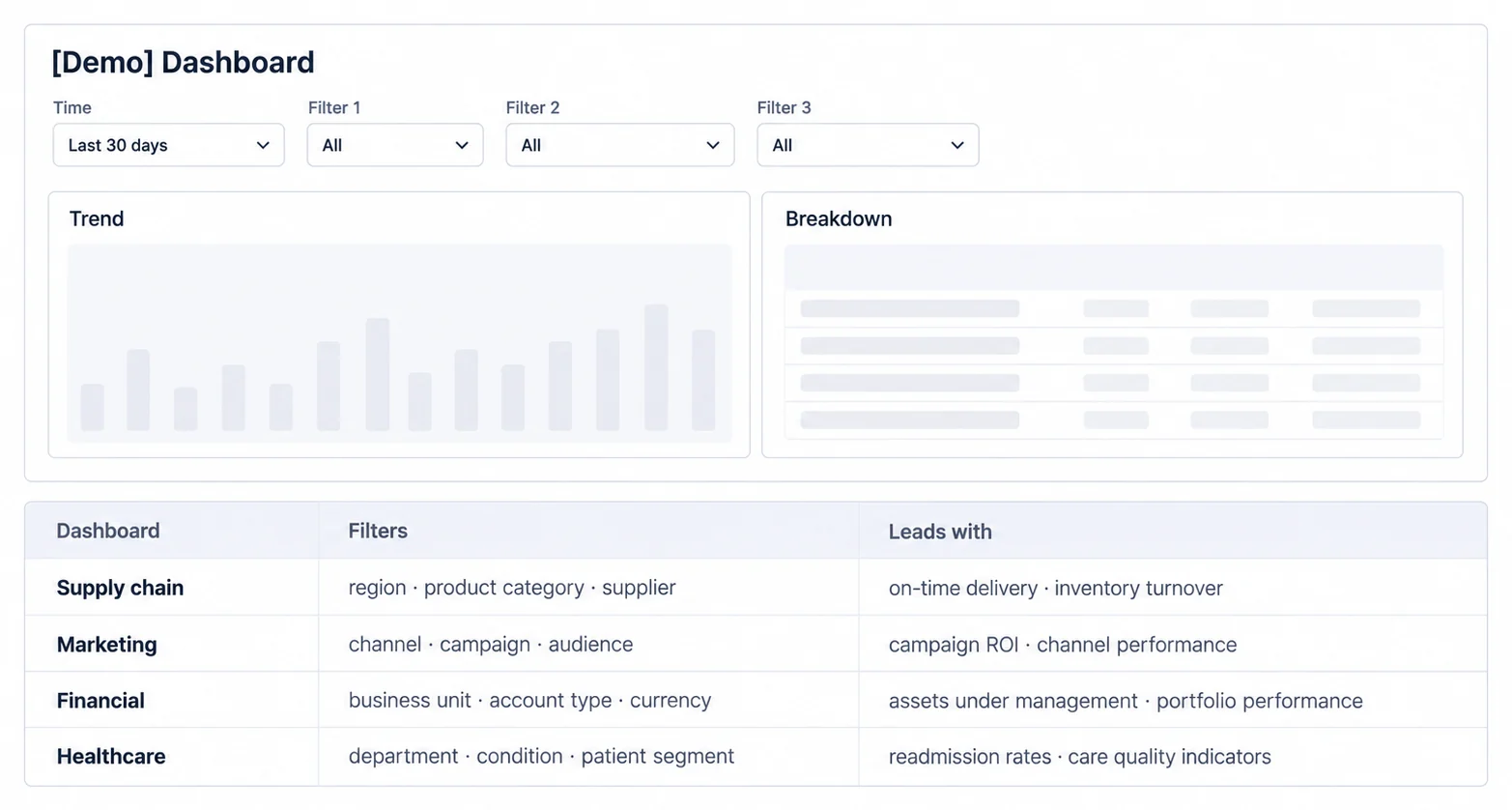
Different industries require different strategic metrics. We've created complete guides for:
- Healthcare Dashboard: Patient outcome metrics, readmission rates, care quality indicators, revenue per patient, payer mix analysis
- Financial Dashboard: Assets under management (AUM), portfolio performance, risk exposure metrics, fee income, client retention rate
- Marketing Dashboard: Campaign ROI, channel performance, lead generation costs, conversion funnel metrics, brand awareness indicators
- Supply Chain Dashboard: On-time delivery rate, inventory turnover, supplier performance, freight cost percentage, order accuracy
- Manufacturing Dashboard: Overall equipment effectiveness (OEE), production yield, cycle time, defect rate, capacity utilization
- Retail Dashboard: Same-store sales growth, inventory turns, gross margin return on investment (GMROI), customer foot traffic, basket size
- Real-Time Dashboard: Streaming metrics for time-sensitive industries (trading, logistics, emergency services)
For B2B SaaS companies, strategic dashboards are often the customer-facing layer you embed in executive portals. Your SaaS platform's customers want to show their executives how their business is performing using your product's data, which means you need white-label analytics that matches their branding, not yours.
Analytical Dashboards: the Question Is Not Known in Advance, So Exploration Is the Feature
An interactive data exploration environment that enables ad-hoc analysis, hypothesis testing, and deep-dive investigations. These dashboards provide dynamic filtering, drill-down capabilities, and complex visualizations for self-service analytics.
Analytical dashboards serve a fundamentally different purpose than operational or strategic dashboards. Instead of monitoring pre-defined metrics, analytical dashboards provide an interactive environment for ad-hoc exploration, hypothesis testing, and deep-dive analysis. These are the dashboards data analysts, business intelligence teams, and researchers use to answer questions that weren't anticipated when the dashboard was designed.
Interactivity Is What Makes an Analytical Dashboard Analytical
Interactivity: The defining feature of analytical dashboards is user control. Analysts need to filter data dynamically, change date ranges, switch dimension breakdowns, toggle between visualization types, and drill down from summary to detail without waiting for developers to build new reports.
Complex Visualizations: Analytical dashboards go beyond simple bar charts and line graphs. They include scatter plots for correlation analysis, heat maps for pattern detection, box plots for distribution analysis, cohort retention matrices, funnel visualization for conversion analysis, and pivot tables for multi-dimensional slicing.
Historical Data Access: While operational dashboards focus on current state and strategic dashboards emphasize recent trends, analytical dashboards provide access to full historical datasets (sometimes years of transaction records) to support longitudinal analysis, seasonal pattern detection, and year-over-year comparisons.
Ad-Hoc Query Building: The most sophisticated analytical dashboards let users construct custom queries without writing SQL. Drag-and-drop interfaces for selecting dimensions, measures, filters, and aggregations enable self-service analysis without requiring database expertise.
Analytical Dashboards Get Used Where the Question Is Not Known in Advance
Marketing Analytics: Campaign performance analysis (spend, impressions, clicks, conversions by channel, creative, audience segment), attribution modeling (first-touch, last-touch, multi-touch), cohort analysis (customer acquisition cohorts and their behavior over time), customer journey analysis (touchpoint sequences leading to conversion)
Product Analytics: Feature adoption analysis (which features drive retention vs churn), A/B test results evaluation (statistical significance testing, confidence intervals), user behavior flow analysis (navigation paths through product), activation funnel optimization (identifying drop-off points)
Financial Analytics: Profitability analysis by customer segment, product line, or sales channel; cost driver analysis (what factors most influence operating expenses); revenue variance analysis (actual vs budget, broken down by contributing factors)
Customer Analytics: Customer lifetime value (LTV) prediction models, churn risk scoring and analysis of churn indicators, customer segmentation based on behavior patterns, support ticket trend analysis to identify recurring product issues
Self-Service Means Answering Your Own Question Without Filing a Request
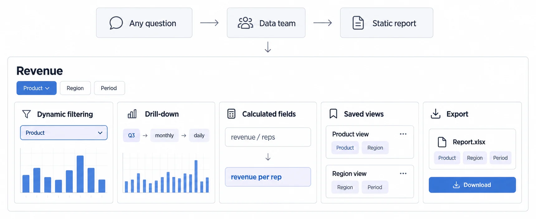
Modern analytical dashboards emphasize self-service, enabling business users to answer their own questions without submitting requests to the data team. Key self-service features include:
- Dynamic filtering: Users apply filters (date ranges, customer segments, product categories) and instantly see updated results without page reloads
- Drill-down navigation: Click on a summary metric to see underlying detail (e.g., click "Q3 revenue" to see monthly breakdown, then daily breakdown, then individual transactions)
- Custom calculated fields: Create ad-hoc metrics (e.g., "revenue per sales rep" = total revenue / number of reps) without database changes
- Saved views: Store frequently used filter combinations, dimension selections, and visualization settings for quick access
- Export capabilities: Download filtered data as CSV, Excel, or PDF for offline analysis or presentation to stakeholders
For embedded analytics, self-service analytics capabilities reduce your customer support burden dramatically. Instead of building custom reports for every customer request, you provide tools that let customers explore their data independently.
Tactical Dashboards: the Only Tier Where the Reader Can Still Move the Number
A mid-term progress monitoring interface that bridges strategic goals and operational execution. These dashboards track department or team performance against quarterly or monthly objectives, helping managers translate strategy into action.
Tactical dashboards occupy the middle ground between strategic and operational dashboards. They track progress toward mid-term objectives (typically weeks to months) and help middle management translate strategic goals into operational execution. If strategic dashboards answer "Are we heading in the right direction?" and operational dashboards answer "What needs attention right now?", tactical dashboards answer "Are we on track to hit this quarter's targets?"
Tactical Dashboards Carry Metrics a Manager Can Actually Move This Week
Update Frequency: Daily to weekly. Tactical dashboards need fresher data than strategic dashboards but don't require real-time updates. A sales manager reviewing pipeline health, a product manager tracking sprint velocity, or a marketing manager monitoring lead generation performance typically checks their tactical dashboard once daily or at the start of each week.
Department/Team Focus: While strategic dashboards span the entire organization and operational dashboards focus on specific processes, tactical dashboards are scoped to departments or teams. The sales team has tactical dashboards tracking quota attainment; the engineering team has tactical dashboards tracking sprint burndown; the marketing team has tactical dashboards tracking campaign performance.
Action-Oriented Metrics: Tactical dashboards emphasize metrics that middle managers can directly influence. A sales manager can coach reps to improve win rates, adjust pricing to improve deal size, or reallocate territory to balance pipeline. An engineering manager can adjust sprint scope, add resources to bottleneck areas, or change prioritization based on velocity trends.
Bridges Strategic and Operational: Tactical dashboards connect high-level strategic goals to day-to-day operational activities. If the strategic goal is "increase annual revenue by 25%", the tactical sales dashboard tracks weekly pipeline generation, sales cycle length, and win rate, the levers that determine whether the annual goal is achievable.
Each Department Runs Its Own Tactical Dashboard, and They Rarely Share Metrics
Sales Management: Pipeline health (stages, velocity, age of deals), quota attainment by rep and by team, win rate percentage by deal size and product, average deal size trends, sales cycle length, forecast accuracy (predicted vs actual close rates)
Marketing Management: Lead generation volume by channel, MQL to SQL conversion rates, campaign performance by objective (awareness, consideration, conversion), cost per lead by channel, content engagement metrics (downloads, views, time on page)
Product Management: Sprint velocity and burndown charts, feature adoption rates post-launch, product backlog health (sized stories ready for development), bug resolution time, customer feedback sentiment analysis, feature request voting
Operations Management: Team productivity metrics (output per FTE, cycle time), process efficiency indicators (time from order to fulfillment), resource utilization (capacity vs demand), quality metrics (defect rates, rework percentage), vendor performance (on-time delivery, quality scores)
Customer Success Management: Customer health scores, onboarding completion rates, product usage trends, support ticket volume and resolution time, renewal risk indicators, expansion opportunity pipeline, net promoter score (NPS) trends
Decision Timeframe Is the Cleanest Way to Tell the Three Types Apart
The clearest way to distinguish these three dashboard types is by decision-making timeframe:
- Strategic dashboards: Long-term direction (quarterly to annual). "Should we expand into enterprise market?" "Is our pricing model sustainable?" "Do we need to pivot product strategy?"
- Tactical dashboards: Mid-term execution (weekly to monthly). "Are we hitting this quarter's sales targets?" "Is the current sprint on track?" "Should we reallocate marketing budget between channels?"
- Operational dashboards: Immediate action (real-time to hourly). "Which customer support tickets are approaching SLA breach?" "Which server is experiencing high error rates?" "Which orders are stuck in fulfillment?"
A complete analytics strategy requires all three. Strategic dashboards set direction, tactical dashboards track progress toward strategic goals, and operational dashboards ensure day-to-day execution doesn't derail plans.
Most Dashboard Guides Cover What to Build and Skip How to Build It
Most dashboard guides focus on what to build but neglect how to build it effectively. Poor dashboard design, cluttered layouts, misleading visualizations, confusing color schemes, undermines even the best data infrastructure. These best practices synthesize Stephen Few's visual perception research, 2025 UX trends, and real-world embedded analytics implementation experience.
A Dashboard Has About Five Seconds to Deliver Its Primary Message
Prioritize the most important metrics: Users should grasp the dashboard's primary message within 5 seconds of viewing. Place the most critical KPIs in the upper-left corner (where Western readers begin scanning) or use size, color, and position to draw attention to key metrics.
Create an explicit reading order: Use size, local contrast, and whitespace to establish one first fixation, then group related metrics into regions. A dashboard should direct attention according to the decision, rather than assuming every reader follows a universal scan pattern.
Limit metrics per screen: Few (2013) recommends displaying no more than 5-7 key metrics on a single dashboard screen. More metrics create cognitive overload and force users to search rather than monitor. If you need to show more data, use multiple dashboards or drill-down navigation.
Group related metrics: Organize metrics into logical sections (financial, operational, customer) rather than scattering related information across the dashboard. Visual grouping (using whitespace, borders, or background colors) helps users quickly locate relevant information.
Colour Should Encode Information, and Never Be the Only Thing That Does
Use color meaningfully, not decoratively: Color should encode information (status, magnitude, category), not just make dashboards "pretty." Red/yellow/green for status indicators, hue for categorical distinctions, saturation for magnitude, these are meaningful color applications.
Respect color blindness: Approximately 8% of men and 0.5% of women have color vision deficiency. Never use color as the only way to encode information; supplement with icons, patterns, or text labels. Avoid red/green combinations for binary states.
Maintain sufficient contrast: Light gray text on white backgrounds may look elegant but frustrates users with visual impairments or those viewing dashboards on mobile devices in bright sunlight. WCAG 2.1 Level AA requires a contrast ratio of at least 4.5:1 for normal text.
Limit your color palette: Using 10 different colors for 10 data series creates a confusing rainbow. Stick to 3-5 primary colors plus neutral tones. Use the same color consistently across dashboards for the same metric (e.g., revenue is always blue, costs are always orange).
Choosing the Wrong Chart Type Is One of the Most Common Dashboard Errors
Choosing the wrong visualization type is one of the most common dashboard design errors. Chart types are not interchangeable, each excels at showing specific patterns.
Line charts: Best for time-series trends. Use when showing how metrics change over time (daily revenue, monthly user growth, quarterly sales). Multiple lines enable comparison of related trends.
Bar charts: Best for comparing discrete categories. Use when showing performance across regions, products, sales reps, or any nominal categories. Horizontal bars work better when category labels are long.
Pie charts: Use sparingly, only for part-to-whole relationships with 2-5 segments. Human perception struggles to compare angles; bar charts often communicate proportions more effectively.
Scatter plots: Best for showing correlation between two variables. Use when exploring whether relationships exist (e.g., marketing spend vs leads generated, customer satisfaction vs retention rate).
Heat maps: Best for showing patterns across two dimensions. Use for identifying hot spots (which product categories sell best in which regions, which hours of day have highest activity).
Dashboards Designed Only for Desktop Get Abandoned on the Phone
Dashboards get opened on phones, and the ones that were only designed for a desktop get abandoned there. We have no defensible figure for the share, so we are not quoting one; design for it regardless, because the cost of being wrong is one-sided. Key mobile design principles:
Vertical scrolling, not horizontal: Mobile screens are narrow; design dashboards that scroll vertically rather than requiring horizontal panning. Stack metrics in a single column rather than multi-column grid layouts.
Touch-friendly controls: Ensure buttons, filters, and interactive elements are at least 44x44 pixels (Apple's recommended minimum touch target size) with adequate spacing to prevent accidental taps.
Simplified visualizations: Complex multi-series line charts with 10 trend lines become illegible on mobile screens. Provide simplified mobile views that focus on 2-3 key metrics, with the ability to drill into detail on larger screens.
Conditional rendering: Use responsive design techniques to show different dashboard layouts on mobile vs desktop. Don't just shrink desktop dashboards, redesign them for mobile contexts (shorter attention spans, intermittent connectivity, one-handed usage).
Dashboard Performance Is Several Independent Dimensions, Not One Number
Dashboard performance has several independent dimensions: when primary content appears, whether the layout shifts, how quickly interactions receive visual feedback, when each metric becomes trustworthy, and whether filtering remains responsive under the real workload. Core Web Vitals does not define a universal three-second abandonment rule. Google's current Core Web Vitals thresholds classify LCP, INP, and CLS separately at the 75th percentile; a dashboard also needs product-specific data-freshness and interaction budgets.
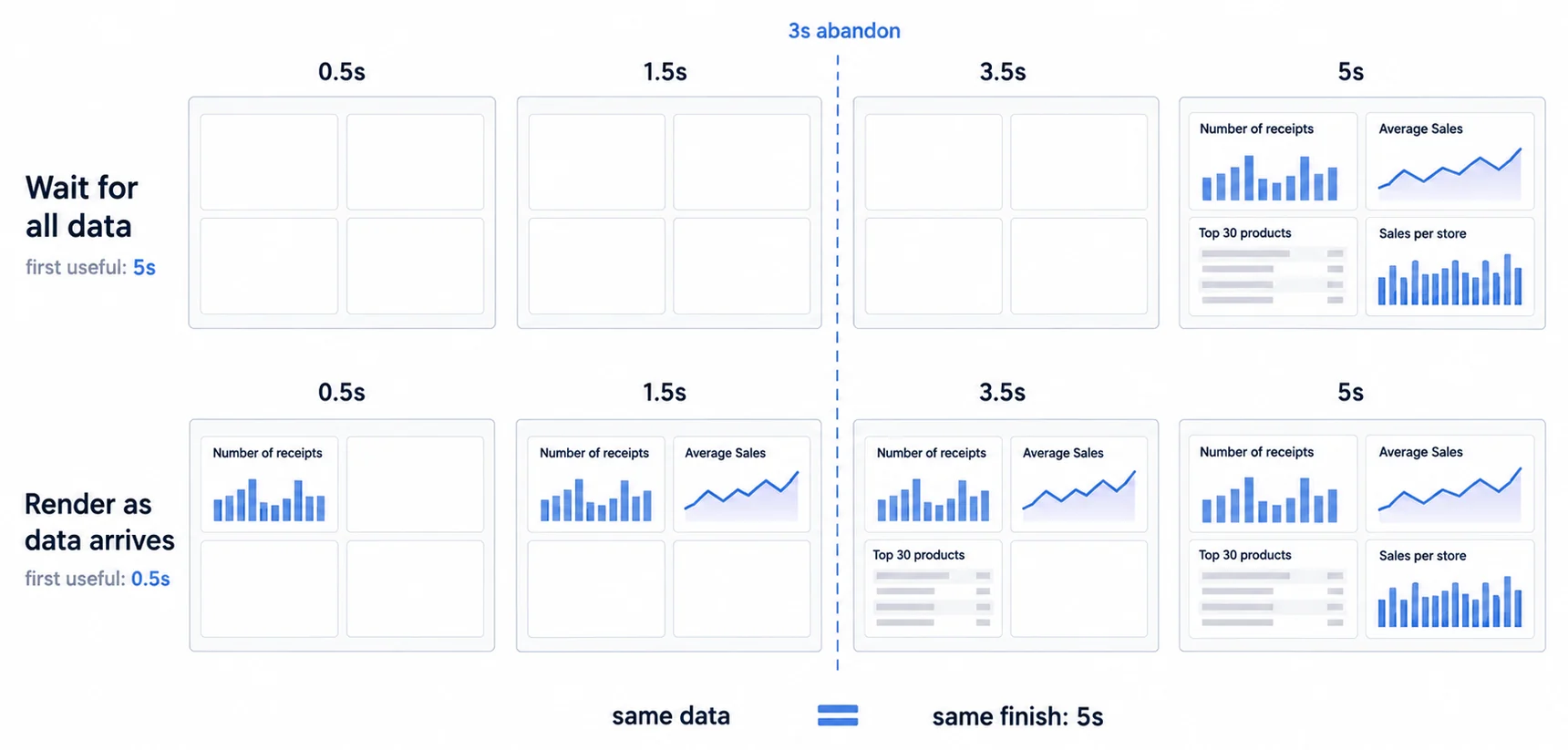
Trace the complete path: A slow dashboard can spend time in authentication, network setup, API queues, database work, serialization, transfer, JavaScript evaluation, layout, chart rendering, or third-party code. Capture a representative request and browser trace before deciding where to optimize. Indexes, pre-aggregation, caching, columnar storage, smaller payloads, and frontend changes solve different measured bottlenecks.
Incremental loading: When panels are independent, render the decision-critical region first and give every pending panel a stable skeleton, status, and error state. Progressive delivery is useful only when it does not create layout shift, display inconsistent filter states, or let users act on a partial result without knowing it.
Measure chart candidates: Apache ECharts documents Canvas and SVG renderers and recommends choosing from hardware, software environment, data volume, and functional requirements rather than a universal point threshold. Use the same visible marks, labels, interactions, update cadence, device matrix, and correctness criteria for every candidate; source-row count alone is not a benchmark. See the React chart library benchmark contract.
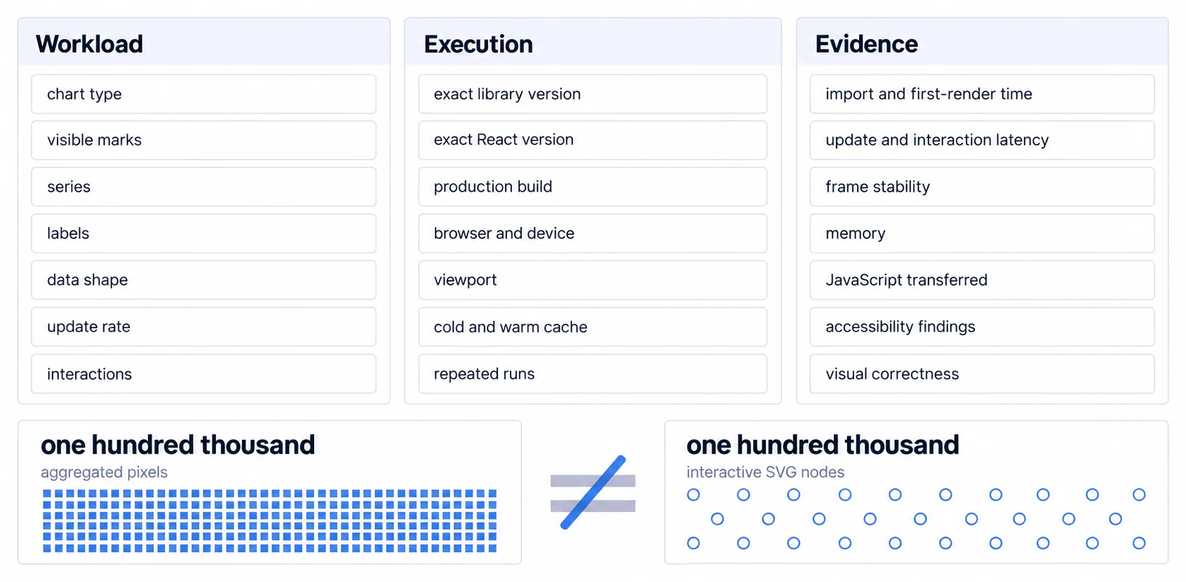
Data aggregation: Match the visible grain to the decision. A month-over-month view may use daily or weekly summaries while preserving drill-through to authorized detail. Record the aggregation rule, timezone, missing-period behavior, freshness, and reconciliation path so a faster chart does not silently change the metric.
A Dashboard Roadmap Is a Sequence of Decisions, Not a Sequence of Screens
Building effective dashboards requires more than technical execution, it demands structured discovery, iterative design, and continuous improvement. This five-phase implementation roadmap, refined through hundreds of embedded analytics deployments, prevents common pitfalls that derail dashboard projects.
Phase 1: Effective Dashboards Answer Specific Questions, So Find Them First
Define user personas: Different dashboard users have different needs. A CFO needs strategic financial dashboards; a sales manager needs tactical pipeline dashboards; a support agent needs operational ticket dashboards. Interview representatives from each persona to understand their decision-making contexts.
Identify key questions: Effective dashboards answer specific questions, not just "show data." What questions do users need answered to make decisions? "Are we on track to hit quarterly revenue targets?" "Which customer support agents need help?" "Which marketing channels generate highest ROI?"
Map data sources: Inventory available data sources (databases, APIs, SaaS tools) and assess data quality. Missing or unreliable data undermines even beautifully designed dashboards. Identify data gaps early and plan integration work.
Establish success metrics: How will you measure whether dashboards succeed? Common metrics: time to insight (how long it takes users to find answers), dashboard usage frequency, reduction in ad-hoc reporting requests, improvement in decision quality (measured through A/B testing outcomes).
Phase 2: One Dashboard Cannot Serve Every Type, So the Architecture Chooses
Choose dashboard type: Based on Phase 1 discovery, determine which dashboard type(s) you need. Don't try to build one dashboard that serves all purposes, operational, strategic, analytical, and tactical dashboards require different technical approaches.
Select technology stack: Compare build and platform options against the same named scope: data connectors, semantic definitions, tenant isolation, authoring, embedding, exports, accessibility, operations, support, and acceptance tests. Estimate roles, delivery units, dependencies, and recurring ownership for an internal build; verify platform scope and current terms on the pricing page. Universal timelines and cost ranges cannot represent those different boundaries.
Design multi-tenant architecture: Define the tenant boundary, authorization context, query enforcement, cache and export scoping, audit evidence, and bypass tests before implementation. The acceptance criterion is that one tenant cannot retrieve another tenant's data through supported or adversarial paths; no architecture can substitute an untested promise of zero risk.
Plan for measured growth: Define concurrency, tenant count, data volume, query mix, refresh cadence, export load, and recovery objectives for the next capacity boundary. Test that boundary and record which components scale horizontally, which depend on shared state, and where isolation or query performance begins to miss its budget.
Phase 3: Wireframe and Test With Real Users Before Anything Is Built
Create wireframes: Before building anything, sketch dashboard layouts on paper or in design tools. Experiment with metric placement, chart types, color schemes. Test layouts with actual users to validate information hierarchy and visual design.
Build prototypes: Use lightweight prototyping tools or your chosen dashboard platform to create functional prototypes with sample data. Interactive prototypes reveal usability issues that static mockups miss, can users find the filter controls? Is drill-down navigation intuitive?
Conduct user testing: Show prototypes to 5-10 representative users and observe how they interact with dashboards. What do they look at first? Where do they get confused? What questions can't they answer? Iterate designs based on feedback before investing in full implementation.
Define style guide: Document color schemes, typography, chart types, and layout patterns in a style guide. Consistent design across dashboards improves usability and reduces cognitive load when users switch between different dashboards.
Phase 4: Pipelines, Components and Row-Level Security Land Together
Implement data pipelines: Build or configure data connections from source systems to your analytics database. For API-first analytics platforms, this often means REST API calls or webhook integrations. For direct database connections, ensure proper security (SSL encryption, IP whitelisting, read-only credentials).
Build dashboard components: Implement dashboard layouts using your chosen technology. Modern approaches use component-based architecture with reusable elements. React dashboard components enable building complex dashboards by composing smaller, tested components.
Implement security controls: Apply row-level security rules to ensure users see only authorized data. In multi-tenant environments, this means tenant ID filtering on every query. In internal BI scenarios, this means role-based access control (RBAC) based on user groups.
Optimize performance: Profile the complete source-to-visible path, then apply the intervention that matches the bottleneck. Define separate acceptance budgets for primary content, interactions, data freshness, full-panel completion, memory, and correctness instead of one universal three-second target.
Phase 5: Verify Against the Source System, Then Pilot Before You Launch
Conduct QA testing: Verify dashboard accuracy against source systems, missing and late data, filter and timezone boundaries, tenant isolation, keyboard and screen-reader paths, exports, and measured performance against the acceptance budgets defined for the product fixture.
Pilot with beta users: Release dashboards to a small group before full launch. Gather feedback on usability, accuracy, and value. Monitor usage patterns to identify unused features or confusing elements.
Train users: Don't assume dashboards are self-explanatory. Provide training on dashboard navigation, filter usage, drill-down capabilities, and how to interpret visualizations. Create documentation (video tutorials, help text, tooltips) embedded in the dashboard.
Monitor adoption and iterate: Track dashboard usage metrics (daily active users, session duration, feature utilization) and gather continuous feedback. Most successful dashboard implementations iterate monthly based on user feedback, adding new metrics, removing unused features, and refining layouts.
Each Department Needs Different Metrics, and the Same Metric at Different Depth
Different organizational functions require different metrics. A sales team cares about pipeline velocity; an engineering team cares about sprint burndown; a finance team cares about cash flow. This section provides metric frameworks for six core business functions.
Sales Dashboards Track the Pipeline, the Revenue and the Forecast Separately
Pipeline metrics: Total pipeline value, pipeline coverage ratio (pipeline value / quota), pipeline velocity (how fast deals move through stages), stage conversion rates, average deal size, new pipeline generation rate (weekly or monthly)
Revenue metrics: Monthly recurring revenue (MRR), annual recurring revenue (ARR), revenue growth rate, quota attainment percentage by rep, win rate (closed-won / total opportunities), average sales cycle length, revenue by product line
Forecasting metrics: Weighted pipeline forecast (probability-weighted deal values), forecast accuracy (predicted vs actual close), upside opportunities (deals not yet in forecast), commit vs. best case scenarios
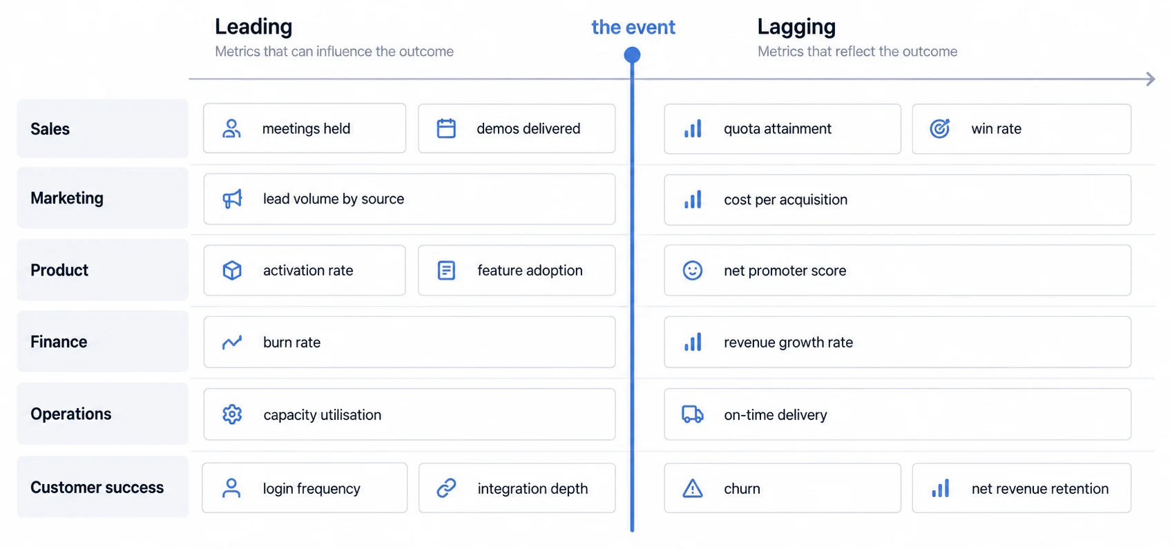
Activity metrics: Meetings held, demos delivered, proposals sent, follow-up completion rate. While lagging indicators (revenue) show results, leading indicators (activity) predict future performance.
Marketing Dashboards Trace Spend to Lead and Then to Revenue
Campaign performance: Campaign ROI by channel (revenue generated / campaign spend), cost per lead (CPL) by source, cost per acquisition (CPA), return on ad spend (ROAS), campaign engagement metrics (click-through rate, conversion rate)
Lead generation: Lead volume by source and campaign, marketing qualified lead (MQL) volume, MQL-to-SQL conversion rate, SQL-to-opportunity conversion rate, lead velocity (rate of lead generation growth)
Content marketing: Website traffic by source, content engagement (time on page, scroll depth, downloads), organic search rankings for target keywords, backlink acquisition rate, content conversion rates
Attribution: First-touch attribution (which campaign first touched a customer?), last-touch attribution (which campaign closed the deal?), multi-touch attribution (how did all touchpoints contribute?)
Product Dashboards Measure Adoption, Starting With Time to First Value
Adoption metrics: Product activation rate (percentage of users who complete onboarding), time to value (how long until users achieve first meaningful outcome), daily/monthly active users (DAU/MAU), feature adoption rate (percentage of users who use each feature)
Engagement metrics: Session frequency, session duration, feature usage depth (basic vs advanced features), user journey paths (how users work through the product), retention cohorts (what percentage of users remain active over time)
Product-qualified leads (PQLs): Users demonstrating buying intent through product usage (e.g., hitting usage limits, inviting team members, requesting enterprise features)
Product feedback: Net promoter score (NPS), customer satisfaction score (CSAT), in-app feedback submission rate, feature request voting, bug report volume by severity
Finance Dashboards Separate Recurring Revenue From Everything Else
Revenue metrics: Total revenue, revenue by product/service line, recurring vs non-recurring revenue, revenue per customer, revenue growth rate (month-over-month, year-over-year)
Profitability: Gross margin percentage, operating margin, EBITDA, contribution margin by product, customer lifetime value (LTV), customer acquisition cost (CAC), LTV:CAC ratio
Cash management: Cash balance, burn rate (monthly cash consumption), cash runway (months of cash remaining at current burn rate), accounts receivable aging, days sales outstanding (DSO), accounts payable aging
Financial forecasting: Revenue forecast vs actual, expense forecast vs actual, cash flow projections, scenario analysis (best case, base case, worst case)
Operations Dashboards Measure Cycle Time, Throughput and Spare Capacity
Process efficiency: Cycle time (time from start to completion), throughput (units processed per time period), capacity utilization (actual output / maximum capacity), bottleneck identification (which process steps slow overall flow)
Resource management: Labor utilization (billable hours / total hours), equipment uptime percentage, inventory turnover ratio, order fulfillment rate, on-time delivery percentage
Quality metrics: Defect rate, rework percentage, customer complaint volume, first-time fix rate (resolved on first attempt), return rate, warranty claim rate
Cost metrics: Cost per unit produced, cost per transaction, overhead allocation, labor cost percentage, materials cost percentage
Customer Success Dashboards Fold Usage, Tickets and Payment Into One Health Score
Customer health scoring: Composite health scores combining product usage, support ticket volume, payment status, expansion opportunity indicators, renewal risk factors
Usage tracking: Login frequency, feature adoption, integration depth (how many connected systems), user license utilization (active seats / total seats purchased)
Support metrics: Ticket volume by priority, average resolution time, first-response time, customer satisfaction (CSAT) scores, support ticket trend analysis
Retention and expansion: Customer churn rate, logo churn vs revenue churn, net revenue retention (NRR), expansion MRR, contraction MRR, reactivation rate
The Dashboard Technology Stack Decides Which Team Owns Which Failure
Understanding dashboard technology architecture helps B2B SaaS companies make informed build-vs-buy decisions. This section separates frontend, transport, query, storage, and embedding contracts so candidates can be compared against the same workload and ownership boundary.
The Frontend Framework Should Follow the Host Product, Not the Dashboard
React: React's official documentation defines UI as reusable, nestable components. It can fit an embedded dashboard when the host product already uses React or when a component boundary matches the team's ownership model. Runtime performance still depends on the application tree, state flow, payload, rendering work, and chart implementation. Common React chart candidates include Recharts, Victory, Nivo, and wrappers around Apache ECharts.
Vue.js: Vue provides its own component and reactivity model. Evaluate it when it matches the host application, team skills, server-rendering strategy, and embedding boundary; do not infer implementation time from a generic learning-curve ranking.
Angular: Angular can fit products already standardized on its framework, dependency-injection, routing, and build conventions. Measure the dashboard route and integration contract rather than treating framework popularity as a capability requirement.
Framework-agnostic web components: Some embedded analytics platforms provide framework-agnostic web components that work with any frontend stack. This approach maximizes flexibility but may sacrifice some framework-specific optimizations.
REST, GraphQL and WebSockets Each Suit a Different Refresh Pattern
RESTful APIs: Standard approach for dashboard data APIs. Dashboards make HTTP requests to REST endpoints that return JSON data. Simple, stateless, well-understood, but can become chatty (multiple requests for complex dashboards).
GraphQL: Growing adoption for analytics APIs because dashboards can request exactly the data they need in a single query. Reduces over-fetching (getting unused data) and under-fetching (requiring multiple requests). Complexity: requires GraphQL schema design and client-side query management.
WebSocket connections: WebSockets provide a persistent bidirectional channel. They are a candidate when the dashboard and server both need to send messages over the same connection, but the choice still depends on reconnect behavior, ordering, backpressure, authorization refresh, infrastructure support, and the actual real-time analytics decision window.
Server-sent events (SSE): The browser EventSource contract lets a server push event data to a page over a one-way stream. It can fit server-to-client updates when the product does not need bidirectional messaging on the same channel. Compare connection limits, proxy timeouts, retry and event-ID behavior, authentication, and infrastructure support with the WebSocket and polling alternatives.
The Store You Pick Decides Which Queries Stay Fast as the Data Grows
OLTP databases (PostgreSQL, MySQL): Operational databases prioritize transactional workloads. They can also serve analytical reads when the schema, indexes, replicas, materialized views, concurrency, freshness, and query shapes meet the dashboard contract. Row count alone does not decide suitability.
Analytical warehouses and databases (Snowflake, BigQuery, Redshift, ClickHouse): These systems provide different storage, execution, ingestion, scaling, and pricing models for analytical queries. Compare the representative query mix, concurrency, freshness, tenant isolation, operations, and cost; a source-table row threshold does not establish which product fits.
Time-series systems (InfluxDB, TimescaleDB, Prometheus): Time-oriented systems expose different retention, downsampling, label, query, and ingestion contracts. Evaluate them when the dashboard workload depends on those semantics, then test the real cardinality and query windows.
Data lakes and lakehouse systems: Object storage with catalogue, table-format, and query layers can support exploration, machine learning, and dashboard serving. Whether it meets an interactive dashboard budget depends on file layout, metadata, caching, engine, concurrency, freshness, and query shape; the architecture label alone does not establish latency.
Iframe, SDK and API-First Trade Integration Speed Against Control
iFrame embedding: Simplest approach, dashboard hosted on analytics platform's domain, embedded via HTML <iframe> tags in your application. Fastest implementation (minutes) but limited customization, performance overhead (full page load), and potential security concerns (clickjacking).
SDK integration: Dashboard rendered natively in your application using JavaScript SDK. Provides full control over styling, smooth user experience (no iframe boundaries), better performance (shared resources), and tighter security. Requires more development work (hours to days) but delivers superior user experience.
API-first / headless approach: You build your own dashboard UI using your design system and framework, consuming data from embedded analytics platform's API. Maximum flexibility and control, but you're responsible for building and maintaining all visualization components.
Multi-Tenancy Is the Architecture Decision Everything Else Depends On
For B2B SaaS companies embedding dashboards for thousands of customers, multi-tenancy is the critical architectural decision. Three common patterns:
Shared database, shared schema: All customers' data in same database and tables, distinguished by tenant_id column. Queries filter by tenant_id to isolate data. Most efficient for resource utilization but highest risk if tenant_id filter is missed.
Shared database, separate schemas: All customers in same database but each has separate schema (namespace). Provides logical separation while sharing database infrastructure. Medium isolation, medium resource efficiency.
Separate databases per tenant: Each customer gets dedicated database. Maximum isolation and security, easy to migrate customers between servers, but highest infrastructure cost and operational complexity.
Most embedded analytics platforms use shared database, shared schema approach with mandatory tenant_id filtering to balance security, performance, and cost.
Dashboard Security Starts After Authentication, Not At It
Dashboard security goes beyond user authentication. Embedded analytics platforms handling sensitive business data must implement defense-in-depth security: encryption, access control, audit logging, and compliance with industry regulations.
Row-Level Security Decides What Each User Sees Before the Query Returns
Row-level security ensures users see only data they're authorized to access. In multi-tenant environments, RLS enforces tenant_id filtering on every query. In role-based systems, RLS filters data by user attributes (region, department, team).
RLS implementation belongs at an independently enforced boundary and must survive application mistakes and bypass attempts.
- Query rewriting: Analytics platform intercepts user queries and automatically injects filters based on user context. Most transparent to users but requires reliable query parsing.
- Secure views: Database views with built-in filters based on session context (e.g., current_user, current_tenant). Simple but limited flexibility.
- Application-level filtering: Application code adds filters before executing queries. Maximum control but requires discipline to apply consistently.
Testing RLS: Security testing must verify users cannot bypass RLS filters through URL manipulation, API tampering, or SQL injection. Common test: attempt to access competitor tenant's data by changing tenant_id in request.
Embedded Dashboards Should Reuse Your Existing Sign-In, Not Add Another
Single sign-on (SSO): Embedded dashboards should integrate with your application's existing authentication (SAML, OAuth 2.0, OpenID Connect). Users shouldn't log in separately to access analytics. It's part of your product.
Token-based authentication: When embedding dashboards, your application generates short-lived, signed tokens that grant access to specific dashboards for specific users. Tokens encode user identity, tenant context, and permissions. Analytics platform verifies token signatures before rendering dashboards.
Role-based access control (RBAC): Define roles (admin, analyst, viewer) with different permission levels (create dashboards, edit dashboards, view only). Assign users to roles; grant permissions to roles, not individual users.
Attribute-based access control (ABAC): More granular than RBAC; access decisions based on user attributes (department, level, location), resource attributes (data classification, owner), and environmental context (time of day, IP address).
Encryption Applies at Rest, in Transit, and Sometimes to the Field Itself
Encryption at rest: All data stored in databases, data warehouses, and backups must be encrypted using industry-standard algorithms (AES-256). Encryption keys should be managed by hardware security modules (HSMs) or cloud key management services (AWS KMS, Azure Key Vault).
Encryption in transit: All API requests and dashboard data transfers must use TLS 1.2 or higher. Dashboards loaded over unencrypted HTTP connections expose sensitive business data to interception.
Field-level encryption: For highly sensitive data (PII, financial information, health records), consider encrypting specific database columns. Dashboard queries decrypt data only when authorized users request it.
Audit Logs Carry a Retention Period, and Regulation Sets It at Two to Seven Years
Complete audit trails: Log all dashboard access (who viewed what, when), data queries executed, user actions (export, filter, drill-down), permission changes, and security events (failed authentication, unauthorized access attempts).
Retention policies: Regulations like GDPR, SOX, HIPAA require retaining audit logs for specific periods (typically 2-7 years). Implement automated log archival and ensure archives are tamper-proof (write-once storage).
Compliance frameworks: Depending on your industry and geography, embedded analytics may need to comply with:
- SOX (Sarbanes-Oxley): Financial reporting controls for public companies
- GDPR (General Data Protection Regulation): EU data privacy regulation
- HIPAA (Health Insurance Portability and Accountability Act): US healthcare data protection
- SOC 2 Type II: Service organization control audit for data security
- ISO 27001: International information security management standard
Most embedded analytics vendors provide compliance documentation (SOC 2 reports, GDPR data processing agreements, HIPAA business associate agreements) that you can use rather than building compliance infrastructure yourself.
Operational Dashboards Get Opened on Phones More Than Any Other Type
Operational dashboards get opened on phones more than anything else on this list, because the people watching them are rarely at a desk. We have no defensible figure for the share and are not quoting one, which is the same position this guide takes on it earlier. Treating mobile as an afterthought rather than a core design constraint guarantees poor user experience and low adoption.
Mobile-First Means Designing for the Smallest Screen and Enhancing Upward
Start with mobile constraints: Design dashboards for smallest screens first, then enhance for larger displays (progressive enhancement). This approach forces prioritization, what metrics are truly essential?, and prevents cluttered desktop dashboards from being crammed into mobile screens.
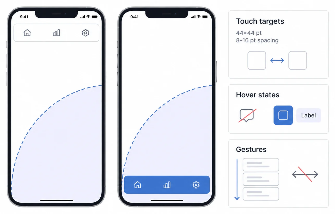
Touch-optimized interactions: Mobile users interact via touch, not mouse hover. Design for:
• Tappable elements: Minimum 44x44 pixel touch targets with 8-16 pixel spacing to prevent accidental taps
• Gestures: Swipe between dashboard pages, pinch-to-zoom on charts, pull-to-refresh data
• No hover states: Tooltips triggered by hover don't work on touch devices; use tap-to-reveal or persistent labels
Thumb-friendly navigation: Most users hold phones in one hand and work through with their thumb. Place primary navigation and controls within easy thumb reach, bottom of screen, not top.
Mobile Dashboards Stack Vertically Where Desktop Ones Use Columns
Vertical stacking: Desktop dashboards often use multi-column grid layouts (2-4 columns). Mobile dashboards should stack metrics vertically in a single column to avoid horizontal scrolling.
Conditional rendering: Use CSS media queries or JavaScript to show different dashboard layouts on mobile vs desktop. Don't just shrink desktop dashboards, redesign for mobile contexts:
• Show simplified visualizations (single-line chart instead of 5-line comparison)
• Hide secondary metrics (display top 3 KPIs, hide remaining 7)
• Collapse filters into expandable panels to preserve vertical space
Progressive disclosure: Show summary metrics immediately, provide drill-down to detail on tap. A mobile sales dashboard might show total monthly revenue prominently, with ability to tap and see daily breakdown, then individual transaction list.
Mobile Networks Are Slower, So the Payload Has to Shrink First
Reduce data payload: Mobile devices often have slower network connections than desktop (4G vs WiFi). Minimize data transferred:
• Return aggregated data, not raw records (daily summaries instead of hourly data points)
• Implement pagination (load 20 records at a time instead of 1,000)
• Use data compression (gzip, Brotli)
Optimize image rendering: High-resolution chart images consume bandwidth and memory. Use vector graphics (SVG) that scale without quality loss and compress efficiently. For raster images, serve appropriately sized images for mobile screens (don't send 2000x1000 pixel charts to display in 400x200 pixel containers).
Implement lazy loading: Load only visible dashboard components on initial page load. As users scroll, load additional charts and metrics. This perceived performance improvement keeps users engaged even if full dashboard takes 10+ seconds to load.
Field Work Means Intermittent Connectivity, So Offline Stops Being Optional
For industries with intermittent connectivity (field service, healthcare, retail), offline dashboard capabilities are essential:
Service workers and caching: Use browser service workers to cache dashboard assets (JavaScript, CSS, chart libraries) and recently viewed data. When network connection is lost, dashboards continue functioning with cached data.
Sync on reconnect: Queue user interactions (filters applied, drill-downs executed, exports requested) while offline. When connection restores, sync queued actions and refresh dashboard with latest data.
Offline-first design: Show cached data with clear indicators (Last updated: 2 hours ago) rather than broken dashboards. Users prefer seeing slightly stale data to seeing nothing.
Further Reading
- KPI Dashboard Examples, real-world KPI layouts by industry
- Responsive Dashboard Design, building dashboards that work on any screen
- Interactive Dashboard Features, drill-down, filtering, and cross-filtering patterns
- Data Visualization Best Practices, visual design principles for dashboards
- Multi-Tenant Analytics Architecture, how tenant isolation works at scale
- React Dashboard Components, embedding dashboard types using React
- Building analytics reports, how to plan, build, test and maintain the report itself
Choose Dashboard Types by Decision Context and Operating Requirements
Dashboard types aren't arbitrary categories, they reflect fundamental differences in user needs, decision-making contexts, and technical requirements. Operational dashboards demand real-time data streaming and alert systems for immediate action. Strategic dashboards require aggregated trends and forecasting for long-term planning. Analytical dashboards need interactive exploration and drill-down capabilities for ad-hoc analysis. Tactical dashboards bridge strategic goals and operational execution through mid-term progress tracking.
For B2B SaaS companies, understanding these distinctions prevents one interface from mixing incompatible audiences, freshness levels, and interaction models. A product may need one pattern or several, delivered with the required branding, tenant isolation, accessibility, and operational controls.
Purpose-built embedded analytics platforms can reduce the amount of infrastructure a product team owns, but the result still depends on the selected scope and implementation. Verify every required dashboard pattern, SDK boundary, tenant test, pricing unit, capacity limit, export path, and support responsibility in writing.
Ready to evaluate operational, strategic, analytical, and tactical dashboard patterns? Explore Sumboard's embedded analytics platform and validate its SDK, multi-tenancy, and white-label capabilities against your acceptance scope.
Ready to launch customer-facing analytics?
Stop losing customers to competitors with better analytics. Sumboard's customer-facing analytics platform lets you launch self-service dashboards in days, not months.