

Data visualization is the graphical representation of information and data using visual elements such as charts, graphs, maps, and dashboards to make complex data accessible and understandable.
What Data Visualization Means in Analytics Products
Data visualization is the graphical representation of information and data using visual elements such as charts, graphs, maps, and dashboards. In embedded analytics platforms, those representations place comparisons, trends, distributions, relationships, and exceptions inside a product workflow.
The widely repeated five-digit multiplier comparing visual and text processing does not provide a reproducible experiment, task definition, or unit of measurement. Controlled graphical-perception research asks a narrower and useful question: how accurately do people decode values from particular visual encodings? In the foundational experiments by Cleveland and McGill, judgments based on position along a common scale and length were generally more accurate than judgments based on angle or area for the tested tasks. That evidence supports task-specific encoding choices; it does not establish a universal visualization speed multiplier.
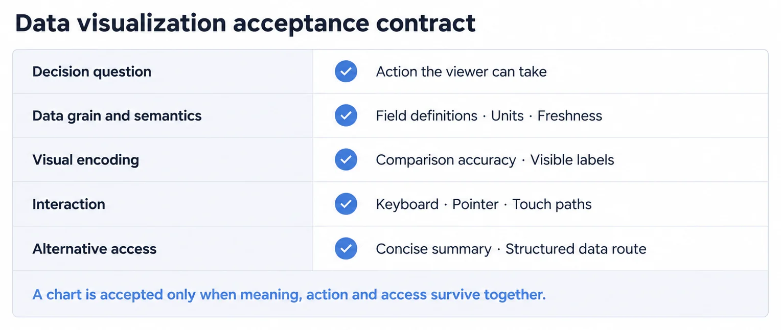
Modern data visualization supports several distinct analytical jobs: comparing categories, tracking change, inspecting distributions, testing relationships, locating spatial patterns, and communicating a finding through data storytelling. A useful design begins with the decision question and data semantics, then selects an encoding and interaction model that preserves the required precision.
Accessibility is part of the data contract, not a finishing layer. The W3C Web Accessibility Initiative calls for descriptions of the data represented in charts and diagrams and teaches authors to provide structured data tables as alternatives to visualizations where appropriate. A chart should preserve keyboard access, non-color cues, meaningful text, and a route to the underlying values required by the audience.
Five Characteristics Define Effective Data Visualization
What defines effective data visualization:
- Task-aligned comparison: Places the marks required for a comparison in the same view and uses an encoding whose precision matches the decision
- Common Visual Formats: There are many chart types to choose from, bar charts, line graphs, pie charts, scatter plots, histograms, heat maps, geographic maps, and interactive dashboards, each serving specific purposes based on data type and communication goals
- Decision context: Keeps units, time range, source, freshness, filters, uncertainty, and comparison baseline close enough to prevent a visually correct mark from supporting the wrong conclusion
- Storytelling discipline: Uses annotation and sequence to explain a finding without changing scales, hiding counterevidence, or severing claims from their source values
- Equivalent access: Provides meaningful text, keyboard behavior, non-color cues, and a structured route to values. Data visualization best practices and common visualization mistakes cover implementation patterns in more detail
Five Questions Cover Most Charts, and Each One Narrows the Encoding
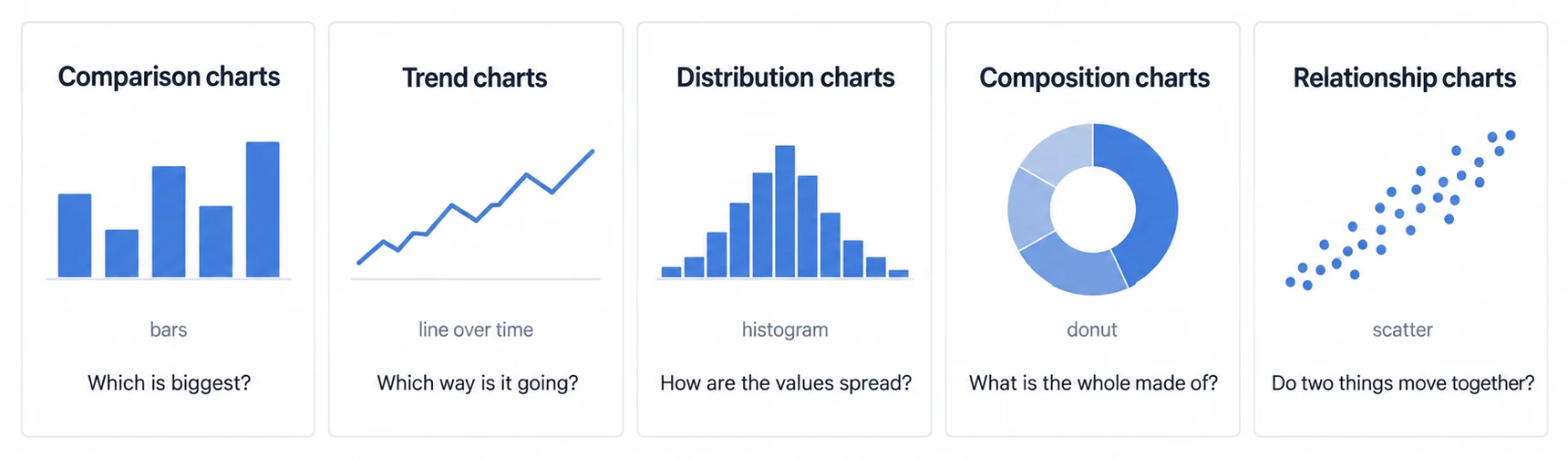
Chart choice is a decision about the question, not about taste, and naming the question first removes most of the options before anyone argues about them. Comparison asks which is biggest, and bars answer it. Trend asks which way it is going, and a line over time answers it. Distribution asks how the values are spread, and a histogram or box plot answers it. Composition asks what the whole is made of, and a pie, donut, or treemap answers it only where the parts genuinely sum to that whole. Relationship asks whether two things move together, and a scatter answers it. The chart types reference guide works through more than forty shapes inside those five families.
Precision follows from the same choice. Where a reader has to decode a value rather than rank two of them, the graphical-perception results above point at position along a common scale and length rather than angle or area.
A Chart Misleads Through Its Encoding More Often Than Through Its Data
Most misleading charts contain no false numbers. The distortion enters through the encoding. A truncated y-axis can turn a two percent movement into a cliff. A rainbow palette assigns an order the categories never had. A third dimension carries no data while distorting the two that do. A pie whose slices do not sum to a whole is measuring something other than composition. Seven worked visualization mistakes take each mechanism apart with the corrected version beside it, which is also the reason a review step belongs in the design contract rather than after launch.
Inside a Product, the Constraint Is the Interaction Budget, Not the Chart Library
A chart in a report is read once by someone who chose to open it. A chart inside a product is opened repeatedly by someone doing a different job, often on a phone, often while something else is still loading. That changes what a good visualization is: fewer marks per view, a default that answers the common question without configuration, an interaction that returns an answer rather than opening a builder, and a render cost that survives a customer's data volume rather than a demo set. Our notes on embedded dashboard design work through the render-cost side of that budget.
Live Data Changes the Design Problem From Reading to Re-Reading
When a view refreshes underneath the reader, the question stops being whether the encoding is accurate and becomes whether a change is noticeable and worth noticing. A value that moves while someone is watching needs a stable axis so that movement means movement, a visible timestamp so a stale view cannot pass as a live one, and a refresh rate matched to how quickly anyone can actually act. Real-time data visualization covers the delivery side of that.
Related Data Visualization Concepts and Guides
- Chart types guide: more than forty charts grouped by the question each one answers.
- Choosing a chart by the question it answers, rather than by how it looks
- Seven ways a visualization kills adoption, with what to do instead
- KPI dashboard examples, worked through by team and use case
- When real-time actually matters, and when it is a maintenance bill
- AI Analytics Guide, how machine learning is reshaping how insights are surfaced and presented
Build visual analytics into your product
See how Sumboard delivers interactive, white-labeled dashboards with powerful visualization capabilities