Most B2B SaaS product teams invest months building customer-facing analytics, only to watch users bypass their dashboards entirely. They export to Excel, use external BI tools, or simply ignore the features you worked so hard to deliver.
The culprit? Bad data visualization.
When data visualization goes wrong, it doesn't just look unprofessional, it makes the reading task harder. Users must decode the chart before they can evaluate the data, and avoidable ambiguity weakens trust in the result.
In this guide, we'll walk through 7 real examples of bad data visualizations that plague customer-facing analytics, explain why they fail, and show you how to fix them. Whether you're building embedded dashboards for your SaaS product or designing internal analytics, these lessons will help you create visualizations your users will actually use.
Example 1: A truncated y-axis turns a two percent change into a cliff
A Cropped Y-Axis Exaggerates Small Differences Because Readers Compare Bar Lengths
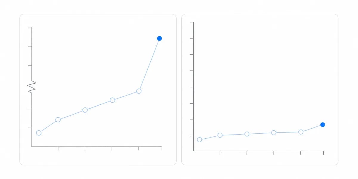
For bar charts, a cropped y-axis can exaggerate small differences because viewers compare bar lengths. The same rule does not apply mechanically to every chart: a line chart may use a narrower, clearly labeled range when the task is to inspect variation rather than compare magnitude from zero.
Imagine a bar chart comparing two products: Product A shows 46% adoption, Product B shows 47% adoption. If the y-axis starts at 45%, Product B's bar appears twice as tall as Product A's, visually suggesting a massive difference when the actual gap is just 1 percentage point.
End Users Decide on the Exaggerated Version, and Then Stop Trusting the Platform
When customer-facing dashboards use truncated axes, end users make decisions based on exaggerated data. A product manager might panic about a "massive drop" in engagement that's actually a 2% decline. A sales team might over-invest in a "winning strategy" that's marginally better than alternatives.
Worse, when users discover the manipulation (even if unintentional) they lose trust in your entire analytics platform.
How to Fix It
Use a zero baseline when bar length represents magnitude. If a different range is necessary, make the boundary conspicuous and choose a form that does not imply magnitude from a hidden baseline. Consider:
- Using a broken axis indicator (though sparingly)
- Adding clear labeling that explains the scale
- Including reference lines that show the zero baseline
- Choosing a different chart type (like a bullet chart) that handles ranges better
Modern embedded analytics platforms should make this the default behavior, with clear configuration options for cases that require different ranges.
Example 2: A rainbow palette assigns meaning the data never had
Hues Assigned Without Meaning Make the Reader Decode Instead of Read
Colors should amplify your message, not obscure it. Yet many dashboards use colors randomly, assigning different hues to categories without any semantic meaning, or using so many colors that the visualization becomes visual noise.
A common mistake: showing 15 different product categories in 15 different colors, forcing users to constantly reference a cluttered legend to understand what they're seeing.
The Dashboard Becomes a Puzzle to Solve Rather Than a Tool for Insight
When colors lack meaning, users can't quickly identify patterns or trends. The dashboard becomes a puzzle to solve rather than a tool for insight. For customer-facing analytics in B2B SaaS, this means:
- Longer time-to-insight for end users
- Increased support requests ("What does this color mean?")
- Reduced dashboard adoption as users find it frustrating
- Professional credibility damage (it looks amateur)
How to Fix It
Follow these color best practices:
Use only the distinctions the task needs. If category names are already visible, a different hue for every bar often duplicates information instead of adding it.
Assign meaning deliberately. Status colors depend on product conventions and context, so define them once and keep the mapping consistent rather than assuming every audience reads a hue the same way.
Use color strategically to highlight the most important data point, not to label every category.
Do not rely on color alone: Use direct labels, patterns, shapes, or line styles so the distinction remains readable when two hues are hard to separate.
When building white-label analytics for your SaaS product, establish a color system aligned with your brand. Sumboard's white-label theming ensures color consistency across all customer-facing visualizations.
Example 3: A 3D chart adds a dimension that carries no data and distorts the ones that do
Perspective Distortion Makes Some Data Points Look Larger Than They Are
3D charts might look impressive in a presentation, but they're a visualization disaster. The added dimension creates perspective distortion, making some data points appear larger or smaller based on their position, not their actual value.
A 3D pie chart is particularly problematic: slices in the foreground appear larger than identical slices in the background, purely due to perspective effects.
Readers Ignore the Chart and Read the Numbers Instead
Users literally cannot trust 3D charts. The visual appearance contradicts the actual data, forcing users to ignore the chart entirely and read numerical labels instead. This defeats the entire purpose of visualization: quick, accurate pattern recognition.
For customer-facing analytics, 3D charts signal that you prioritize aesthetics over accuracy, exactly the wrong message for data-driven products.
How to Fix It
Never use 3D charts. Period.
If someone requests "more visual impact," use hierarchy, labeling, annotation, or interaction without adding perspective that changes perceived size.
Sumboard's chart library focuses on clean, accurate 2D visualizations that prioritize data integrity over visual gimmicks.
Example 4: A screen of unrelated charts has no reading order, so it has no argument
Showing Everything at Once Produces Charts That Show Nothing
Trying to show everything at once creates charts that show nothing useful. A line chart with 15 different metrics, a scatter plot with 500 unlabeled points, or a table with 50 columns, these aren't helpful visualizations, they're data dumps.
The intention is good (show complete data), but the execution backfires. Users can't identify patterns, compare values, or draw conclusions when faced with overwhelming information density.
Overload Obscures the Questions the Dashboard Was Built to Answer
Information overload obscures the questions a dashboard is meant to answer. When users face a wall of cluttered charts, they may:
- Export to Excel to create their own simplified views
- Use external BI tools that offer better filtering
- Simply stop using your analytics features entirely
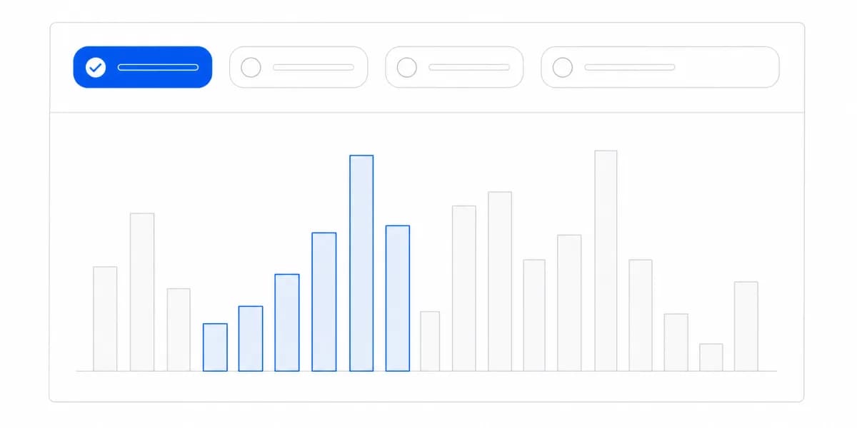
This is where the gap between static and interactive dashboards becomes critical. A static chart showing 20 data series is overwhelming. An interactive dashboard that shows 3 series by default (but lets users explore the other 17 through filters) is powerful.
How to Fix It
Design for progressive disclosure: Show the most important information first, with interactive controls that let users drill deeper.
Use filters, not clutter: Instead of displaying all product categories at once, show top 5 by default with a filter to explore others.
Create multiple focused charts rather than one complete chart. Each visualization should answer one clear question.
For customer-facing analytics, this means building dashboards with custom filters that empower users to explore data on their terms, not force-feeding them everything at once.
Example 5: The wrong chart type makes the reader do arithmetic the chart should have done
The Wrong Chart Type Hides Patterns That Should Have Been Obvious
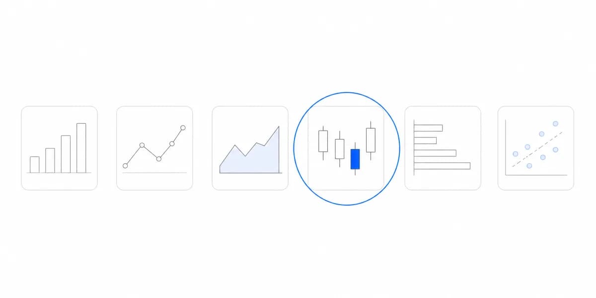
Every data type has ideal visualization methods, but many dashboards use the wrong chart type, making comparisons difficult and hiding patterns that should be obvious.
Common mistakes:
- Using pie charts to show change over time (use line charts)
- Using line charts for unordered categories (use bar charts)
- Using stacked bars when you need precise comparisons (use grouped bars)
- Using scatter plots when there's no correlation to show (use tables)
The Reader Does the Work the Chart Should Have Done, and Misses the Trend
The wrong chart type forces users to work harder to understand your data. A product manager might miss a crucial trend because it's hidden in a poorly chosen visualization. A customer might make incorrect comparisons because the chart type doesn't support accurate visual comparison.
For B2B SaaS products, this translates to reduced dashboard engagement and lower perceived value of your analytics features.
How to Fix It
Learn the strengths of each chart type and match them to your data:
Bar charts: Comparing values across categories Line charts: Showing trends over time Scatter plots: Revealing correlations between variables Tables: Displaying precise values or lookup data Heatmaps: Showing patterns in multi-dimensional data
Sumboard's drag-and-drop builder enables product teams to select from 20+ visualization types without requiring data visualization expertise.
For a deep dive on when to use each chart type, see our complete guide to choosing the right chart type.
Example 6: A number without its unit, period and comparison is not yet information
Without Labels, Units and a Period, the Reader Is Left Guessing
A chart without clear labels, axis titles, or data sources is essentially useless. Users are left guessing: What does this number represent? What time period? What's the unit of measurement?
Even worse: charts with misleading labels that don't match the actual data, or legends that are ambiguous about what they represent.
Missing Context Costs Confidence in the Data Itself
When dashboards lack context, users lose confidence in your data. They'll ask questions like:
- "Is this current data or historical?"
- "What's the source of these numbers?"
- "Why doesn't this match what I see in [other system]?"
These questions lead to support tickets, reduced trust, and ultimately, dashboard abandonment. For customer-facing analytics in SaaS products, every unclear visualization damages your product's credibility.
How to Fix It
Every chart needs:
- Clear axis labels with units (e.g., "Revenue (€)", "Users (thousands)")
- A descriptive title that explains what's being shown
- Time period indicators (e.g., "Last 30 Days", "Q4 2025")
- Data source references for transparency
- Tooltips with additional context on hover
Follow data visualization best practices for labeling: be specific, be concise, and prioritize clarity over cleverness.
Modern embedded analytics platforms should make proper labeling the default, not an afterthought.
Example 7: A pie chart that does not sum to a whole is measuring the wrong thing
A Pie Chart Promises Parts of a Whole, and the Slices Have to Add Up
Pie charts represent parts of a whole, each slice should represent a percentage of a total that adds to 100%. Yet many dashboards misuse pie charts to show:
- Multiple unrelated data points (different time periods as slices)
- Percentages that exceed 100% (because categories overlap)
- Non-exclusive categories (where items can belong to multiple groups)
When pie slices don't represent true proportions, the entire visualization becomes mathematically nonsensical.
Slices Adding to 150% Make the Customer Question Every Other Number Too
Mathematically incorrect visualizations destroy credibility. When a customer sees a pie chart with slices that add to 150%, they immediately question all your data, not just that chart.
For B2B SaaS analytics, this is particularly damaging because business users often have strong analytical skills and will notice these mistakes.
How to Fix It
Use pie charts only for:
- Mutually exclusive categories (each item fits in exactly one slice)
- Data that truly represents parts of a whole
- A small set of clearly distinguishable categories
For everything else, use:
- Bar charts for comparing quantities across categories
- Stacked bar charts for showing composition across multiple groups
- Tree maps for hierarchical part-to-whole relationships
When precise comparison matters, a sorted bar chart usually makes the differences easier to inspect than slice angles. Keep a pie chart for a genuine part-to-whole question with a small set of clearly distinguishable parts.
Every One of These Seven Is Cheaper to Prevent Than to Explain
Now that you've seen what not to do, here's how to prevent these mistakes in your customer-facing analytics:
Design with Users in Mind
Don't create dashboards in isolation. Test your visualizations with actual end users, both technical and non-technical. Watch where they struggle, what questions they ask, and what insights they miss.
For B2B SaaS products, this means testing with both your internal team and actual customers. A dashboard that makes sense to your data team might confuse product managers or executives.
Use Interactive Dashboards
The solution to many bad visualization problems is interactivity. Instead of cramming everything into static charts:
- Let users filter data to focus on what matters to them
- Enable drill-downs for progressive disclosure
- Provide tooltips with additional context
- Allow date range selection for time-based data
This is the baseline a customer-facing analytics product has to meet: interactive embedded dashboards turn overwhelming data into explorable insights, and users get what they need without the clutter.
Follow Best Practices Automatically
The best way to avoid bad visualization is to use tools that help you apply best practices consistently. Modern embedded analytics platforms should:
- Make proper axis scaling the default behavior
- Provide accessible color palettes
- Offer a wide range of appropriate chart types
- Support clear labeling and context
- Apply white-label theming consistently
When building customer-facing analytics, choose an embedded analytics platform that makes best practices the easy path, not an advanced option.
Learn from Dashboard Design Principles
Understanding why these examples fail helps you apply broader dashboard design principles. Good visualization design isn't about following rules blindly. It's about understanding how visual perception works and designing accordingly.
The goal of customer-facing analytics isn't to show all your data. It's to help users make better decisions faster.
A Bad Visualization Is Not an Aesthetic Problem, It Is a Decision Made on a Wrong Reading
Bad data visualizations aren't just aesthetic problems. They're business problems. They lead to:
- Dashboard abandonment as users bypass your analytics
- Poor decisions based on misleading visuals
- Reduced trust in your data and your product
- Wasted development time on features users don't use
The examples we've covered, truncated axes, color chaos, 3D distortion, information overload, wrong chart types, missing context, and misused pie charts, represent the most common visualization mistakes in customer-facing analytics.
The solution isn't just avoiding these mistakes. It's building analytics with clarity, interactivity, and user needs at the center. When your dashboards follow visualization best practices, users engage with your data, make better decisions, and see real value in your analytics features.
That's why Sumboard's embedded analytics platform is built with these principles from the ground up. Our drag-and-drop builder helps you apply best practices consistently, our modern chart library prioritizes clarity over flashiness, and our interactive features let users explore data without overwhelming them.
Ready to build dashboards your users will actually use? Start with visualizations that help, not confuse.