We've been noticing a pattern in how our customers' users interact with dashboards. Some need the big-picture strategic view, annual revenue targets, market share, long-term growth. Others need real-time operational data, today's sales, current inventory levels, tickets open right now.
But there's a third group that doesn't fit either category. Department heads tracking quarterly initiatives. Project managers monitoring month-over-month progress. Team leads comparing this week's performance to last week's targets.
They need what's called a tactical dashboard, and it's probably the most underappreciated type of dashboard in analytics.
The Common Definitions Say Where Tactical Sits and Not When to Build One
Search this term and two descriptions come back repeatedly. Klipfolio's result describes a tactical dashboard as one "used to connect strategic planning and operational activities", with tools that "offer real-time or near-real-time data"; the description is cut off at that point, so what it says next is not quoted here. DataCamp's course result describes them as "interactive, providing filters and segmentation to analyze business performance and drill down into the available data".
Both are fair descriptions and neither tells you when to build one. "Between strategy and operations" locates the reader on an org chart. "Interactive with filters" names a feature set that analytical dashboards also have.
The cut that actually decides what you build is how long the reader has to respond, and the whole four-type separation on that axis is worked through in our dashboard types guide. If you are not yet sure which of the four you are being asked for, read that first; the rest of this page assumes you want the tactical one.
A note on the search results, since you may have arrived here by accident
The phrase is overloaded. The first result for it is a feature inside SAP Focused Run, a monitoring product that reports "the status of key performance indicators for your solution landscapes". Another result is a football tactics board. A third is a design inspiration gallery. If you came looking for one of those, this page is not it, and saying so is cheaper than letting you find out three paragraphs in.
A Tactical Dashboard Exists Because a Department Goal Has a Deadline
Most analytics platforms categorize dashboards into two buckets: strategic (for executives tracking long-term KPIs) and operational (for front-line teams monitoring daily metrics). But that binary doesn't capture how most organizations actually work.
Take a supply chain manager, as a worked example rather than a specific account. Their CEO cares about annual cost reduction targets, which is strategic. The warehouse team needs today's shipment status, which is operational. The manager sits between the two: bringing lead times down against a target set for this quarter, improving supplier performance month over month, moving inventory turnover across the next couple of months.
Those goals span weeks to months, not years, not hours. That's the tactical layer.
The Middle Tier Is Where the Reader Can Still Move the Number
Drawn as a pyramid these three tiers say seniority and little else. Sorted by what a bad number means to whoever is reading it, the middle one stops looking like a compromise between the other two.
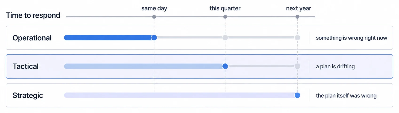
Tactical dashboards bridge strategic planning and operational execution. While strategic dashboards focus on long-term direction and operational dashboards monitor real-time activities, tactical dashboards provide detailed insights into short-to-medium term performance.
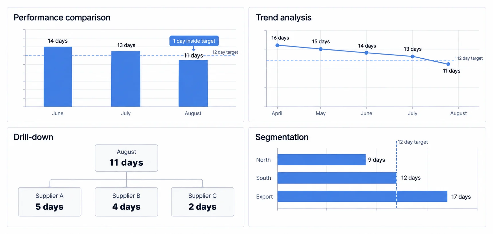
Dashboard categories differ most in decision horizon, audience, freshness, and the action they support.
Strategic dashboards track annual or multi-year goals for executives. They show whether the company is on track to hit its 5-year plan, where market share stands compared to competitors, overall financial health trends.
Operational dashboards display real-time or near-real-time data for day-to-day activities. They help teams respond to what's happening right now, orders coming in, support tickets being resolved, systems going down.
Tactical dashboards sit between the two. They're used by mid-level managers and department heads to track progress toward quarterly objectives, monthly targets, or project milestones. The time horizon is weeks or months, not years or minutes.
A tactical dashboard usually carries four things, and each one exists because the tier has a deadline:
- Performance comparison: Current results vs goals and benchmarks
- Trend analysis: Patterns over the past few weeks or months
- Drill-down capabilities: Ability to dig into why numbers are trending certain ways
- Segmentation: Breaking data down by team, department, or project
To understand the full spectrum of dashboard types and when to use each, it helps to see how they complement each other in a complete analytics strategy.
Your Customers Need Tactical Dashboards Too, and Embedded Analytics Usually Skips That Layer
Here's where things get interesting for B2B SaaS companies: almost all the content about tactical dashboards focuses on internal business use. The examples are always about tracking your own company's sales performance, project management, or departmental KPIs.
But your customers need tactical dashboards too.
Think about who uses your product. If you're selling to B2B companies, you're likely serving department heads, project managers, and team leads, exactly the audience that needs tactical-level insights.
A supply chain manager using your logistics SaaS platform doesn't just want to see today's shipment status (operational) or long-term cost trends (strategic). They want to track this quarter's supplier performance improvements, analyze month-over-month inventory optimization, compare team productivity across the past 8 weeks.
When you build embedded analytics for your customers, you're not just creating dashboards for executives or front-line workers. You need to serve that middle layer, the tactical decision-makers who are executing on specific initiatives with clear, time-bound goals.
Goal Comparison, Trend, Drill-Down, and Segmentation Are What Make a Dashboard Tactical
Based on patterns we see in successful implementations, tactical dashboards share several distinctive characteristics:
Performance comparison is the foundation. Tactical dashboards constantly answer the question: "How are we performing against our goals?" This means showing actual results alongside targets, highlighting variances, and making it immediately obvious where performance is ahead or behind.
For a marketing manager tracking a quarterly campaign, this means seeing actual lead generation numbers next to monthly targets, conversion rates compared to benchmarks, and cost-per-acquisition trends versus budget constraints. KPI dashboard examples demonstrate how this comparison approach works across different business contexts.
Trend analysis provides context. Unlike operational dashboards that focus on the current moment, tactical dashboards show how performance has evolved over the relevant time period. This could be week-over-week comparisons for a sprint-based team, month-over-month trends for a quarterly initiative, or quarter-over-quarter progress for an annual goal.
The visualization typically uses line charts for trends, bar charts for period comparisons, and heat maps to show performance intensity across different dimensions.
Drill-down capabilities enable investigation. When performance deviates from plan, tactical dashboard users need to understand why. This means building in the ability to segment data by team, filter by product line, or break down results by customer segment.
From customer feedback, we're learning that the "why" matters more at the tactical level than at either strategic or operational levels. Executives want to know if the strategy is working. Front-line teams want to know what to do next. But mid-level managers need to diagnose problems and adjust tactics, which requires deeper data exploration.
Department and team segmentation shows accountability. Tactical dashboards often serve multiple teams or departments, so they need to break down performance by organizational unit. This allows each team to see their contribution to the overall goal while managers can identify which areas need support or intervention.
A Tactical Dashboard Without a Review Rhythm Decays Into a Report
The tier is defined by a deadline, which means it is also defined by a cadence. A dashboard nobody looks at on a schedule stops being tactical the week after launch, whatever it contains.
Attach it to a meeting that already happens. Someone opens it, the goal comparison is read out loud, and the gap either has an owner and an action or is explicitly accepted for another period. That ritual is what keeps the drill-down honest, because a number nobody has to explain drifts without anyone noticing. It is also the cheapest usage signal available: when a tile stops being referenced in that meeting for a month, it has told you it was never tactical, and the board is better with it removed than with it quietly ignored.
Build Tactical Dashboards for Exploration, Because Monitoring Alone Is the Operational Tier
When implementing tactical dashboards in your product, several design principles help ensure they actually get used:
Start with clear time-bound goals. Tactical dashboards only make sense when there are specific objectives to track. Work with your customers to understand what initiatives they're running, what quarterly or monthly targets they've set, and what success looks like over the next few weeks or months.
Design for exploration, not just monitoring. Unlike operational dashboards that primarily monitor real-time status, tactical dashboards should enable users to investigate and analyze. This means including filtering options, comparison tools, and the ability to drill down into underlying data.
Enable self-service filtering. The users of tactical dashboards (department heads and project managers) often need to slice data in different ways depending on the question they're answering. Building in filters for time periods, teams, product lines, or customer segments allows them to explore without waiting for IT or analytics teams.
Connect tactical to operational views. Tactical dashboards work best when they're not isolated. Users should be able to drill down from tactical quarterly trends to operational daily details when they need to investigate specific issues or understand what's driving certain patterns.
With an embedded analytics platform that supports interactive filtering and drill-down, you can build tactical dashboards that your customers' mid-level managers will actually use, not just dashboards that look good in demos.
Where to go next
- Dashboard types guide: the four dashboard types sorted by how fast the reader has to act.
- Analytical Dashboard Techniques: design analytical dashboards as a governed loop from a decision question through comparison.
- Dashboard Types articles: every article in this cluster.
Ready to launch customer-facing analytics?
Stop losing customers to competitors with better analytics. Sumboard's customer-facing analytics platform lets you launch self-service dashboards in days, not months.