Histograms and bar charts both use rectangles, but the rectangles encode different things. A bar chart assigns one value to each category. A histogram divides a quantitative scale into intervals and counts or normalizes the observations in each interval.
Choosing between them requires the raw data, analytical question, and axis meaning. Spacing is a useful visual cue, not the definition.
Why Chart Choice Matters More Than You Think
At first glance, both charts use a baseline and rectangular marks. The difference is the statistical transformation behind those marks.
For activity by hour, a bar chart of 24 named hour buckets may be valid when the goal is to compare clock-hour totals. A histogram is appropriate when raw durations or timestamps are binned to study their distribution. Effective data visualization begins by stating that transformation explicitly.
The Wrong Chart Makes Readers Compare Things That Are Not Comparable
An unclear chart can make users compare quantities that are not comparable, miss a tail or second mode, or infer continuity where none exists. These are visualization mistakes that should be caught with data-contract tests and task-based review rather than anecdotes.
The Core Difference Is Your Data Type, Not Your Preference
The fundamental distinction comes down to your data type and what you're trying to show.
Bar Charts Show Comparisons
Bar charts compare a value across nominal, ordinal, or discrete categories: sales by region, users by subscription tier, or tickets by department.
Each bar represents one category value. Gaps conventionally reinforce that separation, while labels and the categorical axis establish the meaning.
When you're building customer-facing dashboards, bar charts work when users ask: "Which category has more? How do these groups compare?"
Histograms Reveal Distributions
Histograms summarize a univariate quantitative dataset such as response times, transaction amounts, or session lengths. The values may be continuous or discrete, but they are grouped into numeric intervals.
The bars represent bins. Equal-width bins commonly show counts or relative frequencies by height. When widths vary, height must represent frequency density if bar area is intended to encode frequency.
Users inspect a histogram for location, spread, skew, modes, gaps, and tails. The NIST histogram definition describes these distributional questions and the count and normalized variants.
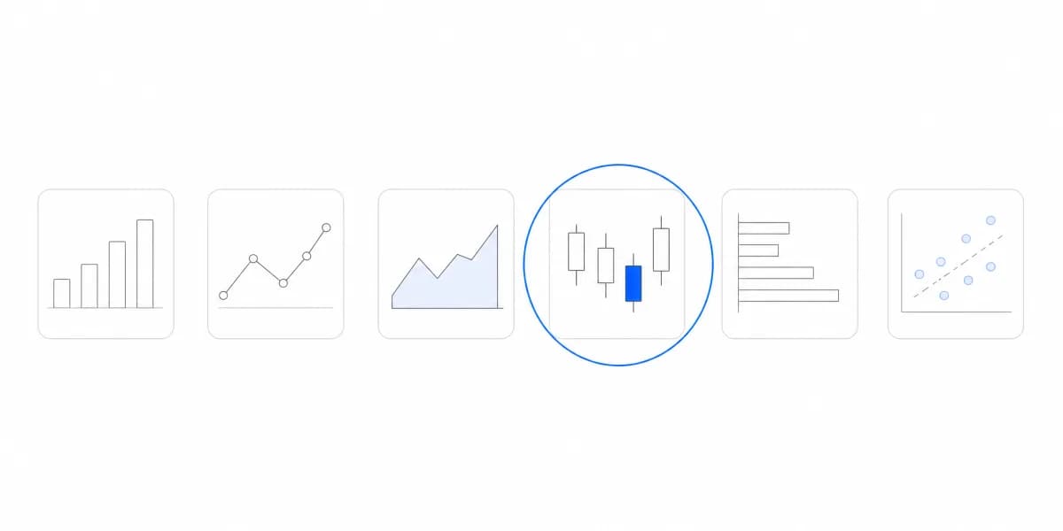
Check our complete chart types guide to see when each visualization type fits your data best.
The Visual Tells You Everything
Spacing is the quickest visible cue, but axis semantics and data preparation are stronger evidence.
Why Bar Spacing Isn't Just Aesthetic
A Gap Between Bars Signals That the Categories Are Separate
Gaps usually signal separate categories. Nominal categories can often be sorted by value or label. Ordinal categories and time buckets must preserve a meaningful order, so flexibility is not universal.
Adjacent Bars Signal Consecutive Intervals, so Bins Cannot Be Reordered
Adjacent bars usually signal consecutive numeric intervals. Bins must remain in numeric order because moving them changes the distribution. A zero-count interval should normally remain visible so the axis does not silently collapse a gap.
Predefined age bands can legitimately be categorical reporting groups, while a histogram of raw ages answers a distribution question. The correct choice depends on whether the bands are the analytical object or merely a binning of underlying observations.
When Bins Go Wrong
Histograms require decisions about bin boundaries, width, origin, and normalization.
Bins that are too wide
Wide bins can hide modes, gaps, or a concentrated center.
Bins that are too narrow
Narrow bins can emphasize sampling noise and produce an unstable shape.
There is no universal bin count. Candidate rules use sample size, spread, or assumptions about the underlying distribution. Compare several defensible widths, state the rule, and check whether the conclusion is stable. The chart types guide sets out which chart suits which question. NIST likewise notes that optimal width depends on the underlying distribution.
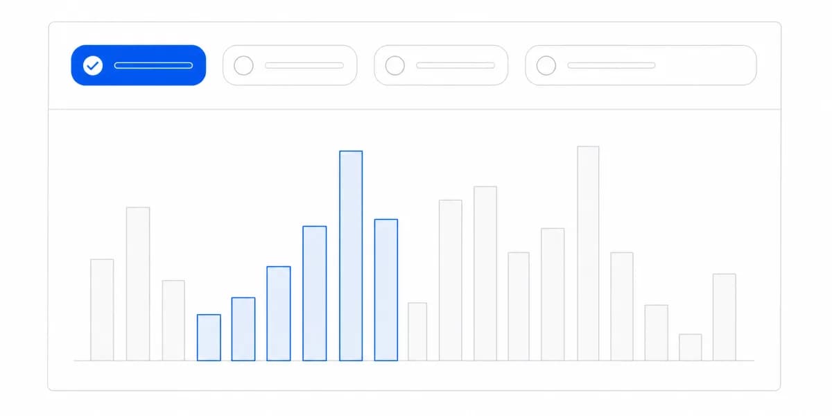
Interactive filters can support subgroup exploration, but changing the population may also change the useful bin domain or width. Keep bins aligned when users need a direct comparison and disclose when they are recomputed.
Four Mistakes Turn a Correct Chart Into a Misleading One
Pre-aggregated values are not observations, and a histogram needs observations
A histogram needs observation-level values or a valid frequency table with bin boundaries. Feeding category totals into a histogram component does not recover a distribution.
Categories have no interval width, so they cannot be bins
Product categories such as Shoes, Shirts, and Accessories have no numeric interval width. Touching bars would imply an ordered quantitative scale that the data does not contain.
With unequal bins, height alone makes the wide ones look bigger than they are
If unequal bin widths are necessary, plotting count directly as height makes wider bins look more important partly because they cover more range. Use frequency density so area, not height alone, represents frequency, and label the axis accordingly.
An unlabelled bin boundary hides the transformation the reader needs to see
Label the measured variable, units, bin boundaries, vertical statistic, population, filters, and sample size. A title such as "Response-time distribution" is more informative than "Performance."
Following visualization best practices means matching chart type to both your data structure and user intent.
In a histogram, bin width is the numeric interval covered by a bar. Width and origin affect the visible distribution; compare defensible settings and disclose the chosen boundaries.
A Histogram of Twelve Observations Is Noise Wearing the Shape of a Distribution
A bar chart of twelve categories is a bar chart of twelve categories. A histogram of twelve observations is a claim about a distribution made from almost nothing, and it will still look like a distribution, complete with a peak and a tail the reader will interpret.
Sample size therefore belongs on the chart, not in a caption someone scrolls past. Show the observation count, and where the count is small enough that the shape would change materially with a different binning, prefer a display that shows the individual values, such as a dot plot or a strip of points, over one that implies a smooth underlying shape.
The general rule underneath both chart types: a histogram makes a statement about a population from a sample, so anything that changes how much the sample can support, count, outliers, or a truncated range, changes what the chart is entitled to say.
The Analytical Question and the Input Shape Decide the Chart, Not Taste
When applying dashboard design principles, start from the analytical question and the form of the input data.
Choose a bar chart when
- Comparing discrete categories (products, regions, teams)
- The value for each category is already defined
- Users need to compare category magnitude
- Sorting follows the category semantics
Choose a histogram when
- Showing distribution of continuous values (time, amounts, scores)
- Raw observations or valid numeric-bin frequencies are available
- Users need to inspect center, spread, shape, or tails
- Bin order and width remain meaningful
Ask what question the user is trying to answer. "How do regions compare?" needs category values and a bar chart. "How are transaction amounts distributed?" needs observations, explicit bins, and a histogram.
If the product reports fixed lifetime-value tiers, a bar chart compares those business categories. If analysts need to test whether the tier boundaries conceal clusters, a histogram of raw lifetime values can reveal the distribution. These are complementary questions, not interchangeable visual styles.
Where to go next
- Chart types guide: more than forty charts grouped by the question each one answers.
- Dashboard Color Theory: build dashboard color roles for grouping, order, status, interaction, contrast.
- Data Visualization articles: every article in this cluster.
Build dashboards users actually understand
Use explicit data contracts, chart previews, labels, and representative user tasks to validate whether a category comparison or distribution view is appropriate.