Chart accessibility is not a palette setting or an alt attribute added at the end. It is a release contract for the information and actions represented by the chart across visual, non-visual, pointer, keyboard, touch, zoom, and assistive-technology paths.
This article is implementation guidance, not a legal conformance opinion. Identify the standard and conformance target that apply to your product, and test the complete experience with qualified reviewers and users.
Accessible Visualization Starts From the Question the Chart Answers, Not From Alt Text
Start with the question the data visualization must answer, the essential relationships or values, any permitted action, and uses the chart must not support. Without that purpose, teams either write a vague alternative (“line chart trending upward”) or dump every point into an unusable paragraph.
Record:
- The chart's accessible name and purpose
- The essential values, relationships, scales, uncertainty, and takeaway
- Actions such as filter, select, compare, drill, annotate, or export
- Changes that must be announced
- The equivalent path for the same task
- The source-of-truth behavior when data is missing, stale, partial, or denied
A Complex Chart Needs an Equivalent, Which W3C Distinguishes From a Short Description
W3C's complex-images tutorial describes a two-part approach for charts and diagrams: a short description identifies the image, while a long description provides the essential information. The long description may be visible prose, structured data, or another form suited to the content and context.
A useful short description identifies the chart and where the detailed equivalent is available. A useful long description covers the values or relationships needed for the task, including axes, scales, units, time period, comparisons, and important uncertainty. It should not merely restate the title or narrate decorative geometry.
Tables can provide exact values and relationships when tabular reading fits the task. Prefer a native HTML table for static tabular content where possible; W3C's ARIA table guidance likewise recommends native HTML semantics when they are available. Interactive grids are different widgets with managed focus and a more complex keyboard model.
Test the chart and equivalent separately. Can a reader answer the same representative questions, identify the same caveats, and reach the same permitted actions?
Colour Can Carry Status and Direction, and It Cannot Carry Them Alone
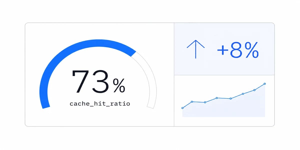
Color can communicate status, direction, category, selection, or emphasis, but it cannot be the only cue for information or action. Pair it with a visible and, where relevant, programmatic cue:
- Status: text and icon or shape
- Direction: arrow, sign, slope, or reference line
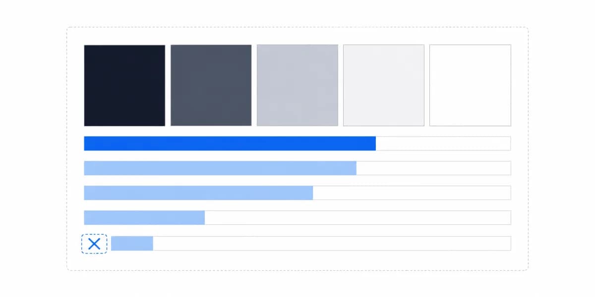
- Category: direct label, marker, line style, pattern, or position
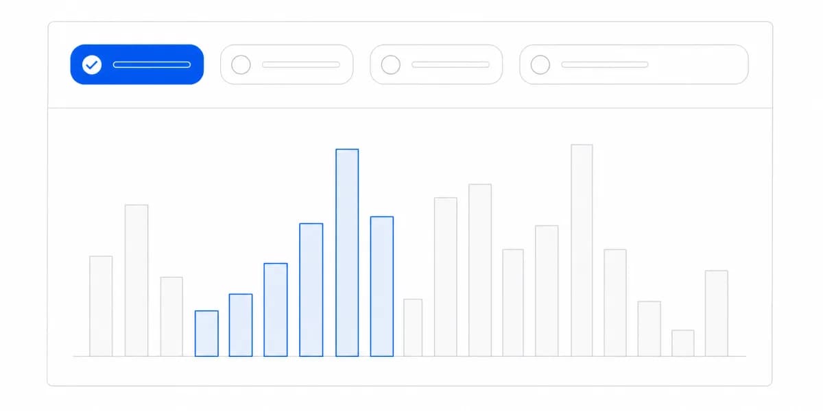
- Selection and error: border, text, icon, shape, and programmatic state
The exact prevalence of color-vision differences varies by population and classification. If publishing demographic figures, preserve the source and context rather than turning Colour Blind Awareness estimates into a universal product requirement. The design requirement does not depend on a prevalence claim.
Use the dashboard color theory guide to assign roles, then test meaning with hue removed. Check text and required graphical cues against the applicable WCAG contrast criteria at their least-contrasting point, across every shipped theme and component state. “High contrast” is not a test result.
SVG in the Document Does Not Produce a Useful Screen-Reader Experience by Itself
SVG elements appearing in the document does not automatically produce a useful screen-reader experience. Canvas does not automatically make one impossible. The accessibility tree, names, roles, states, relationships, reading order, and equivalent content are implementation decisions.
For a static chart, a grouped graphic with a concise name plus an adjacent long description or table may be clearer than hundreds of individually exposed marks. For an interactive chart, expose only the elements needed for the task and announce changes without flooding the user.
Test supported browser and assistive-technology combinations for:
- Accessible name, description, grouping, and reading order
- Table captions, headers, and cell relationships where a table is used
- Filter, selection, sort, drill, and disclosure states
- Loading, stale, empty, denial, error, and updated-data messages
- Whether off-screen or hidden chart content pollutes navigation
Automated accessibility checks can find some structural and contrast defects. They cannot establish that a chart's equivalent conveys the intended insight or that an interaction model is understandable.
“Everything Is Tabbable” Is Not a Keyboard Model, It Is Hundreds of Tab Stops
“Everything is tabbable” is not a design. A chart with hundreds of marks can create hundreds of tab stops. Define which objects are interactive, how focus enters and leaves, how movement works inside the chart, how details open and close, how selection is announced, and how users reach the equivalent data.
Use native controls and established patterns where possible. W3C's keyboard-interface guidance explains why predictable conventions and persistent focus visibility matter. If a composite grid pattern is chosen, its arrow-key and focus management become application responsibilities.
Test representative tasks with keyboard only, but do not stop there. Test pointer, touch, zoom, screen magnification, voice input, reduced motion, and relevant screen readers. Hover-only tooltips need focus or another equivalent trigger. Tiny marks may need an alternative selection surface rather than merely a larger hit box.
No Chart Type Is Inherently Accessible, So Familiarity Is Not the Test
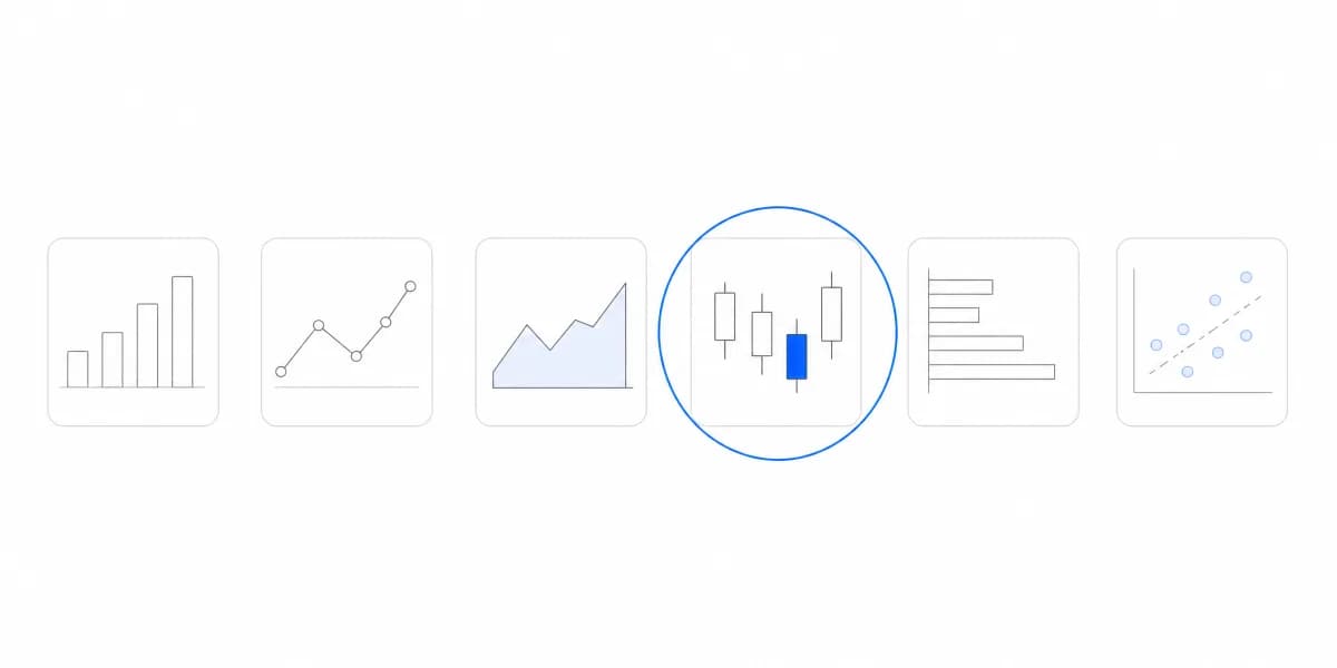
Familiarity can reduce learning cost, but no chart type is inherently accessible. A bar chart can fail through missing units or poor structure; a complex chart can be usable when its task, labeling, alternative, and interaction are carefully designed. A pie chart does not become accessible merely because users recognize it.
Use the chart types guide and data visualization best practices to match form to question and data. Then apply the same accessibility contract to the selected form.
Responsive behavior also needs task-level evidence. Test zoom and reflow, label collisions, clipping, panning, orientation, focus visibility, and whether horizontal scrolling preserves context. The responsive dashboard guide provides layout considerations; it does not replace accessibility testing.
Different dashboard types may have different tasks and update rates, but all require equivalent access to essential information and actions. Do not assume an operational dashboard must announce every real-time update or that an executive dashboard only needs a prose summary.
Automated Checks Cover the Part That Is Easy to Automate, Which Is Not the Chart
Every point above ends in the same question: how would you know. Automated tooling answers less of it here than anywhere else in a product.
A scanner can find missing accessible names, colour contrast below threshold, and elements that cannot receive focus. It cannot tell you whether the text equivalent conveys what the chart shows, whether the reading order of a dashboard matches its argument, whether a keyboard model is navigable or merely reachable, or whether the non-colour encoding is distinguishable in practice. Those are judgments about meaning, and meaning is exactly what a chart exists to carry.
So build the manual pass into the release rather than into a backlog. Read one representative chart with a screen reader, complete one real task using only the keyboard, and check one view in greyscale. Three short exercises, run on the workflow that matters most, find more than a clean automated report does.
An Analytics Platform Can Offer Accessible Components and Still Ship an Inaccessible Page
An embedded analytics platform may provide theming, tables, exports, responsive components, or semantic hooks. Those are inputs to an accessible implementation, not proof of conformance. The host product still owns surrounding navigation, focus transitions, authentication states, headings, errors, zoom behavior, support, and the intended task.
During evaluation, build the hardest representative chart and inspect:
- The visual and equivalent paths with production-shaped data.
- Keyboard and assistive-technology behavior across the integration boundary.
- Every theme, responsive breakpoint, runtime state, and update path.
- Generated CSV, PDF, image, email, and share-link artifacts separately.
- Regression coverage, ownership, issue response, and upgrade behavior.
Accessibility is maintained evidence, not a one-time feature claim. Keep the approved contract, browser/assistive-technology matrix, manual task results, automated checks, known limitations, and regression tests with the chart.
Where to go next
- Chart types guide: more than forty charts grouped by the question each one answers.
- Dashboard design principles: design customer dashboards around decisions, hierarchy, progressive disclosure.
- Data Visualization articles: every article in this cluster.
Ready to launch customer-facing analytics?
Stop losing customers to competitors with better analytics. Sumboard's customer-facing analytics platform lets you launch self-service dashboards in days, not months.