
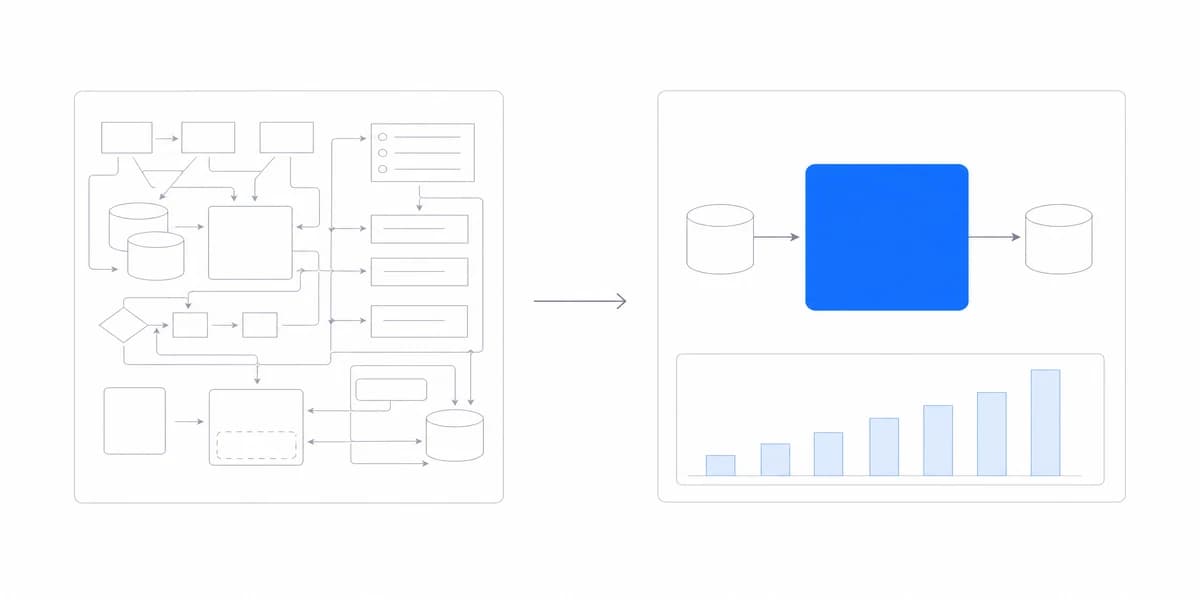
When teams evaluate embedded analytics platforms, visual feature count is only one part of product fit. The dashboard also has to support the host product's tasks, interaction conventions, performance budget, and security model.
The difference comes down to design decisions made at the integration stage, choices about visual hierarchy, white-labeling depth, and performance optimization that determine whether customers perceive the analytics as a smooth part of your product or as a clunky add-on.
Why Dashboard Design Makes or Breaks Customer Adoption
Your customers don't think about "analytics features." They think about solving their specific problems within the tools they already use every day.
When a dashboard loads slowly, uses different fonts than the rest of your product, or forces users to learn new navigation patterns, it creates friction.
That friction can appear as failed tasks, abandonment, repeated support questions, or low repeat use. Measure those outcomes instead of treating page views alone as adoption.
The challenge is balancing three competing priorities:
Speed to market - The integration needs a defined launch scope and a credible path to production.
Brand consistency - The dashboard must look and feel like it was built by your team, not bolted on from a third party.
Technical performance - Query, network, rendering, and interaction latency must stay within an agreed budget.
These priorities create trade-offs. Document which visual controls, interactions, latency targets, and operating responsibilities are required before choosing a managed embed, components, or a custom build.
Embedded Dashboard Design Happens in Three Layers, Each Solving a Different Problem
Effective embedded dashboard design happens in three distinct layers, each addressing different aspects of the user experience.
Layer 1: Visual Integration (What Users See First)
This is where most teams start, and where many stop. Visual integration means matching your product's design system:
Typography and spacing - Using your existing font families, sizes, and line heights so text feels consistent across the interface.
Color system - Applying your brand colors not just to logos, but to data visualizations, interactive elements, and status indicators.
Component library alignment - Matching button styles, input fields, and navigation patterns users already know.
The goal isn't perfect pixel-matching.
It's eliminating the "this feels different" reaction when users first see the dashboard.
Layer 2: Interaction Patterns (How Users Work through)
Visual consistency matters, but interaction design determines whether customers actually use the dashboard:
Progressive disclosure - Showing high-level metrics first, with drill-down capabilities for users who need details. Not overwhelming PMs who just want executive summaries.
Contextual filtering - Enabling users to slice data by dimensions that matter to their role without requiring them to understand your data model.
Responsive behavior - Ensuring dashboards adapt to different screen sizes and devices without losing functionality.
Reuse familiar navigation patterns when the embedded workflow is structurally similar. Validate the result through task completion and accessibility testing; copying a navigation position without preserving behavior can create a false sense of consistency.
Layer 3: Performance Architecture (What Users Feel)
This is where engineering decisions become design decisions. Users perceive performance as part of the interface:
Loading states - Showing skeleton screens or progressive rendering instead of blank white screens or generic spinners.
Caching strategy - Reusing appropriate results with explicit cache keys, tenant scope, freshness, and invalidation behavior.
Render optimization - Using techniques like virtualization for large datasets and lazy-loading for off-screen components.
Latency is part of the experience, but one aggregate load time hides important states. Measure cold and warm loads, first useful result, interaction latency, layout movement, errors, and data freshness separately.
White-Label Design Is More Than Colours and Logos, so Check Each Surface Separately
Embedded analytics products expose different white-label surfaces. Treat the following as evaluation areas, not standard industry tiers, and verify each control in the target plan.
For a complete breakdown of implementation approaches, see our white-label analytics guide.
Identity Controls Decide Whose Product the Dashboard Looks Like
Start by checking which product identity elements can be controlled:
- Custom logo placement
- Primary color selection
- Basic font family override
When it may be sufficient: Internal tools or proof-of-concept implementations where the remaining vendor interface is acceptable to the audience.
Limitation: Attribution controls alone do not align typography, component states, interaction behavior, exports, or domains.
Theme Control Is Only as Deep as the Tokens the Platform Exposes
Inspect the tokens and component states the platform actually exposes:
- Complete color palette (primary, secondary, accents, status colors)
- Typography system (font families, weights, sizes, line heights)
- Spacing and padding values
- Border styles and shadow effects
Theme coverage is incomplete if loading, empty, error, disabled, focus, hover, export, or email states fall outside the same system. Build a representative state inventory rather than judging the default dashboard alone.
Extension Controls Are Where Custom Domains and SDK Hooks Appear
An extended integration may expose additional theme variables, fonts, layout controls, custom domains, SDK hooks, or supported style overrides. The exact surface and upgrade contract matter more than the label. Verify Sumboard's available controls in the target plan and build a representative screen before committing.
A managed surface can reduce the UI and rendering code the host team owns, while the host still owns product integration, authorization, accessibility acceptance, responsive layout, and release testing.
When it matters: Products whose required workflows, domains, navigation, or component behavior cannot be expressed through theme tokens alone.
Trade-off: More configuration and regression testing can produce a closer fit, but no managed integration guarantees complete visual control or removes all operating responsibility.
The Biggest Performance Wins Come From Design, Not Only From the Backend
Dashboard performance isn't just about backend query optimization. Some of the biggest performance wins come from thoughtful design decisions.
Following core dashboard design principles helps teams avoid common performance pitfalls.
Loading Every Metric at Once Is What Creates the Wait
Problem: Loading all metrics at once creates long wait times.
Critical KPIs Render First, and Everything Else Waits Its Turn
- Critical KPIs render first (the metrics users check every time)
- Secondary charts load progressively in the background
- Advanced analytics and drill-downs load on-demand
Prioritization can improve time to first useful result even when all deferred work finishes later. Confirm that early content is stable and actionable rather than a misleading partial state.
This approach works particularly well for KPI dashboard examples where executives need quick access to top-line metrics without waiting for detailed breakdowns.
A Chart's Render Cost Depends on Mark Count, Interaction and Update Frequency
The cost of a chart depends on mark count, labels, interaction, animation, renderer, device, and update frequency, not its name alone.
Lower-complexity cases: A bar or line chart with limited marks and labels, or a virtualized table showing a small visible window.
Cost multipliers: Stacking, dense labels, tooltips, animation, multiple series, frequent updates, and expensive layout calculations.
High-density cases: Scatter plots, heat maps, networks, and large tables may require aggregation, sampling, virtualization, canvas, or server-side preparation.
Choose the simplest encoding that answers the question, then profile it with representative data and the slowest supported device. Set limits on points, labels, series, and update rate based on measurements.
Interaction Design That Reduces Server Load
Real-time filtering vs. server-side queries
When users adjust date ranges or filter dimensions, you have two options:
- Send new queries to the database for each interaction
- Fetch a reasonable dataset once, then filter client-side
The right choice depends on authorized data scope, transfer size, freshness, query cost, device capability, and interaction budget. Never fetch a broader tenant or row scope merely to enable local filtering. Give immediate state feedback whenever an interaction may take noticeable time, whether the work happens in the browser or on the server, and preserve the last valid result only when its stale status is explicit.
Five Design Mistakes Recur Often Enough to Use as Review Prompts
The following anti-patterns are useful review prompts for embedded analytics implementations:
Mistake #1: Treating Dashboards as Reports
Why it fails: a report layout cannot carry filtering, comparison or drill-down
Designing dashboards like printable reports: dense tables, minimal interactivity, and exhaustive data display.
Why it fails: A dense report layout may not support the filtering, comparison, or drill-down task the embedded workflow requires.
Better approach: Start with the minimum evidence required for the primary questions. Make supporting detail discoverable through progressive drill-downs.
Mistake #2: Over-Customizing at Launch
The problem: Spending weeks perfecting every pixel of the embedded dashboard before shipping.
Why it fails: You're optimizing based on assumptions, not real usage patterns.
Better approach: Ship with strong visual integration and basic functionality.
Watch how customers actually use it. Iterate based on real interaction data, not theoretical "best practices."
Instrument the target tasks and observe representative users before expanding the information architecture. Complex designs are justified only when the audience needs the added dimensions and can navigate them reliably.
Understanding different dashboard types helps teams choose the right format for their specific use case rather than building everything at once.
Mistake #3: Ignoring Mobile/Responsive Design
Why it fails: alerts and approvals happen on phones even when analysis does not
Designing only for desktop without establishing which analytics tasks must work on smaller screens.
Why it fails: Users may need alerts, status checks, or approval tasks on phones and tablets even when deep analysis remains desktop-oriented.
Better approach: Define which tasks must work at each supported breakpoint. Preserve critical status and approval workflows on small screens, and provide an explicit desktop path when deep analysis cannot remain usable in the available space.
Mistake #4: Treating Performance as an Engineering Problem
The problem: Assuming slow dashboards can be fixed with better caching or database optimization alone.
Why it fails: Many performance issues stem from design decisions, loading unnecessary data, rendering complex visualizations before they're needed, or triggering too many server queries.
Better approach: Include performance budgets in design specifications and define the measured event, percentile, device, network, data volume, and cache state. A target without that test context is not enforceable.
Mistake #5: Building Before Validating User Needs
The problem: Designing elaborate dashboards based on what you think customers want to see.
Why it fails: The metrics you prioritize often aren't the metrics customers care about.
Better approach: Start with conversations.
What questions do your customers ask your support team? What metrics do they request in feature requests? Design dashboards that answer those questions specifically.
Designing for Adoption, Not Just Aesthetics
Strong embedded dashboard design reduces unnecessary context switching while keeping scope, freshness, controls, and provenance visible.
The key is understanding the specific users and owners: who needs to complete the analytical task, who supports the integration, and who operates it after launch.
Understanding dashboard fundamentals (from visual hierarchy to interaction patterns) helps teams build analytics experiences that customers actually adopt.
Treat visual integration, measurable performance, information hierarchy, accessibility, and task fit as acceptance criteria. Adoption still needs to be measured after launch; it does not follow automatically from design quality.
Where to go next
- Embedded analytics guide: the three routes to shipping it, what each one costs in calendar time, and the four things that set your launch date.
- Embedded Analytics Implementation: most embedded analytics implementations take weeks.
- Embedded Analytics articles: every article in this cluster.
Ready to launch customer-facing analytics?
Stop losing customers to competitors with better analytics. Sumboard's customer-facing analytics platform lets you launch self-service dashboards in days, not months.


