Modern manufacturing operates on razor-thin margins. A 5% improvement in Overall Equipment Effectiveness (OEE) can mean millions in recovered revenue. Yet most plants still rely on end-of-shift reports and spreadsheets, finding problems hours after they occur.
Manufacturing dashboards solve this visibility gap. They consolidate real-time data from machines, ERP systems, and quality sensors into visual KPI displays that operators, supervisors, and plant managers can act on immediately.
But here's the challenge: Not all dashboards deliver value. Poorly designed dashboards overwhelm users with data. Over-customized solutions take 6-12 months to deploy. Enterprise BI tools require analysts to interpret results.
This guide explains how to build manufacturing dashboards that actually improve production, what metrics matter, how to design for shop-floor use, and how to deploy analytics without derailing operations. We'll also cover embedded analytics platforms for manufacturing SaaS companies delivering dashboards to their customers.
Live demo: Interactive manufacturing dashboard built with Sumboard, explore OEE, downtime analysis, shift performance, and quality metrics across machines and plants.
What is a Manufacturing Dashboard?
A visual interface that consolidates real-time production data (machine uptime, throughput, quality rates, cycle times) into centralized displays for operational decision-making.
A manufacturing dashboard is a visual interface that consolidates real-time production data (machine uptime, throughput, quality rates, cycle times) into centralized displays for operational decision-making.
A plant already has the data. It arrives too late and in four shapes
Manufacturing generates massive data volumes:
- Machine sensors: Cycle times, temperatures, vibrations, power consumption
- ERP systems: Work orders, material consumption, labor hours
- Quality systems, for inspection results, defect codes and rework rates
- MES platforms, for production counts, downtime events and changeover times
The difficulty is not that this data is missing. It is that each audience sees a different slice of it: operators watch machine HMIs, supervisors read MES reports, plant managers review ERP summaries, and none of those three views is the same shape. By the time a problem has travelled far enough to appear in a report, the production it cost is already gone.
OEE, overall equipment effectiveness, measures productivity by multiplying availability, performance and quality together. Top-tier is conventionally taken as above 85% and most plants run nearer 60%, though both of those are industry convention rather than a measurement of your sector.
Two shapes this takes in practice, and both are worth testing against your own line rather than against a number from somebody else's. The first is micro-stops, the two-to-five minute delays that no shift report is granular enough to record: a line can sit well under its rated OEE with nothing in the reporting to say where the time went, and the correction is often operator retraining rather than equipment. The second is delayed quality feedback: defect trends read out of spreadsheets surface two or three days after production, so every correction arrives after the affected parts have shipped, and the gain comes from moving the correction into the same shift rather than from catching more defects. In both cases the loss is invisible rather than unknown.
Manufacturing dashboards unify this data into a single view, enabling proactive management instead of reactive firefighting.
Why Manufacturing Needs Specialized Dashboards
Manufacturing dashboards differ from generic business intelligence tools in four ways that all follow from one thing: the reader is standing next to the process rather than sitting at a desk.
1. Real-time data refresh, and what it actually requires
Standard BI dashboards refresh hourly or daily. Manufacturing dashboards update every 1-5 seconds. When a machine stops, operators need to know now, not at the next report refresh. That gap is an architectural one rather than a settings change, and it is worth understanding what real-time analytics actually demands of a data pipeline before promising it to a shop floor.
2. The reader is standing up, three metres away
Office workers can analyze complex charts. Shop-floor operators need instant clarity:
- Large fonts readable from 10 feet away
- Red/yellow/green indicators for at-a-glance status
- Minimal clicks to drill into details (touchscreen-friendly)
3. An alert has to name the action, not just the anomaly
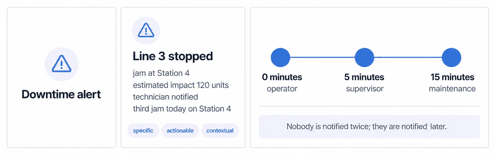
Generic dashboards send threshold alerts ("Metric X exceeded limit"). Manufacturing dashboards send contextual alerts:
- ❌ "Machine downtime: 15 minutes"
- ✅ "Line 3 stopped: Jam detected at Station 4. Estimated impact: 120 units. Technician notified."
Cycle time, the duration to complete one production unit from start to finish, is critical for capacity planning and bottleneck identification.
4. The integrations are industrial, not commercial
Manufacturing dashboards must connect to:
- SCADA/DCS: Real-time machine data
- MES: Production schedules, work orders
- ERP: Material availability, labor costs
- Quality systems: Inspection results, defect tracking
Generic BI tools require custom integration. Purpose-built manufacturing dashboards have pre-built connectors.
Many plants attempt to build "perfect" dashboards with 50+ KPIs and custom visualizations. Result: 12-month projects that deliver dashboards nobody uses.
The better approach is narrower and faster: five to seven core KPIs such as OEE, cycle time and quality rate, deployed in weeks rather than quarters, then iterated from what operators actually use.
The business case is not faster reporting. It is being wrong about where the loss is
Manufacturing dashboards are not a nice-to-have, and the reason is not the one usually given. The pitch is normally speed: you find out sooner. The four cases below are more interesting than that, because in two of them the plant did not find out sooner. It found out that it had been looking in the wrong place for years.
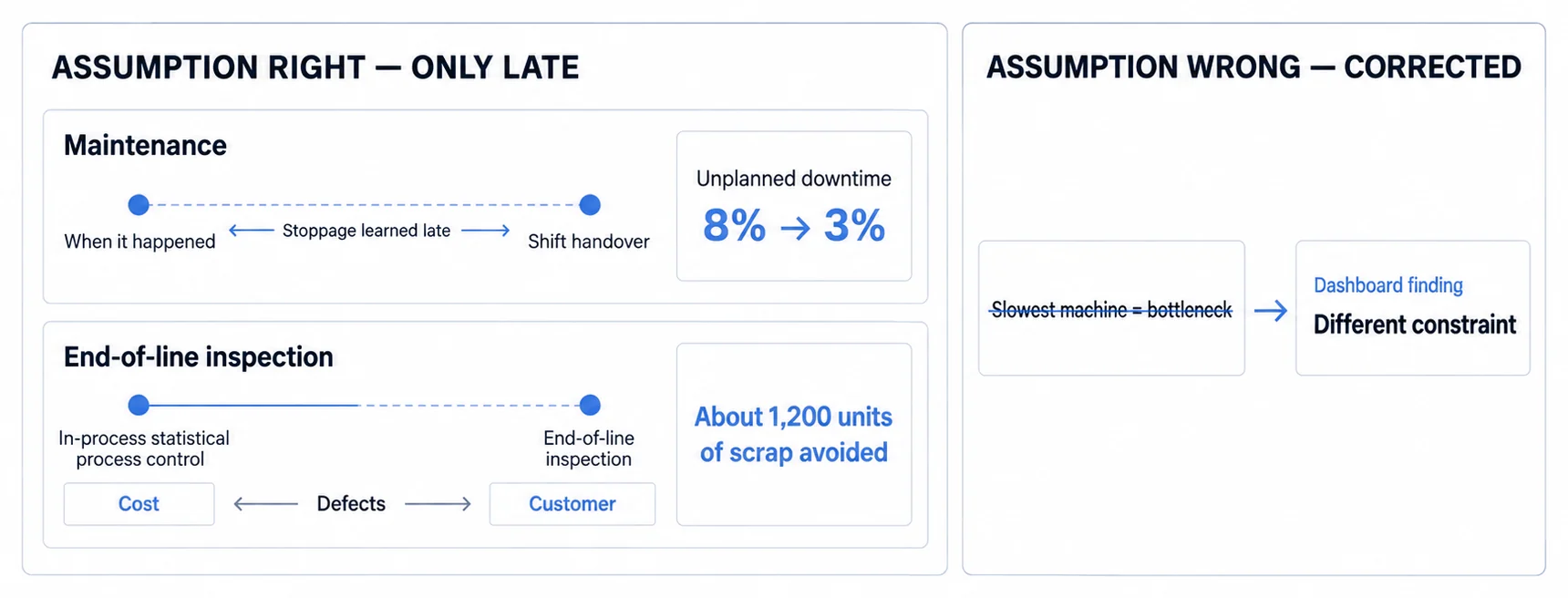
Downtime is where the money is most obvious. Unplanned stoppages are commonly costed somewhere in the region of €5,000 to €20,000 an hour in lost production, though that is a range people quote rather than a figure anyone measured for your plant, and the only version of it worth planning against is your own revenue per hour plus your own fixed cost per hour. A food processing plant took unplanned downtime from 8% to 3% with real-time machine monitoring, and the mechanism was mundane: maintenance responded within five minutes instead of discovering the problem at shift handover. Five points of downtime is roughly 440 hours a year on continuous operation, and what that is worth depends entirely on the hourly figure you substitute in. Do that multiplication with your number rather than ours.
Quality shifts the detection point rather than the detection rate. Defects found at end-of-line inspection have already consumed their materials and their labour, so catching them there saves the customer and not the cost. In-process monitoring with SPC moves the catch upstream: solder joint quality read live shows a defect rate trending upward while it is still inside tolerance, which is early enough to adjust reflow oven temperatures before the affected units become scrap. The trend is the signal, not the threshold.
Throughput is the first case where the dashboard contradicts the plant. The bottleneck a team goes looking for is the slowest machine; the one worth finding is often the fastest line, losing more capacity to changeovers than the slow machine loses to its cycle time. Whether that is your shape is answerable from a number you already hold, your actual changeover time against the target it was set to, and the capacity a SMED programme returns follows from that gap rather than from anyone else's result. Aggregate data hides bottlenecks precisely because it aggregates; the shift-by-shift view is what makes them nameable.
Labour is the second such case, and the starker one. Indirect labour, meaning material handling, rework and unplanned maintenance, typically absorbs a large share of production hours and is invisible in standard reporting because no report has a row for it. Categorising operator activity as value-added against non-value-added is what puts a figure on it, and the figure is usually larger than the plant expects, because nobody had been managing that number badly; nobody had been managing it at all.
That is the honest version of the business case. Two of these four plants improved by learning that their assumption was wrong, which is a thing a faster report cannot do for you and a categorised one can.
A production methodology focused on waste elimination, overproduction, waiting time, transportation, overprocessing, inventory, motion, defects. Dashboards enable Lean by making waste visible in real-time.
Four dimensions decide whether a plant is running well
A manufacturing dashboard earns its place on four dimensions: production efficiency, quality, delivery and cost. Each one holds a handful of metrics, and the useful question inside each is not which numbers exist but which of them a plant can act on today. If you want the general definition first, our glossary covers what makes a metric a KPI rather than just a number you happen to have.
Production efficiency: four metrics, and only one of them is a number
OEE is one number hiding three unrelated problems
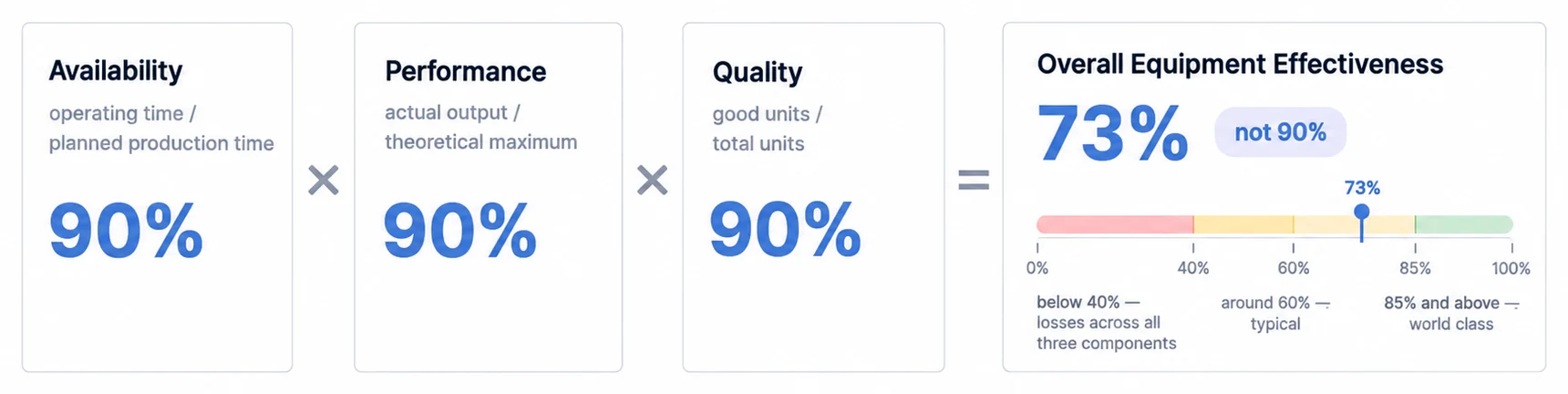
Overall equipment effectiveness multiplies three ratios: availability, which is operating time over planned production time; performance, which is actual output over theoretical maximum; and quality, which is good units over total units.
The multiplication is the part that surprises people. Ninety percent on each component is 73% overall, not 90%, and three respectable scores produce a number that looks like a crisis. The usual TPM bands put top-tier above 85%, average around 60% and poor below 40%, though those are a shared vocabulary rather than something measured in your industry, so treat them as a way to talk to other plants rather than as a target somebody proved.
What makes OEE worth tracking is also what makes it useless alone. A plant at 60% is losing 40% of its capacity, and the number will not tell you whether it went to downtime, to slow cycles or to defects. Those are three different departments: maintenance, engineering and quality. A manager who can only see the 60% will go looking in the wrong one roughly two times in three.
So put OEE on the dashboard as a single banded gauge, and put the three components beside it rather than one click away. The point of the gauge is not the score. It is which of the three is dragging the product down.
Cycle time is the only metric here you can improve without spending anything
Cycle time is how long one unit takes from start to finish, and it sets your throughput ceiling. Cut it by ten percent and capacity rises by ten percent, with no capital expenditure, which is a claim almost nothing else on a manufacturing dashboard can make.
Track actual against target, and put twenty-four hours of it on a trend line rather than showing today's average. The average hides the thing you are looking for: cycle time usually varies by time of day and by shift, and the variation is where the recoverable minutes are. A plant with a stable average and a bad third shift looks fine on a single number.
Throughput is what you are paid for, and it is not the same as being busy
Throughput is units per unit time: units per hour, tons per shift, parts per minute. It translates directly into revenue, because plants are paid for output rather than for effort, and it is the metric most likely to disagree with how hard everybody feels they are working.
Show the current rate against target, and add a cumulative counter for the shift, the day and the week. The counter matters more than it looks: a rate tells an operator how they are doing right now, and a cumulative figure tells them whether the shift can still be saved.
Takt time is the one that tells you when to stop
Takt time is available production time divided by customer demand, so 480 minutes against 240 units of demand gives two minutes per unit. It is a demand figure rather than a capability figure, which is what makes it different from everything above.
Run cycle time above takt and you cannot meet demand. Run it far below and you are overproducing, which Lean counts as waste rather than as achievement, and which most plants have no dashboard signal for at all. That asymmetry is the reason to draw them together: every plant has an alarm for being too slow, and almost none have one for being too fast.
Put them side by side as two bars, and alert when cycle time crosses takt. If you want the harder version, alert on both sides.
Do not try to fix every cause. A Pareto chart on downtime reasons usually shows three to five causes carrying most of the total, and the shape of that chart decides where the first improvement goes.
A representative distribution looks like 42% material shortages, 23% changeover delays, 18% equipment jams and 17% everything else. On that shape the answer is not a maintenance project, it is material logistics, and it recovers more than the next two causes combined. Your own distribution will differ, which is the point of drawing it before choosing.
Quality: four metrics, and each one catches the defect later than the last
The four quality metrics on a manufacturing dashboard are usually presented as a set. They are better read as a sequence, because they catch the same defect at four different moments, and the cost of the defect roughly multiplies at every step.
First-pass yield catches it first: good units on the first attempt over total units started. Top-tier is above 99%, typical sits at 95-98%, and below 90% is a problem, though as with all such bands these are the shared industry vocabulary rather than something measured in your plant. The reason FPY is the most useful of the four is arithmetic: 95% yield means one unit in twenty goes down the line twice, so those units consume double the time, materials and labour to produce the same revenue. Put it on the dashboard as a percentage with a trend line, and put the cost of poor quality next to it, which is simply rework units multiplied by rework cost per unit. That second number is what gets the meeting to take the first one seriously.
Defect rate catches it next, at inspection. Defective units over total units, drilled down by category, because cosmetic, functional and dimensional defects have different causes and different owners. This is where SPC charts earn their place: the useful signal is not that the rate is high today, it is that the rate is trending toward the control limit while still inside it. A defect rate that is fine and rising tells you something a defect rate that is fine does not.
Scrap rate catches it after the unit is unrecoverable. Scrapped over total, which is the purest waste on the list, since materials, labour and energy have all been consumed and there is no revenue at the end of it. Break it out by product, line and shift, and show the material cost, because scrap is the metric where the money is easiest to make visible and therefore easiest to act on.
Customer returns catch it last, and by then it is not really a quality metric at all. Units returned over units shipped means a defect passed your internal inspection and failed in front of the customer, so every return is also a statement about the three metrics above it. It is a lagging indicator, typically four to twelve weeks behind shipment, which makes it useless for daily control and essential for knowing whether the daily control is working.
Read as a sequence, the dashboard design follows: the first two belong on a shop-floor screen where somebody can act within the hour, and the last two belong in a weekly review where somebody can change a process.
A quality methodology targeting 3.4 defects per million opportunities (99.99966% quality). Dashboards enable Six Sigma by providing real-time process variation data for DMAIC (Define, Measure, Analyze, Improve, Control) projects.
Delivery: the metric your customer sees, and the two that explain it
On-time delivery is the only number in this section your customer experiences directly, which is exactly why it is the wrong one to manage by on its own. Orders delivered on time over total orders, with top-tier above 98% and typical between 90 and 95%, tells you that you have a problem without telling you where it started.
The value of OTD on a dashboard is therefore not the percentage, it is the ageing analysis beside it: which orders are currently at risk, ranked by how late they will be. A percentage is a report on last month. A list of orders that can still be expedited is a decision available this afternoon.
Lead time and schedule adherence are the two that explain the percentage, and they fail in different ways. Lead time, from order receipt to shipment, is worth plotting against your quoted lead time rather than against itself, because a plant that is consistently slower than it promises has a sales problem as much as a production one, and the trend line is where you see the two diverge. Schedule adherence, actual production over scheduled production, is the early warning: poor adherence produces material shortages, overtime and expedited freight days before it produces a late delivery, so a variance above ten percent today is a customer conversation next week.
Which gives the section its dashboard shape. Show OTD large because it is what you are judged on, and show adherence beside it because it is what you can still change.
Cost: three metrics, and the third is the only one that moves fast enough to act on
Cost per unit is total production cost over units produced, built from direct labour, materials, energy and allocated overhead. It determines profitability and it is the number the business cares about, but it is also the slowest to move and the hardest to attribute, since the allocation component is an accounting decision rather than a measurement. Trend it by day or week with a drill-down by cost category, and treat a spike as a question rather than an answer.
Labour efficiency, standard hours over actual hours, sits in the middle. Labour is typically 10 to 30 percent of manufacturing cost, so a ten percent efficiency gain reaches the margin directly. Break it down by operator, shift or line, and be careful what you do with it: the honest use is finding where training helps, and the tempting use is ranking people, which produces better-looking numbers and worse information.
Downtime cost is the one that belongs on the screen. Downtime minutes multiplied by revenue per minute plus fixed cost per minute, running live, because it is the only cost metric on the list where the number moves while somebody can still do something about it. Idle labour, wasted energy and delayed shipments all accumulate during the stoppage rather than after it, and a live counter turns an abstraction into a reason to walk over to the line.
Put it next to a year-to-date total against your improvement target, and the three metrics resolve into their proper roles: cost per unit for the quarterly review, labour efficiency for the monthly one, and downtime cost for right now.
Five dashboards, and the refresh rate is set by the reader, not the data
Manufacturing dashboards serve different operational levels, and the five that matter map onto five different dashboard types with genuinely different jobs. What separates them is easy to get wrong, because it looks like a technical choice and is not.
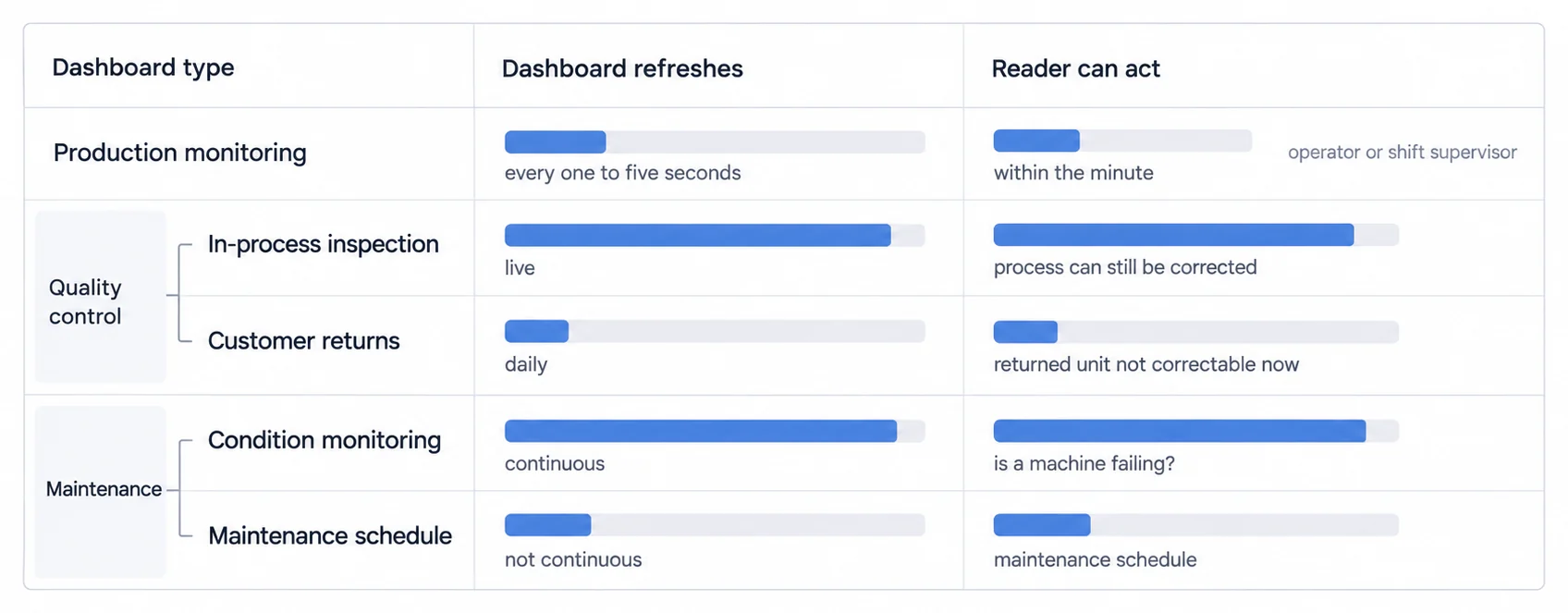
The refresh rate of each one is set by how fast the person reading it can act. An operator on a packaging line can change something within the minute, so a screen that updates every few seconds is worth building. A plant manager acts on a maintenance budget, which is a monthly decision at best, so a real-time executive dashboard is engineering effort spent on a number nobody will look at twice a day. Build a real-time dashboard for the wrong reader and you have paid for latency you cannot use; build a daily-refresh one for an operator and it is not a dashboard, it is a report.
| Dashboard | Who reads it | How often it needs to move | Why that rate |
|---|---|---|---|
| Production monitoring | Operators, shift supervisors | 1-5 seconds | a stopped machine is actionable now |
| Quality control | Quality engineers, supervisors | real-time in process, daily for returns | in-process is correctable, returns are not |
| Maintenance | Technicians, reliability engineers | real-time for condition, daily for work orders | a bearing degrades over weeks, not seconds |
| Plant performance | Plant managers, directors | daily or weekly, with drill-down | the decisions it feeds are monthly |
| Supply chain | Planners, procurement | daily snapshots, real-time stockout alerts | inventory moves slowly until it does not |
Production monitoring is the one people picture: real-time tracking of machine status, production count against target, current cycle time, OEE, and downtime with reason codes. It runs on MES and SCADA, plus operator input for the reason codes, and that last source is the one that decides whether it works. A downtime chart with 60% of its minutes in "other" is a data-entry problem, not an analytics one.
The characteristic use is short: a packaging operator sees OEE drop below 75%, the drill-down shows changeover time rather than a fault, and a kaizen team takes setup from 45 minutes to 20. Note that nothing in that story needed a prediction. It needed a number fast enough to still be about today.
Quality control covers first-pass yield, defect rate by category, SPC charts, scrap and returns, drawing on quality management systems, automated inspection, manual logs and customer return data. The split refresh rate is the point: in-process inspection is worth watching live because the process can still be corrected, while returns arrive weeks later and belong in a review. A semiconductor fab watching wafer defect density can adjust deposition parameters before defects cross specification, which is only possible because the measurement and the adjustment happen on the same timescale.
Maintenance tracks MTBF, MTTR, the ratio of planned to unplanned work, the work-order backlog and equipment condition scores, from a CMMS, condition sensors and operator rounds. Condition data is continuous and work-order metrics are daily, because those are two different questions: is this machine degrading, and is the maintenance function keeping up. A mill watching vibration on critical pumps can schedule a bearing replacement into the next planned shutdown, which turns an outage into a line item.
A maintenance methodology emphasizing proactive and preventive maintenance to maximize equipment effectiveness. Dashboards support TPM by tracking autonomous maintenance activities and equipment degradation patterns.
Plant performance aggregates OEE across lines and sets it beside revenue against plan, cost per unit, on-time delivery and safety. It pulls from MES, ERP, financial systems and incident logs, which is the widest integration on this list and the least urgent refresh. Its value is the trend and the drill-down together: a three-month OEE slide from 78% to 72% is not actionable, and the same slide with one line accounting for 60% of it is.
Supply chain covers inventory turnover, supplier on-time delivery, stockouts, work-in-process and warehouse utilisation, from ERP, warehouse management, supplier portals and transport systems, and connecting it to a full supply chain dashboard is what turns plant visibility into end-to-end visibility. Daily snapshots are enough for inventory levels, but stockout alerts have to be immediate, because two days of remaining stock on a critical component is not a reporting fact, it is a countdown.
Read across the data sources column and a second thing becomes clear: these five draw on almost entirely different systems. Adding manufacturing dashboards is not one integration project. It is five, and they can be sequenced.
When the dashboard faces your customer, the rules change
Customer-facing production dashboards represent a critical gap in existing market content. Unlike internal plant monitoring, these dashboards serve external stakeholders: contract manufacturers providing production status visibility to clients, MES software vendors offering customer portals for production tracking, supply chain platforms enabling real-time capacity visibility, and equipment OEMs delivering machine performance dashboards to customers.
These implementations require white-label capability maintaining the software vendor's brand identity, multi-tenant architecture segregating data between different customer facilities, secure customer access with role-based permissions, and branded reporting generating customer-specific performance documents.
For manufacturing software companies, embedded dashboards become product features rather than internal tools. The technical requirements differ significantly: customer-facing analytics products must handle thousands of end-users across hundreds of customer facilities, support white label analytics with complete UI customization, enable embedded dashboard integration through SDKs or iFrames, and provide predictable flat-rate pricing instead of per-user fees that become prohibitive at scale.
The metrics worth putting on a screen, and why these ones
Selecting the right KPIs transforms dashboards from data displays into decision-making tools. InsightSoftware (2026) emphasizes that manufacturing KPIs require updating as businesses grow, not one-time implementation. For a complete breakdown of production metrics, see the manufacturing KPI dashboard guide.
Design decisions that survive a shop floor
A dashboard for operators should look fundamentally different than a dashboard for executives. Operators need real-time actionability (big numbers, red/green status). Executives need trends and variance analysis (charts, comparisons to plan).
Who is reading it, and from how far away
Almost every other choice in this section follows from two facts: how far the reader is standing from the screen, and how long their decision takes. An operator reads a wall monitor from ten feet while holding a tool. An executive reads a laptop and their decision is a month long.
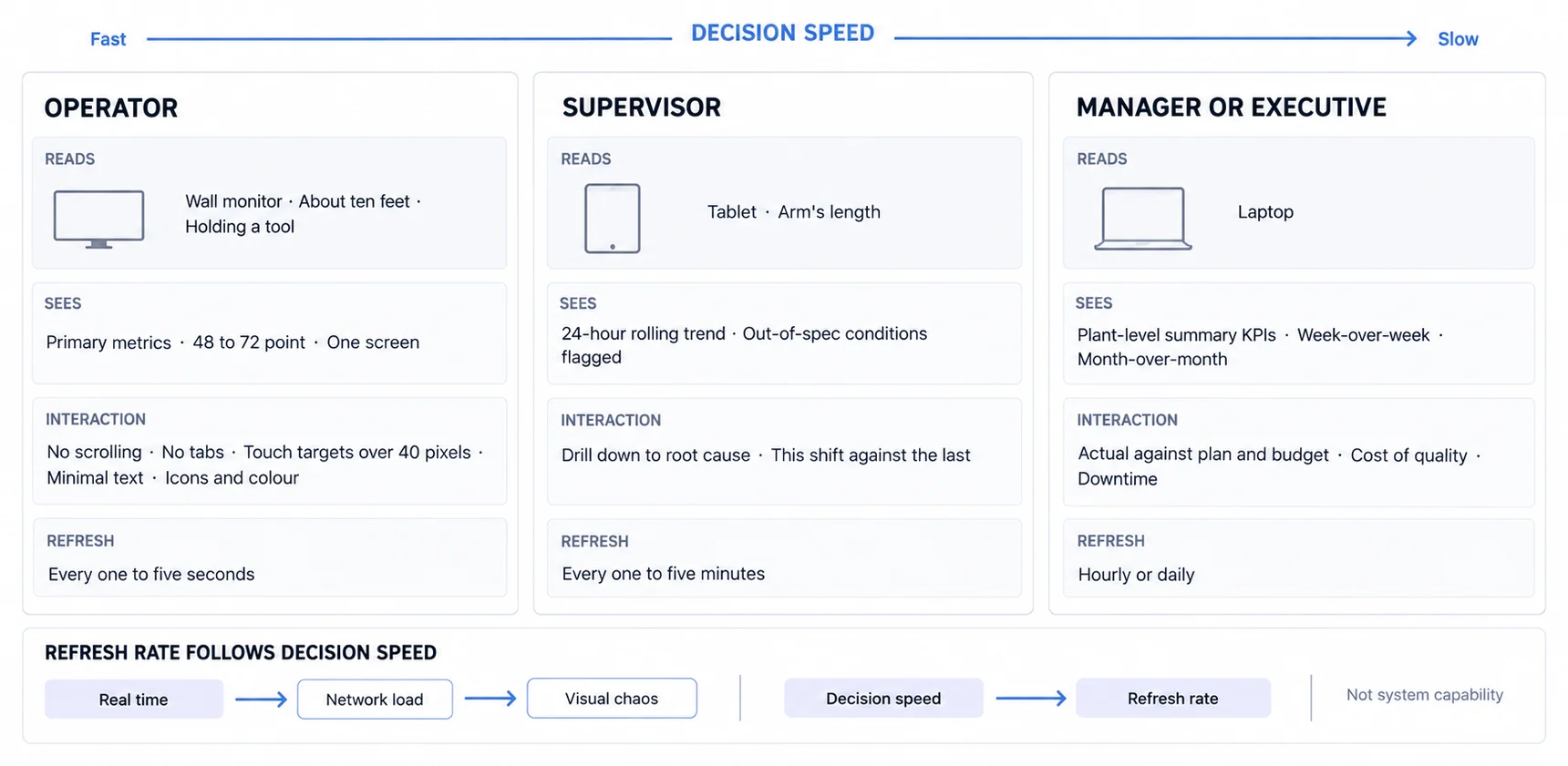
The refresh rates in that figure differ deliberately. Updating everything in real time buys network load and visual chaos rather than awareness, so the rate follows the speed of the decision rather than what the system is capable of.
Status a colour-blind operator can still read
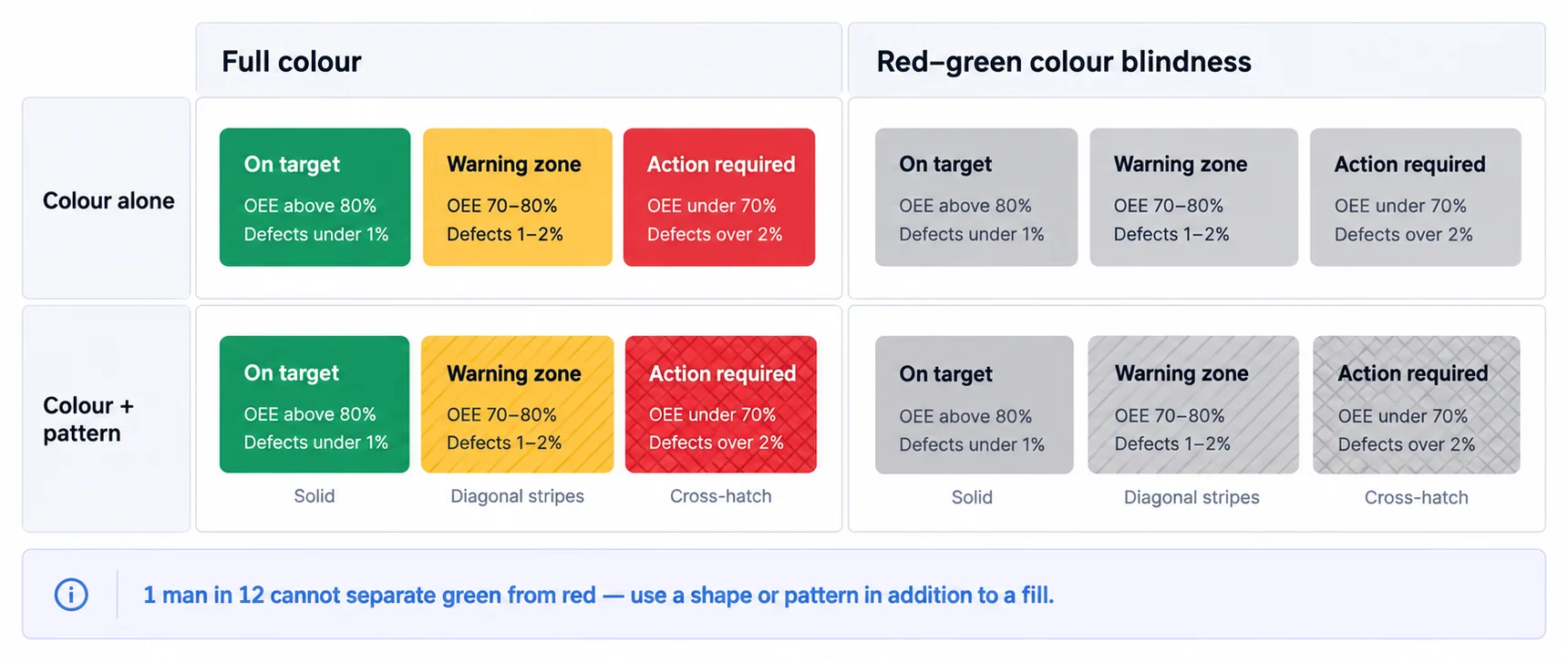
The traffic light works because an operator can assess a line in under three seconds without reading a label. It stops working for roughly one man in twelve, which is why status needs a shape or a fill pattern as well as a colour.
Choosing a chart is choosing what comparison you want made
Bar charts for discrete categories and for Pareto analysis: downtime by reason, defects by type, ranked causes. Line charts for trends and before-and-after comparisons: OEE by hour, production count by shift. Gauge charts for a single KPI against a target range, where the point is instant status rather than precision.
Avoid pie charts here. Segment sizes are hard to compare, the format breaks down past five categories, and a horizontal bar chart answers the same question better. Our chart types guide sets out the full decision.
Alerts that can be acted on, and that stop
An alert reading "Downtime alert" tells an operator to go and find out what happened. The same event written properly tells them what to do. Alert fatigue is then prevented by escalation rather than by repetition: nobody is notified twice, they are notified later.
Three phases, and the third one has a prerequisite nobody mentions
The rollout is usually drawn as increasing sophistication: monitor, then expand, then predict. It is more accurate to read it as increasing prerequisites, and the third phase has one that catches teams out.
Phase one, weeks one to four, proves value on a single line. Pick a line with known pain, because the point is a visible result rather than a representative one. Define five to seven KPIs, not fifty; OEE, cycle time and defect rate are enough to start an argument. Connect the MES, the quality system and operator input, put a large monitor where operators actually stand and a tablet with the supervisor, and check in daily on what is useful and what is noise.
What counts as success is worth setting before you start, and worth stating as targets rather than as guarantees: a meaningful OEE improvement on the pilot line, most operators using it to make decisions rather than merely walking past it, and deployment measured in weeks rather than months. A beverage bottling plant ran this on its slowest line at 68% OEE and reached 74% within three weeks, and the mechanism was small: the dashboard made micro-stops visible, and changeover dropped from 12 minutes to 8. Nothing about that required advanced analytics.
Phase two, weeks five to twelve, takes the proven design to the rest of the plant, and its whole difficulty is standardisation against customization. Use the same metrics everywhere so lines can be compared, then allow genuinely process-specific additions, since temperature control on extrusion and pressure control on injection moulding are not the same job. Train operators for half an hour on reading the dashboard and, more importantly, on logging downtime reasons, because that is the data everything else depends on. Then put it inside the tier meetings that already happen.
Three things reliably go wrong here and all three are avoidable. Forcing one identical dashboard onto a packaging line and an assembly line. Assuming operators will work it out without training. And displaying metrics that never change a decision, which is how a dashboard becomes wallpaper.
Phase three, months four to six, moves from monitoring to prediction, and this is the phase with the hidden prerequisite. Predictive maintenance models that flag equipment failure a week or two ahead, correlation analysis that surfaces relationships nobody looked for, such as defect rate rising with ambient humidity, and scheduling simulations that minimise changeover: all of them are real, and all of them need history. A model cannot learn a failure pattern from four months of data, and the correlation with humidity is invisible unless you stored humidity for a year before anyone suspected it mattered.
So the technology requirements list, a data historian, an analytics platform and an integration layer across MES, SCADA and ERP, is not really a phase-three shopping list. The historian belongs in phase one, quietly recording things nobody is looking at yet, because the alternative is discovering in month four that phase three starts in eighteen months. A chemical plant running vibration and temperature models on critical pumps caught a bearing failure ten days out and moved the repair into a scheduled window; what made that possible was the sensor history, not the model.
Four routes, and what separates them is who ends up operating it
The four ways to put a manufacturing dashboard in front of people are usually compared on price and customization. Both of those matter less than the question underneath them, which is who is running this thing in eighteen months. "Free" and "cheap" describe a licence, and the licence is the smallest line in every one of these four.
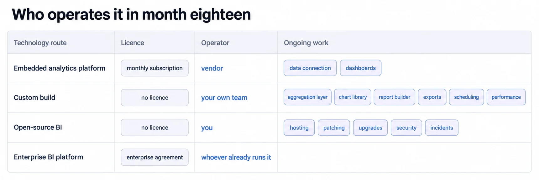
An embedded analytics platform is the fastest route and the one where somebody else operates it. Sumboard, Tableau Embedded and Power BI Embedded all sit here. You get pre-built manufacturing KPI templates, deployment in days rather than months, no DevOps of your own, and white-labelling if the dashboards are going in front of your own customers. What you give up is the last stretch of customization, and what you take on is a subscription; ours is €199-€499 a month, and the enterprise embedding options do not publish a rate for this case at all, which is worth knowing before a comparison spreadsheet implies they do. This is the right route for an operations team that needs dashboards without an engineering project attached.
-- Example: OEE calculation in Sumboard
SELECT
    machine_id,
    AVG(availability) as avg_availability,
    AVG(performance) as avg_performance,
    AVG(quality) as avg_quality,
    (AVG(availability) * AVG(performance) * AVG(quality)) as oee
FROM production_data
WHERE date >= CURRENT_DATE - INTERVAL '30 days'
GROUP BY machine_id
ORDER BY oee DESC
A custom build gives you complete control and makes you the operator permanently. The stack is not exotic: Python or Node on the backend, PostgreSQL with a time-series extension or InfluxDB for the sensor data, React with D3 on the front, hosted wherever you already host. The honest cost is not the first version, it is that the first version takes six to twelve months of a real team and then never stops needing one. You own the data completely and you can integrate anything proprietary, which is why this is the right answer for large enterprises with software teams and requirements no platform covers, and the wrong answer for almost everyone who reaches for it because analytics felt like it should be easy.
import React from 'react';
import { Gauge } from 'react-gauge-component';

function OEEGauge({ oeeValue }) {
  return (
    <div className="oee-gauge">
      <h2>Overall Equipment Effectiveness</h2>
      <Gauge
        value={oeeValue}
        min={0}
        max={100}
        label="OEE %"
        color={oeeValue > 80 ? '#4caf50' : oeeValue > 60 ? '#ff9800' : '#f44336'}
      />
    </div>
  );
}

export default OEEGauge;
Open-source BI, meaning Grafana, Superset or Metabase, is where the word "free" does the most damage. The licence genuinely costs nothing, the community and plugin ecosystem are real, and the tools are good. Then you self-host, patch, monitor, upgrade and troubleshoot them, which is a standing claim on somebody's week that no invoice ever records. There are also few manufacturing-specific features, so the shop-floor conventions in this guide are yours to build. Right for organisations with strong IT and a hard budget constraint, as long as the constraint is on spend rather than on people.
Enterprise BI platforms, meaning Tableau, Power BI, Qlik or Looker, are the one case where the marginal decision is not about the platform at all. If your company already runs one for corporate reporting, someone already operates it, already knows it and already pays for it, so extending to manufacturing is an implementation project rather than a procurement. If your company does not, you are buying a corporate BI platform to draw four gauges, and the implementation runs in months. The capability is not in question; the fit is.
Read down the four and the pattern is the same one every time. The platform route rents an operator. The custom route hires one forever. Open source hands you the job with the software. And enterprise BI is cheap when the operator is already on the payroll and expensive when they are not.
Three integration patterns, and each one trades latency against blast radius
There are three ways to get the data to the dashboard, and choosing between them is not really a technical preference. It is a decision about how much of your plant a bad query can affect.
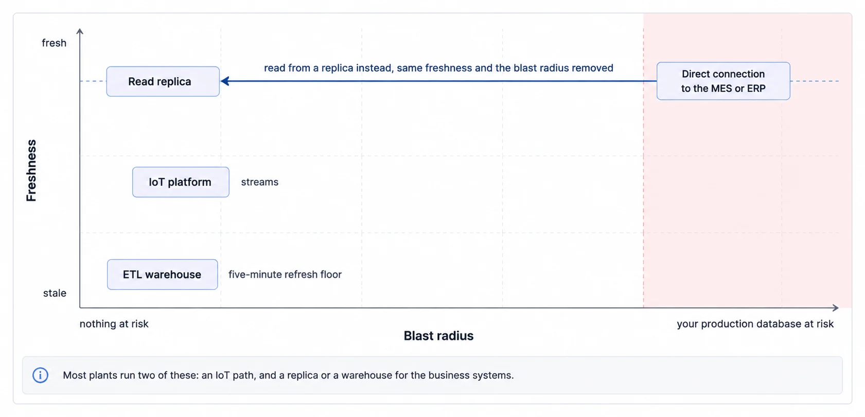
Connecting directly to the MES or ERP database is the simplest thing that works, and it is the one that can take a production system down. The data is live, there is nothing to build, and a dashboard that refreshes every few seconds is issuing queries against the database your plant depends on. Twenty operators leaving a screen open is a load profile nobody sized for. The fix is not clever and it is not optional: read from a replica rather than from live production. That single decision keeps the simplicity and removes the blast radius, which makes this pattern a reasonable default for a small plant with one source system.
An ETL pipeline moves the load off the source systems by accepting latency in exchange. You extract from each system on a schedule, transform in one place, and load into a warehouse the dashboard queries instead. Airflow, Talend and Informatica all do this. In practice the loop looks like: every five minutes pull production counts from the MES, pull quality data from the inspection system, compute OEE and join the two, write to the warehouse, and let the dashboard read only from there. What you get is a single data model that all your dashboards agree on, which matters more than it sounds the first time two screens disagree about yesterday's output. What you pay is complexity and a refresh floor, which rules this pattern out for anything an operator needs within seconds.
IoT platform integration is the pattern for sensor data at scale, where the volume is the problem rather than the joins. Sensors feed an edge gateway, the gateway publishes over MQTT, and a platform such as AWS IoT Core, Azure IoT Hub or Google Cloud IoT handles ingestion before the dashboard sees any of it. It scales to hundreds of machines and it streams, which is what makes second-level condition monitoring possible at all. It also assumes network connectivity on the shop floor and cloud infrastructure you are willing to run, and neither of those is a given in an older plant.
The three are not mutually exclusive and most plants end up with two of them: an IoT path for machine condition, and either a replica or a warehouse for everything that comes out of a business system. The mistake is picking one for the whole estate because the first use case fit it.
A worked example: injection moulding, with the assumptions left visible
What follows is an illustrative scenario rather than a named customer's account. It shows the shape a phased deployment takes and the figures a plant would be tracking, not results we are reporting, and the assumptions are left in the open so you can replace them with yours.
The plant is mid-size: 120 employees, 15 moulding machines. It starts with OEE assumed at 62%, downtime reasons that are not systematically recorded, and quality defects found at end-of-line inspection, which is to say too late to save the parts.
The pilot runs four weeks on the three highest-volume machines, tracking OEE, cycle time, shot count and scrap rate, fed by the machine controllers over OPC-UA plus operator input for downtime reasons, and displayed on a 42-inch monitor on the floor with a tablet for the supervisor. On these assumptions the pilot would move OEE from 62% to around 71%, and it would produce something more durable than the number: a first real breakdown of where the time goes, roughly 38% to material changeovers, 24% to mould changes and 18% to quality holds. Before the pilot none of that was written down anywhere.
The rollout takes weeks five to twelve across all fifteen machines, with standardised KPIs, half an hour of training per shift, and the dashboard placed inside daily tier meetings so somebody is expected to respond to it. On the same assumptions plant-wide OEE would move from 64% to about 74%, scrap from 3.1% to 1.8%, and cycle time variability down by roughly a quarter, which is the least eye-catching of the three and often the most valuable, because consistent production is what makes a schedule believable.
The improvement actions that follow are ordinary and that is the point: quick-change tooling brings mould changeovers from 38% of downtime to 22%, parameter optimisation takes 8% off cycle time on high-volume parts, and live SPC catches process drift before it becomes scrap.
On the return, the arithmetic is worth watching rather than trusting. Take €15K of implementation plus €6K a year of subscription, so €21K in year one. Take a 10% capacity increase, which is 1,200 additional machine-hours. Value them at €400 per machine-hour and you get €480K a year and a payback measured in days.
That last figure is doing what such figures usually do, which is inheriting the optimism of the line above it. It assumes every additional machine-hour is sold, and recovered capacity is only worth anything if there is demand waiting for it. Change that one assumption to the share you can genuinely sell and the payback moves with it, which is the only version of this calculation worth putting in front of a finance director.
Lean and the dashboard: the loop gets shorter, the thinking does not
Manufacturing dashboards are usually described as enablers of Lean, which is true and slightly too flattering. What a dashboard changes about each Lean principle is the same thing every time: the delay between something happening and somebody knowing about it. It does not do the analysis, and the worked example at the end of this section is the clearest evidence of that.
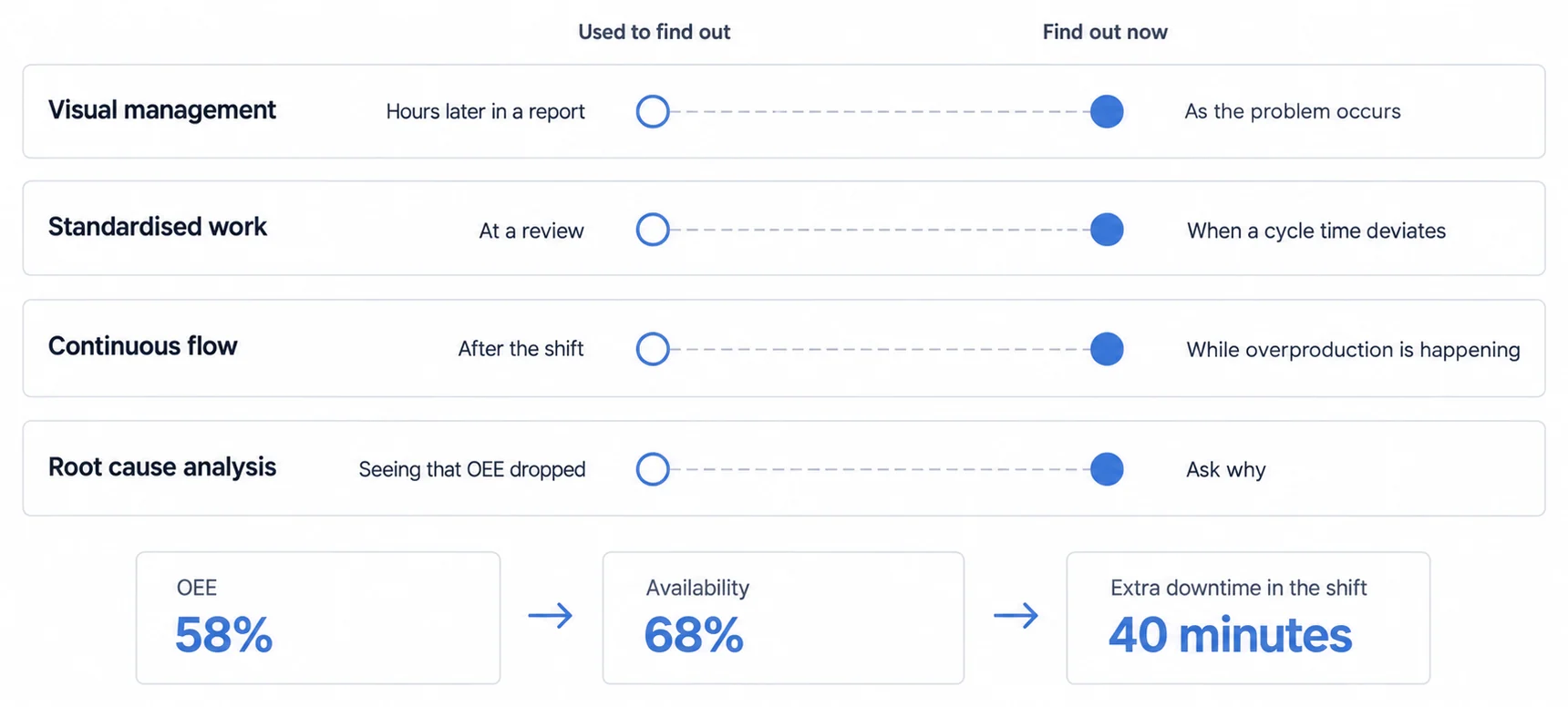
Visual management asks that problems be visible so teams can respond immediately, and this is the principle a dashboard serves most directly: red, amber and green on a shop-floor screen means operators see a problem as it happens rather than in tomorrow's report. Standardised work asks that the best-known method be documented and followed, and the dashboard's contribution is narrower than it sounds, since tracking adherence to standard cycle times tells you a deviation occurred but not whether the standard was wrong. Continuous flow asks you to stop batching, and live WIP tracking with a takt display is how a line knows it is running ahead of demand, which is the overproduction nobody alarms on. Kaizen asks for small daily improvements, and the change here is one of evidence: "we think changeovers take too long" becomes "average changeover is 42 minutes, the best is 18, target 25 in two weeks", which is a different meeting.
Root cause analysis is where the honest limit shows, so it is worth walking a real chain rather than asserting the capability. Five whys, starting from a number on a screen:
- Why did OEE drop to 58%? Availability fell to 68%, while performance and quality stayed normal.
- Why did availability fall? Machine downtime rose by 40 minutes on the shift.
- Why did downtime rise? Three material runouts, 35 minutes between them.
- Why did material run out? The forklift driver was delivering every two hours against a 90-minute requirement.
- Why every two hours? The driver's route included non-production tasks.
The countermeasure is dull and effective: dedicate one driver to production material delivery, runouts stop, availability recovers to 88%.
Notice where the dashboard stopped being useful. It answered questions one, two and three, because those are all in the data: the OEE breakdown, the downtime total, the reason codes. Questions four and five were a conversation with a forklift driver, and no dashboard contains a driver's route. The tool got the team to the third why quickly, which is exactly its job, and the last two whys were still human work. Any vendor promising otherwise is selling you the first three steps as though they were all five.
Quality: three integrations, and only one of them changes what you do tomorrow
Statistical process control is the one with a same-day effect, and its value is a distinction most quality reporting misses. SPC watches variation rather than conformance, so the signal is a measurement drifting toward a control limit while still comfortably within specification. A precision machining shop tracking shaft diameter sees the trend, schedules tool sharpening, and never makes an out-of-spec part. A conformance report would have said everything was fine right up until it was not. On the dashboard that means live X-bar and R charts, alerts on the control limits rather than the spec limits, and process capability indices beside them.
Six Sigma is where the dashboard is infrastructure rather than insight, and it earns its place in the last phase rather than the first. Define identifies the problem, measure sets the baseline, analyse uses the drill-downs, improve tracks whether the initiative moved anything. All four are useful and all four are things a competent team could do with a spreadsheet and patience. Control is different: it runs indefinitely, long after the project team has moved on, and it is the phase where improvement projects quietly regress. SPC charts and alert thresholds left running are the control plan, which makes the dashboard the only part of a Six Sigma project that outlives it.
Quality cost tracking is the one that changes the conversation, because it converts a quality argument into a finance one. The four categories are ordered by how expensive the failure is by the time you meet it: prevention, meaning planning and training, is cheapest; appraisal, meaning inspection and testing, is next; internal failure, meaning scrap and rework, is expensive; and external failure, meaning warranty and returns, is the most expensive because the customer has already been involved. Total quality cost is conventionally held under about 3% of revenue, though as with every band in this guide that is a shared target rather than something measured in your industry.
SELECT
    SUM(scrap_cost + rework_cost) as internal_failure_cost,
    SUM(warranty_claims + customer_returns) as external_failure_cost,
    SUM(inspection_labor_cost) as appraisal_cost,
    (internal_failure_cost + external_failure_cost + appraisal_cost) as total_quality_cost,
    (total_quality_cost / total_revenue) * 100 as quality_cost_percentage
FROM quality_metrics
WHERE month = CURRENT_MONTH
The reason to compute it is that the four categories trade against each other, and the trade is counter-intuitive. Spending more on prevention should reduce the other three by more than it costs, which is a claim you can only test if all four are on the same chart.
Maintenance: a health score is a prediction, and predictions need a decision attached
Predictive maintenance is the most oversold capability in this guide and one of the most useful when it is set up honestly. Vibration, temperature, oil analysis, acoustic emissions and power draw feed anomaly detection, which notices when a machine stops behaving like itself, and remaining-useful-life models, which turn that into a date. The dashboard side is a health score out of 100, a predicted time to failure, the work order queue and parts availability.
Those last two items are what separate a working implementation from an impressive demo. A paper mill watching pump vibration sees health on pump three fall from 92 to 78 over a fortnight with failure predicted in twelve to fifteen days, and the value is not the prediction. It is that twelve days is long enough to order a bearing and reach the next planned shutdown. A prediction with no parts in stock and no shutdown within the window is an accurate way to feel bad.
So the honest test for a predictive maintenance dashboard is whether the prediction horizon exceeds your procurement lead time plus your interval between planned stoppages. If it does not, you are building a countdown clock.
CMMS integration is the unglamorous half and it answers a different question. MTBF, the average operating time between breakdowns, and MTTR, the average time to restore, are not about individual machines at all; they are about whether the maintenance function is keeping up. A planned-to-unplanned ratio around 80:20 is the usual target. What makes these worth a dashboard is the direction rather than the level: MTBF falling or MTTR rising is the signal, and the causes are almost always organisational, meaning deferred maintenance, thin training or parts that are not there when needed.
Access control: four roles, and one of them decides what the numbers mean
Role-based permissions on a manufacturing dashboard are usually drawn as a ladder of increasing visibility, and the interesting boundary is not visibility at all. It is who can edit.
Operators view the production dashboards and edit the things only they know: downtime reason codes and quality issue logs. Supervisors see everything an operator sees plus cost, and edit schedules and shift targets. Managers add financial data and, crucially, edit KPI thresholds and dashboard configuration. Admins hold system configuration and user management.
That third row is the one to think about. Whoever can change a threshold can change whether a line is red or green without changing anything on the line, so the ability to edit thresholds is the ability to edit the story. It belongs with managers rather than with supervisors, and every change to one is worth logging, not because anyone is expected to abuse it but because "the target moved" is otherwise indistinguishable from "performance improved" three months later.
On data security there are two distinct concerns and they need different answers. The data itself can be commercially sensitive: cost per unit and labour efficiency say things about your margin that you would not put in a tender. The connection is the larger risk, because a dashboard wired into MES and SCADA is a path into production systems, and analytics tools are not usually designed as though they were. Encrypt in transit, keep the production network segregated from the corporate one, run security audits on the same schedule as everything else on that network, and require two-factor authentication for anything reachable from outside the plant.
Mobile: the constraint is not the screen, it is where the person is standing
Plant managers and maintenance technicians need the dashboard while walking the floor, which is a different use from the same dashboard on a wall.
The obvious constraint is size, and the obvious answer is fewer metrics: three to five at the top with drill-down underneath, rather than an attempt to reproduce twenty. But the constraint that actually decides the design is context. Somebody looking at a phone on the floor is standing in front of the thing the dashboard is describing, so they do not need the overview, they need the exception and the ability to do something about it. That makes the useful mobile view current plant OEE as a single large number, machines currently down with how long they have been down, active alerts, and the ability to acknowledge an alert and assign a work order without going back to a desk.
Two practical details follow from where they are standing. Wi-Fi coverage on a shop floor is uneven, so cache and degrade gracefully rather than showing a spinner in the one corner where somebody needs it. And tap targets need to survive gloves, which in practice means larger than the 44 pixels a design system will tell you is the minimum.
Four things coming, sorted by what you have to buy first
Every list of emerging trends reads as though the items are equally close. They are not, and the useful sort is not by how impressive each one is but by what it requires you to have before it does anything for you.
AI-assisted root cause analysis is the nearest, and it needs no new hardware at all. Today an operator correlates by hand; the promise is a model that scans hundreds of variables and proposes causes. A defect spike arrives alongside an operator change, an ambient temperature rise from an HVAC fault and a raw material lot change, and the suggestion is that a new operator is handling temperature-sensitive material unfamiliarly. What that requires is not a purchase, it is history: those correlations only exist if you were already recording operator, temperature and lot alongside the defect. Which is the argument for starting the historian early, made again from a different direction.
Edge computing is the next nearest and it does need something: local compute. Cloud dashboards carry latency, typically in the hundreds of milliseconds to a couple of seconds, and processing on-premise on industrial PCs takes updates under a tenth of a second. That matters on high-speed lines and matters not at all on most others, so the honest test is whether anybody can act inside the difference. If your operator's fastest possible response is ten seconds, buying 100-millisecond updates buys nothing.
Augmented reality needs hardware on people's heads, which is a bigger commitment than it sounds and where most pilots stall. The use is genuinely good: a technician looks at a pump and sees live vibration, last maintenance date, parts availability and the repair procedure overlaid on it. The blocker is rarely the software.
Digital twins need a model of your line accurate enough to trust, which is the largest prerequisite on the list and the one most often underestimated. The payoff is asking what-if before committing: raise line speed 10% and see the predicted OEE and quality impact without touching the physical line. Building and maintaining that model is a continuing project in its own right, so treat this as a strategic programme rather than a dashboard feature.
Sorted that way the sequence is clear enough. Record everything now, because the first item runs on history you either have or do not. Buy edge compute only if somebody can act inside the latency you are removing. And treat the last two as programmes with their own budgets rather than as things a dashboard will grow into.
Five ways this fails, and four of them are the same failure
The five things that sink manufacturing dashboard projects look like five different problems. Read what each one actually needs and four of them collapse into one: somebody was never named. The dashboard did not cause that gap. It just made it visible on a screen.
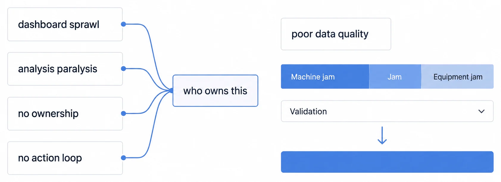
Dashboard sprawl shows up as too many dashboards with metrics that disagree, and it costs you the thing the project was for: when two screens report different OEE, users stop trusting both and the data becomes a source of argument rather than a source of truth. The fix is a standardised KPI definition across every dashboard, one OEE calculation rather than five interpretations. That is not a tooling task. It is somebody having the authority to say which definition wins.
Analysis paralysis is the attempt to build the perfect dashboard, with every conceivable metric, before anyone sees it. What it produces is a twelve-month project delivering something already out of date, because the plant changed while the specification was being agreed. Start with five to seven core KPIs, ship in four weeks, and let the people using it tell you what is missing. Again the blocker is not technical: it is that nobody has been given the right to declare the first version good enough.
No ownership is the one that names itself. A dashboard built by IT and handed to operations becomes shelfware, technically functional and unopened. Operations has to own the design, with IT providing the technical enablement rather than the requirements. This is the pitfall the other three are made of.
Poor data quality is the one with a genuinely mechanical component, and it is worth being specific about the failure mode, because it is rarely dramatic. Downtime reason codes entered as free text produce "Machine jam", "Jam" and "Equipment jam" as three separate causes, and your Pareto chart quietly splits the largest problem into thirds. Dropdowns instead of free text, validation rules and periodic audits fix it. But somebody still has to own the list of valid reasons and keep it short enough that operators use it honestly rather than picking the first option.
No action loop is displaying metrics that never change a decision, which turns the dashboard into digital wallpaper: visible, ignored, and eventually resented. The fix is to put it inside a routine that already exists, so tier meetings review the metrics and improvement actions get assigned from them. What that really means is that the number has an owner who is expected to respond to it.
So the pattern is worth stating plainly before you start. Ask who owns the metric definition, who owns the scope of version one, who owns the reason-code list, and who is expected to act when a number moves. If any of those four questions has no name attached, the dashboard will surface the gap rather than fill it.
The culture part, and the gemba walk that proves why it exists
The technical build is the smaller half of this. The dashboard that gets used is the one that has been placed inside a routine somebody already has, and the four practices below are ways of doing that rather than four separate initiatives.
Daily tier meetings are the routine. Fifteen minutes, standing at the display rather than sitting in a room, reviewing the last 24 hours across safety, quality and production. The rule that makes it work is small: a red metric gets an owner and a date before the meeting ends, and a green one gets asked what the line did differently. Without that first rule the meeting becomes a reading of numbers, which is the same failure as the dashboard becoming wallpaper, just with people standing near it. A workable agenda is two minutes on safety, three on quality, five on production by line, and five on improvement work in progress.
Gemba walks exist because the dashboard is a model of the plant and not the plant, and the best argument for them is the failure they catch. A dashboard shows machine five green and running; the walk finds it cycling without producing, because it is jammed in a way the status logic does not recognise. That discrepancy is worth more than the walk, since it means the status detection is wrong for every machine of that type and nobody would ever have learned it from a screen. Carry a tablet, compare what it says to what is in front of you, and treat every disagreement as a data problem rather than a machine problem.
Operator training takes half an hour to an hour and needs to cover three things, of which only the first is obvious. What the metrics mean, so OEE is not just a number that makes people anxious. Why they matter, and specifically how one operator's downtime logging affects the plant view, because the reason codes are the input the entire Pareto analysis rests on. And how to log accurately, which is where the previous two either land or do not. Refresh quarterly, and always when the dashboard changes.
Recognition is where this can quietly go wrong. Celebrate improvements publicly, keep incentives at shift or team level rather than individual, and do not use the dashboard to attribute poor performance to a person. The reason is practical rather than sentimental: the moment downtime logging can be used against the operator entering it, the reason codes become fiction, and you have traded your best data source for a management lever you did not need.
Measuring the return, and why the headline number is usually about one assumption
The value of a dashboard shows up in four measurable places: OEE improvement, downtime hours recovered, defect rate reduction and throughput. The arithmetic to combine them is straightforward.
Annual Value = (OEE Improvement % × Production Capacity × Revenue per Unit)
             + (Downtime Reduction Hours × Downtime Cost per Hour)
             + (Scrap Reduction Units × Material Cost per Unit)

ROI = (Annual Value - Dashboard Cost) / Dashboard Cost × 100
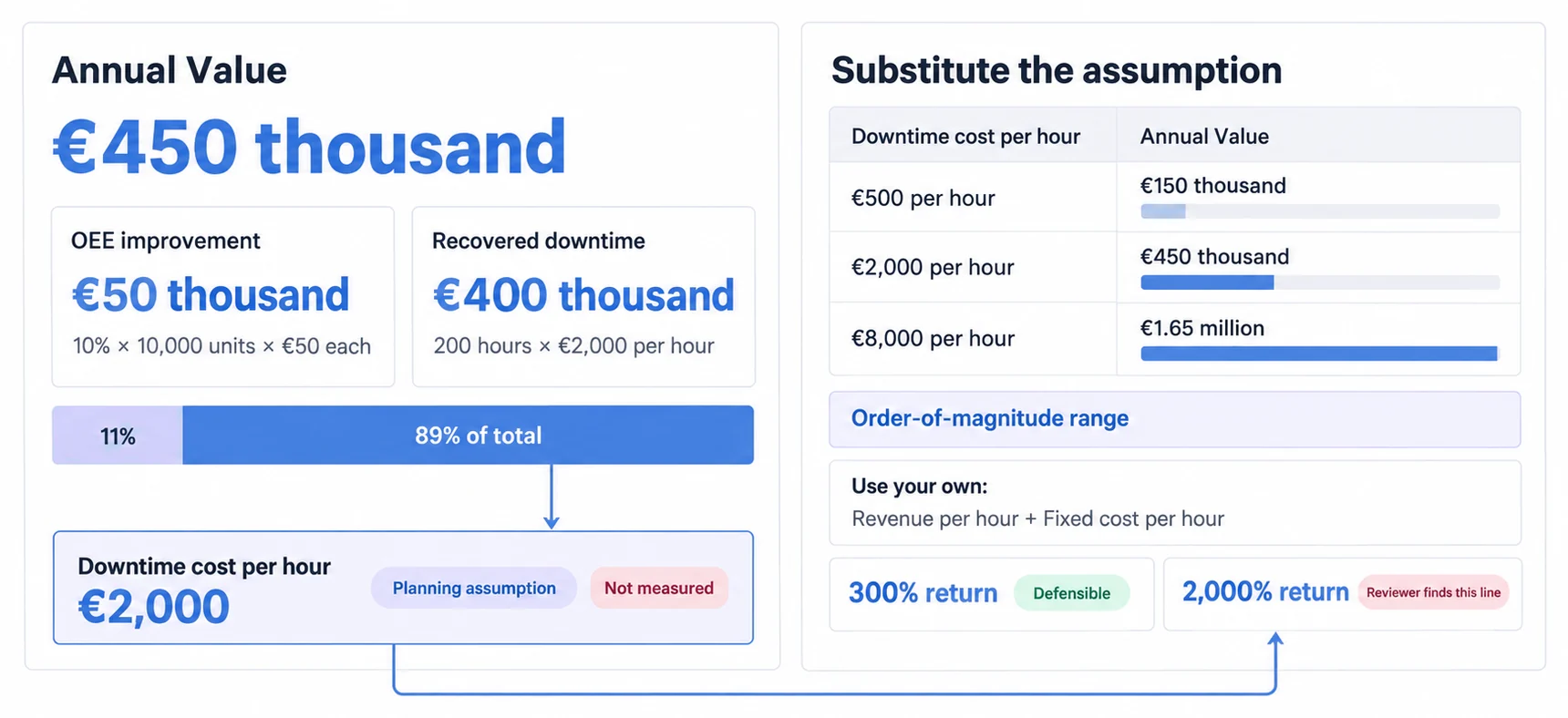
It is worth working an illustration through and then looking at where the answer came from, because that is more useful than the answer. Take a 10% OEE improvement on 10,000 units a year at €50 a unit, which contributes €50K. Add 200 hours of recovered downtime at €2,000 an hour, which contributes €400K. Against €20K of implementation and first-year subscription, that is a return in the region of 2,000%.
Now notice that 89% of the value came from one line, and that line is built on a downtime cost per hour that nobody measured. €2,000 an hour is a plausible figure and so is €500, and so is €8,000, and the headline moves by an order of magnitude between them. The ROI calculation is not really telling you about the dashboard. It is telling you what you assumed about the cost of a stopped line.
So use the formula, and put your own downtime cost in it, derived from your revenue per hour and your fixed cost per hour rather than from a benchmark. A defensible 300% will survive a finance review that a spectacular 2,000% will not.
The benefits that do not enter the calculation are worth naming separately rather than being quietly folded in: decisions made faster, shifts handing over with the same picture rather than two versions of it, improvement work starting from data rather than from whoever argues best, and operators who can see the effect of their own line. None of those are quantified here, which is the honest treatment of them.
Future-proofing is mostly one decision, made early
Four things get filed under future-proofing and three of them are the same decision seen from different angles: keep the data layer separate from the visualisation layer.
Scalability is the version everyone starts with. Pilot on one line, but design as though there will be fifty: modular, reusable dashboard components, and a platform that can add capacity without a migration. Cloud makes this easier than on-premise, with the caveats below.
An API layer is the same decision stated properly. Manufacturing systems change: MES vendors get replaced, ERP gets upgraded, the machine controllers outlive both. If dashboards read directly from those systems, every change is a rebuild. With an API layer between the sources and the visualisation, a source swap is a connector change and the dashboards do not notice.
Avoiding lock-in is that same layer viewed from the exit. Open standards where they exist, meaning OPC-UA for machine data and REST for everything else. Data export in CSV or JSON that you have actually tested, not just seen in a feature list. And a preference for standard SQL over a proprietary query language, because a proprietary language is the thing that does not travel: the dashboards can be rebuilt, but a semantic model written in a language that only runs in one product has to be rewritten from scratch.
Cloud against on-premise is the one genuinely separate decision, and it is not a technical preference so much as a constraint check. Cloud gives you elastic capacity, updates you do not perform, and access from outside the plant. On-premise gives you data sovereignty, latency with no internet dependency, and compliance in the industries that prohibit production data leaving the site. Most plants that think about it for long enough end up hybrid: edge compute for anything that has to respond in milliseconds, cloud for long-term history and heavier analysis. That split maps neatly onto the earlier point about refresh rates, since the things that need to be fast and the things that need to be remembered are rarely the same things.
What to do on Monday
Plants that run on end-of-shift reports and spreadsheets are not short of data. They are short of it at the moment it would have changed something, which is the whole argument of this guide compressed into a sentence.
What a dashboard changes is the interval between a problem happening and somebody knowing: problems surface while they are still today's problem, improvement teams start from a Pareto chart rather than from an opinion, and every shift is looking at the same numbers, which removes an entire category of argument.
Four steps, in order, and the order matters more than any of the individual steps:
- Pilot narrowly and quickly. One line, five to seven KPIs, four weeks. Resist the version of this project that specifies everything first.
- Spend the effort on adoption. Train operators on what the numbers mean and why their reason codes matter, and put the dashboard inside a routine that already exists rather than creating a new meeting for it.
- Iterate from what people actually use. The metrics nobody opens after a month are telling you something.
- Scale the design that worked, rather than the design you originally drew.
And start the historian in step one, even though nothing reads from it yet. Everything in the predictive section of this guide needs history, and the only way to have two years of it is to have started two years ago.
The last thing is the one most likely to decide the outcome and the least likely to appear in a vendor comparison: the best dashboard in the world is worth nothing if nobody looks at it. The technical build is the smaller half.