Production Analytics for Manufacturing Customers
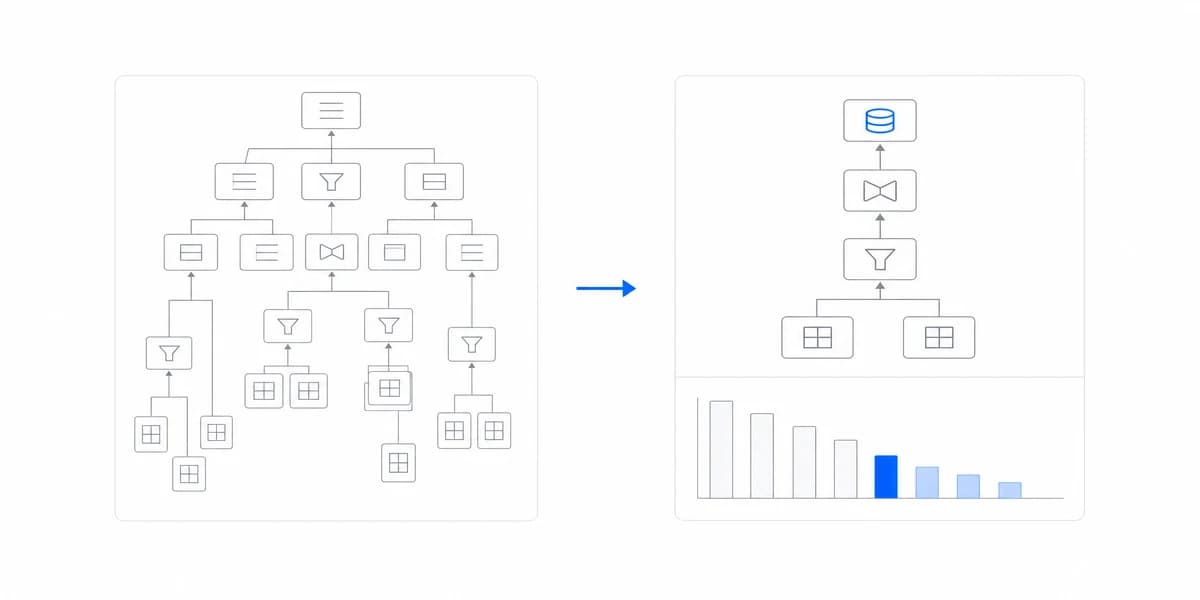
Manufacturing customers now demand interactive production analytics, not CSV exports. Learn how B2B SaaS companies are delivering real-time visibility without 12-month build timelines.
Read more →Resources
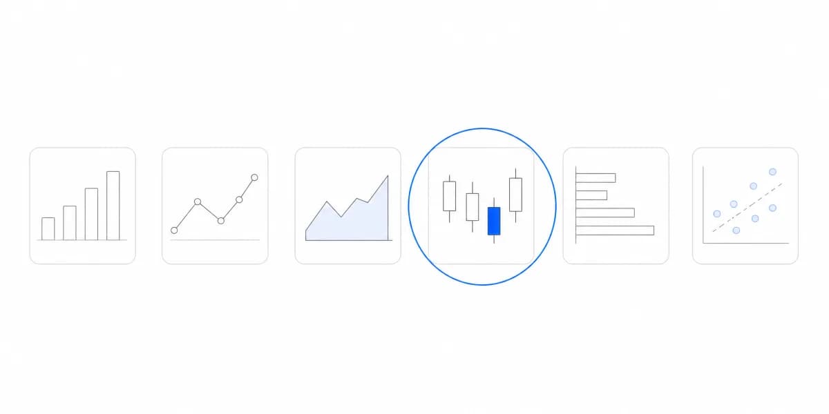
Data visualization turns measures into patterns people can compare. This cluster covers chart selection, color, layout, accessibility, responsive behavior, and data storytelling. The focus is the visual decision itself: what to show, how to encode it, and how to keep the result legible without hiding uncertainty or context.
Articles
Last updated
Pillar guide

Manufacturing customers now demand interactive production analytics, not CSV exports. Learn how B2B SaaS companies are delivering real-time visibility without 12-month build timelines.
Read more →
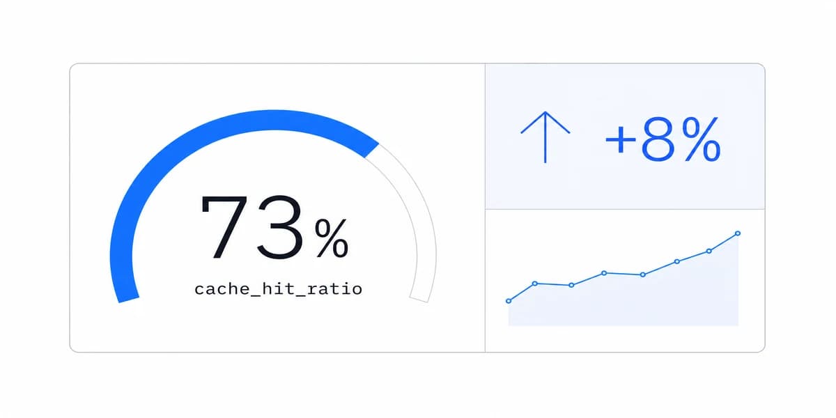
Most cash flow dashboards show you what happened last month. The best ones help you make decisions about next month.
Read more →
Filters, drill-through, refresh, saved views, and actions earn their place when they help a permitted user reach a better decision without losing context.
Read more →
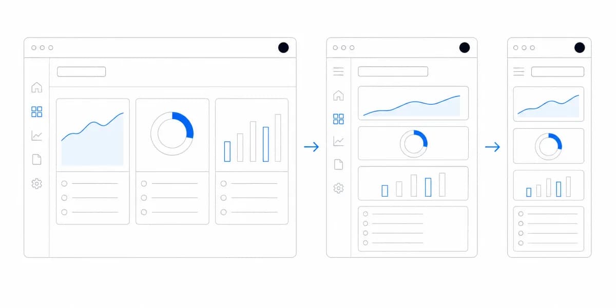
Your customers check analytics on phones during meetings. Here's how to make that experience not terrible.
Read more →
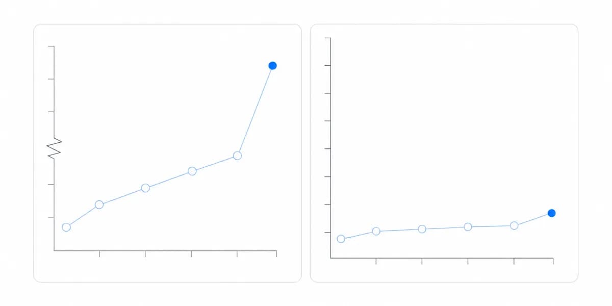
Bad data visualizations lead to dashboard abandonment. Learn from 7 real examples and discover how to create charts your users will actually use.
Read more →
Test charts across equivalent content, semantics, operation, visual resilience, runtime states, and real assistive-technology paths.
Read more →
Bar charts compare values across categories; histograms summarize a quantitative distribution. Learn how data, bins, order, area, and user questions determine the choice.
Read more →
We've seen hundreds of dashboards get built and never used. Here's what separates the ones customers love from the ones they ignore.
Read more →
Your customers don't want more data, they want answers. Here's how to turn dashboards into stories that drive decisions.
Read more →
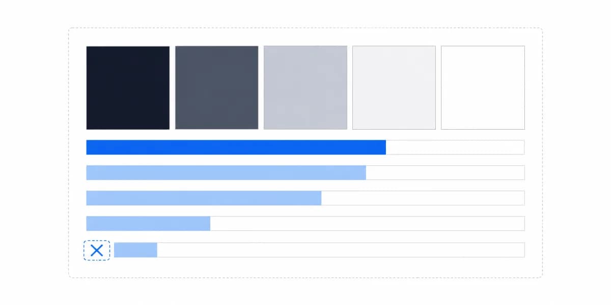
Build dashboard color roles for grouping, order, status, interaction, contrast, and non-color fallback—then validate them in every shipped state.
Read more →
Learn which chart types work best for customer-facing analytics and how to make data exploration intuitive for your users.
Read more →
Design customer dashboards around decisions, hierarchy, progressive disclosure, consistent semantics, accessibility, and tested user tasks.
Read more →
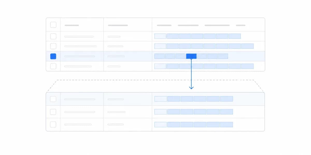
Choose tables, exports, and interactive analytics from the customer task, then validate demand through observable workarounds and product evidence.
Read more →With beautiful, easy-to-understand reports that help your customers make better business decisions. Trusted by CEOs and business leaders who want clarity, not complexity.
Sumboard exceeded our expectations with its performance and ease of integration. We've now embedded it into our product line, enabling our customers to access reports through a cloud portal.

George
CTO and CPO at Orbility